SlideMagic Blog

Frequent updates about all things presentations since 2008. Subscribe to never miss a post.

RSS
·Images

The over-ambitious cover image

Often, my clients want a cover image on the presentation that says it all: the entire message of the presentation in just one smart visual. There are 2 problems with this approach:

  • A technical one. The ideal image will probably not exist in some stock photo site, so there is significant photoshopping and editing required to get that elephant to balance on a skateboard while enjoying the benefits of flexible ROI. This image is unlikely to look good from a technical point of view.
  • Even if you were to make this happen, it is highly unlikely that the audience who walks into the auditorium while sipping a coffee will actually understand what it means.

Lower the ambitions, and pick a professional looking cover image that is somewhat connected to what you are going to talk about and use your presentation to get the full message out.

·Layout

Making image grids in PowerPoint

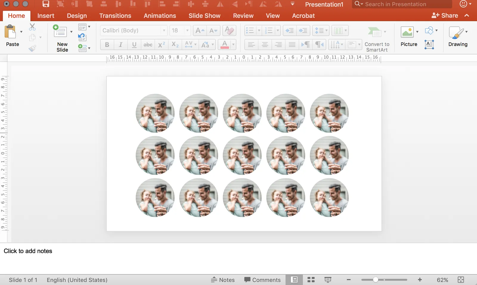
It is tricky in PowerPoint to make a nice grid of images that comes from different sources, in different sizes, and in different aspect ratios. How do you get them all the same size? It can be very tedious to crop them all to the same proportion, and then line them up correctly. There are always one or two that are wrong.

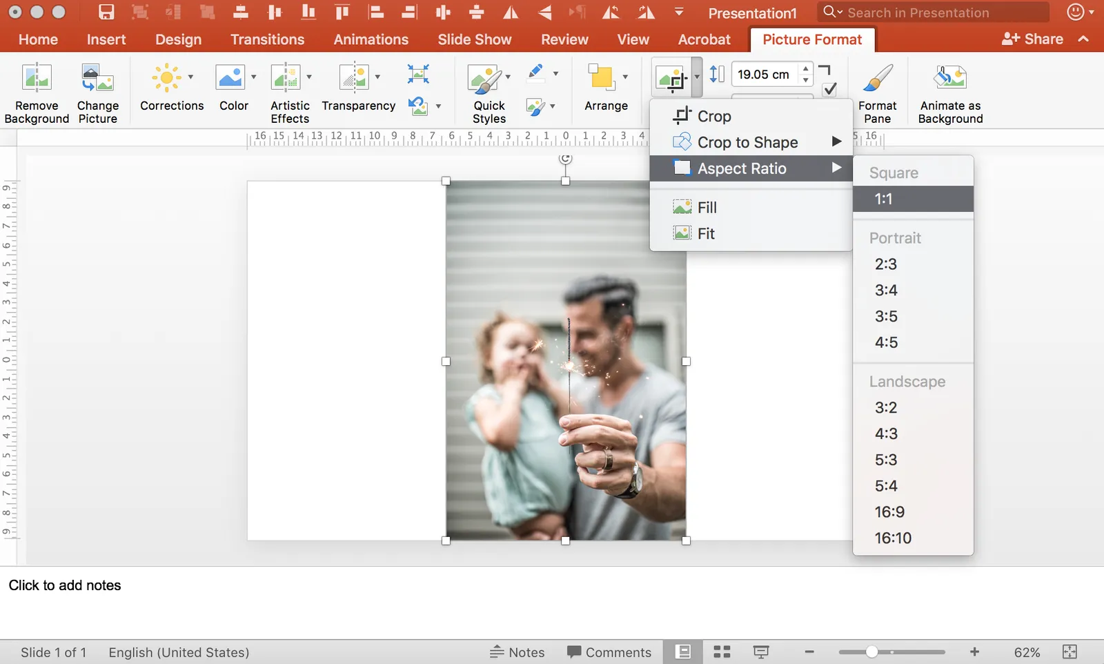
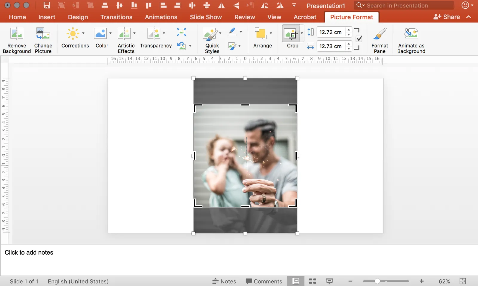
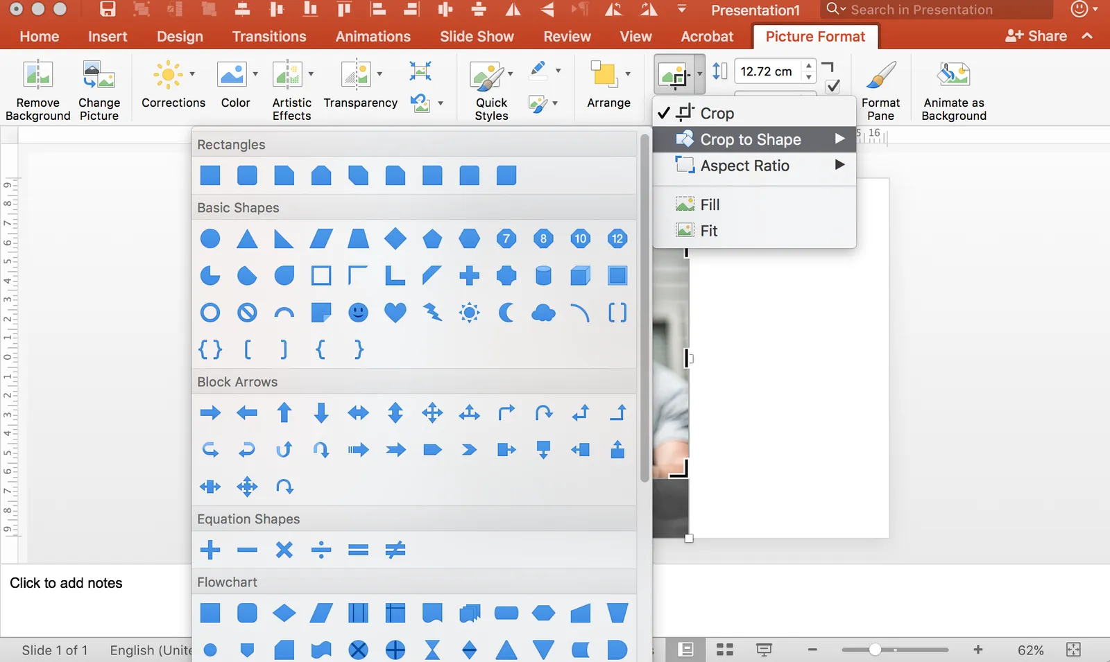
Here is what I do. Crop each image to a certain aspect ratio, don’t worry yet about the exact size. Now select them all and give each the same height, the width will automatically be adjusted as well! Pro-tip, crop to 1:1 and then try cropping to a circle.

In my presentation app SlideMagic, it is impossible not to lay out images in a grid :-)

Need your help with finding a bug

We are constantly squatting small bugs in SlideMagic to make it better and more stable. There is one tiny and mysterious issue that I cannot reproduce whatever I try. A small amount of presentations get a green INSEAD logo inserted in their presentation, despite the fact they have nothing to do with INSEAD. Can you let me know if this happened to you, on what sort of device/operating system you were working and what you were trying out. You can email me on jan at slidemagic dot com.

Copying a look

You see a great layout in a poster, brochure, web site, but you find it impossible to replicate it in PowerPoint. You figured out the font, you copied the color codes, and it still does not look nowhere near the example. How can it be?

There are more variables when it comes to layout than just a type face and color:

  • How are colors used? Take a step back from your example page and try to estimate the % coverage of a page has a certain color. Yes, the accent color could match exactly, but maybe the designer uses it only very sparsely, and in fact the dominant color of the page is grey, not bright yellow.
  • How is white space used? You matched the font, but maybe those bold PowerPoint headlines and text boxes full of text does not fit the loosely spaced, thin text lines that the designer used.
  • What sort of images are in the example? Color or B&W? Busy or calm? People or objects? Stock images or “real” photos?
  • What sort of page element does the designer use? Graphs? Icons? Narrow columns of small body text? Big bold typography?
  • How are accents created? A bullet point? Bold? A different color? Is the main text color actually black, or a lighter grey, or a different color all together?
  • Does the designer use some sort of grid to group items on a page?
  • Where does the headline sit when compared to the other elements on the page. What is the proportion between the headline and the other elements?
Continue reading →
·Story

Too many things in your head

When you are deep into your own story, your mind has hard-wired all aspects of it in one complex mesh network. Everything is related to everything, everything is connected. The upside: you are the expert and know what you are doing. The downside: it is extremely hard for you to explain your idea to someone who comes in cold, without the bits of information, and without the connections between them.

After I return to my office after a client briefing, I usually open a blank piece of paper, take a pencil, and jot down the big ideas I heard in the meeting, after I have given the brain to calm down in the 30 minute journey back. No worry about story lines, no worry about structure, no judgement about what is detail and what is a big message, and no going back to my meeting notes.

These thoughts often become the core building blocks of the presentation. These are the points that I want others to remember when leaving a meeting.

Many people get to this point, they figure out the key messages of a presentation but make the mistake of communicating them in an overly simplistic, or minimalistic way. Just writing “the competition is not flexible” as a big, minimalist statement in a nice designer font is not going to make it stick. Many times, proven/showing these high level messages actually requires going into some depth.

So, a good presentation does not dumb down content. It unravels the wool ball in your head and creates a sequential line of ideas that can ultimately form the basis for a wool ball in the minds of your audience.

·Creativity

40 minutes in

They exercise is good for many things, creativity being one of them. I do the occasional exercise in the form of mountain biking. Preferably, I would roam around on single tracks all the time, but time constraints often limit me to loop around Tel Aviv, close to my home.

And here is the weird thing that is happening to me: every time at about the same time/distance in the run, I get some pretty useful ideas for design problems I am struggling with. I started to notice, because the choice of tracks around my home is not that big, the weather in Israel is pretty much the same every day, so these bike runs happen at more or less the exact same circumstances.

So, the inspiration comes 40 minutes or about 16 km in. Maybe it is this exact amount of exercise you need, or there is something about that specific location…

·Layout

What are good slides?

We all understand that the ultimate slide is a visual composition that has such an emotional impact on us that the moment we walk out of the auditorium, we go and do something we did not plan on doing before.

For most day-to-day presentations, the objectives of a slide will be a bit more down to earth:

  1. Can you actually read what is written on the slide from a distance (font sizes, graphs)?
  2. Does it look as professional as the company/entity you are representing? Comic sans, clip art, low resolution pictures, distorted aspect ratios, PowerPoint bevels. (Professional and pretty are not the same things).
  3. Does the chart just have one message?
  4. Is information laid out so it supports the message? A trade requires pros and cons, a trend should come out of a graph, A implies B, there is a clear differentiation
  5. Does the slide actually look pretty in terms of design, composition, balance?

Slightly related: here is a Dutch TV commercial from the 1970s with a quality inspector stamping “OK” on peanuts.

Humor in investor presentations

Should you put it in?

A joke can break the ice and make a presentation more memorable. But, and there is but, be careful with hardwiring your jokes inside the slides. Sometimes, you start your presentation and you will find that the “vibe” of the room at that moment is just not good to crack a joke. If you know your funny but maybe inappropriate slide is coming up, you need to be a master of the presentation remote control to save the meeting.

Also, when you are sending a deck ahead of the presentation, and you are not in control in what circumstances the recipient will be reading it, it is better not to include that hilarious image.

So, the best is to keep humor verbal, add it in your story if you feel that moment is right.

Art via WikiPedia

Making things look random

A page full of dots, a cloud of text labels, boxes. It is hard to make things look “random”.

I try to replicate the effect of shaking a glass box full of cookies in a different color. Copy paste your presentation objects on the slide. Then start moving them around. Resize to make them more or less the same size. Avoid clusters/clots of similar shapes or similar colors on the page. Take a step (or 3) back from the screen and see how it looks, repeat the above process again.

Randomness is actually a very organized state.

Image via WikiPedia

Logos in M&A and customer pages

Logos: VC and PE funds like to put them in their exit slides, startups put their customers, investment banks showcase their M&A deals, CV pages highlight logos of companies people worked for. Logos can create instantly recognizable endorsements by major companies, but it comes at a cost: clutter. Here are some guidelines.

  • To declutter your logo page, consider putting them in B&W to reduce the number of colors on your page. Also, adhere to a strict grid when placing them on a page: 5x4, 7x5, etc. (SlideMagic makes it easy to take the color out of an image, and it is not possible to escape the grid)
  • Think which logos actually matter: well-known companies. Logos of companies people have never heard from before, just add clutter. Things are even worse when they are written in a language few people can read (Hebrew). On M&A deal pages, consider only putting the logo of the big acquiring company, not the acquired company. On CV/team/bio pages, put only logos of well-known companies and maybe use text for the lesser known ones.
  • At some stage there are simply too many logos on a page. For example, the famous industry landscape charts that started off looking decent, but over the years span out of control as more logos got added.

Image by Loren Kerns on Flickr.