SlideMagic Blog

Frequent updates about all things presentations since 2008. Subscribe to never miss a post.

RSS
all posts

Search results for “web design”

New SlideMagic features

Over the past weeks we have quietly updated SlideMagic. Some workflows will go faster now (you can now change another shape without having to back to the main menu bar, you can drag and drop in story mode), and some bugs have been fixed. There were 2 bigger features deployed a few days ago.

Automatic flipping to a dark background (and back)
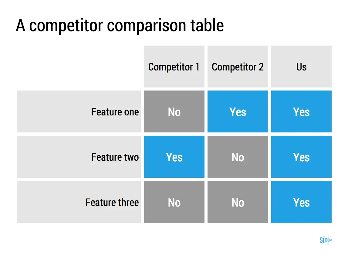
Working with limited colour combinations has its advantages: your slides will always look great. But it allows us to do other things as well, we can automatically convert your presentation to a dark background (on click) to make it more suitable for larger audiences where you do not want the speaker to be overpowered by a huge white screen. Once you are done, -click- and you are back to conference room friendly white.

Image manipulation

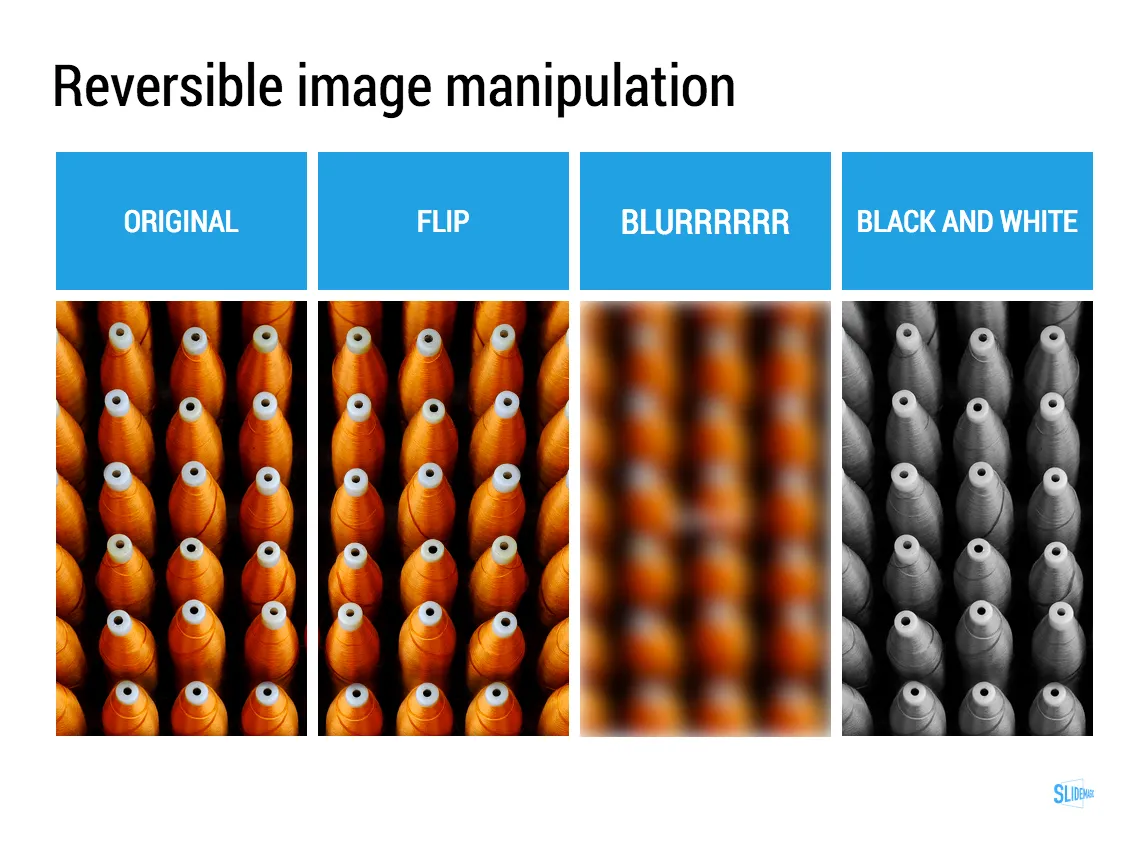
Most presentation design software is loaded with image manipulation functionality, including the ability to stretch and distort the aspect ratio of a photography. SlideMagic only offers the image manipulation you need most: a horizontal flip, blurring, and black and white conversion. All of which are reversible.

Personally, I use the B&W conversion a lot. Wherever I can, I prefer working with black and white images.
Art: Maarten van Cleve, Kitchen Interior, circa 1565
Click here to subscribe to the blog

There are 3 types of presentations

The more I think about it, I can see three different types of presentations:

  1. Stage show
  2. Cold call
  3. Decision document

The stage show

A live, stand up presentation where you introduce an audience to a new idea for the first time

  • Big, stage-setting images (a place, a product, a person)
  • Highly simplified data charts with just one, really one, message
  • Place holder slides (either empty or with a few words)

Note the charts that are absent in this overview:  generic bullet point lists (you knew that already), but also pointless images with visual concepts that can be explained better verbally (no need for the squished tomato to stay that things are tough). Big agenda slides and presentation structure slides might put your audience to sleep early on. If the audience has to be reminded via tracker pages where they are in the story all the time, your story is probably not clear enough.

Cold call

Usually an email attachment or a link to a web site that needs to grab the attention of the recipient who is not neccessarily interested in your idea. The slides will typically be the same as the ones that are used for a stage show, but with a crucial modification: there needs to be a clearly written explanation because you are not present to tell the story behind the slides.

You need to encourage the next page down click, so including big, dense, boring, text slides early on in your document (“we need to say everything on the first 3 pages!”) is likely to encourage your audience to abandon ship early.

Continue reading →

In the stock photo business?

I would like to get in touch with business development people at stock photo web sites to talk about my upcoming presentation design web app, and maybe other ideas. Feel free to contact me at contact at ideatransplant dot com if you are interested.

·Keynote

App update

Regular readers will know that I am busy developing a “PowerPoint killer” web app in my spare time (and financed with my personal savings). Many of you have signed up to be part of an early testing group. Here is where I am at, at the moment.

The key innovation of the app will be the approach to designing slides, and that engine is now more or less up and running. I am very pleased with the result, it runs exactly as I have imagined it in my head and jotted it down in PowerPoint (my web design environment, believe it or not).

My clients do not know it, but I am slowly changing my approach to (PowerPoint) slide design in such as way that it will fit the design approach of the new app, and I am testing to see where the philosophy breaks down.

The slide design engine, cannot be tested on its down, hence development work is now focussing on getting the more trivial parts of the application working (presenting on a screen, managing files, etc.).

When this is finished, I will release the app to a very very limited testing crowd that will not be intimidated by unexpected bugs. The objective is to test whether the methodology appeals to more people than just myself. After the green light and a more robust design, I will open the app to more people.

Please be patient as I am trying to juggle time and financing carefully. Watch this space.

Testing - Pitch It in PDF

I am preparing the conversion of my book Pitch It into PDF based on the comments I received yesterday. In the process, I am becoming an expert in Adobe InDesign as well. The challenge will be to translate the interactive iPad content into static sequential images.

Here is a trial of the first chapter, which is available for download for $0.01 (PayPal obviously does not allow $0 transactions). If you want, you can check it out and let me know whether the format works and how you liked the shopping experience. But I understand it if you save the $0.01 for the full version (chapter 1 is an introduction and does not contain any of the core content of the book).

You can download the first chapter by clicking the button below for a $0.01 charge:

Buy Now

·Keynote

PowerPoint killer?

Now that my book is nearing completion I am switching attention to a much bigger side project, I might have the initial idea for software that can be a PowerPoint and Keynote killer. Many have tried before me, and all of them have more or less failed, so I need to be careful. I keep the idea under wraps for the moment (sorry), but what I can reveal are the fundamental flaws in slideware that I want to take out:

  1. The bloated programs have their roots in 1980s mouse-based drawing software
  2. Templates are technology- or graphics- rather than business content-driven

Things are very early at the moment, and I am trying to get a handle on the budget and timing aspects of a project and start to look into possible design partners (UI, backend). Let me know if you think that there are design studios out there that I should be aware of, especially those that have experience with visual/slide apps on desktop and mobile. You can send me a message via the contact field in my website.

I hope that this post will be the beginning of a solution for death by PowerPoint, rather than a note in the margin like Fermat’s last theorem

·Investor presentation

Speaking in Barcelona

I will be crossing the Mediterranean Sea and talking about designing a good VC/investor pitch presentation in Barcelona. It would be great to shake hands with readers in Spain.

The event is scheduled for October 3, at 19:00. The location still has to be finalised, maybe the campus of the IESE business school, or another central Barcelona location. The presentation will be in English, and is free of charge. You can sign up for the event here.

Thank you Conor Neill for connecting me to the Barcelona startup community. Thank you John  and Mel Kots for this nice and hazy picture of Gaudi’s master piece that is still under construction.

Join me at Startup Reykjavik

I have been enjoying the most amazing holiday in Iceland this summer and will make a stop over at the Startup Reykjavik accelerator for a presentation about designing investor and sales presentations for startups.

Hopefully I can help the companies in the Startup Reykjavik program that are working hard on finalizing their investor pitches for follow-on funding. But Startup Reykjavik agreed to make the event open to the public, so if you are around you are invited to drop by.

This event is sponsored by Arion Bank, a major retail and commercial bank in Iceland that is working hard to support the startup economy here (more info about the bank).

The details of the event: Monday August 13, starting around 11:00-11:30 and will probably last 1-2 hours, Startup Reykjavik is based at 13 Ármúli.

Olympic infographics

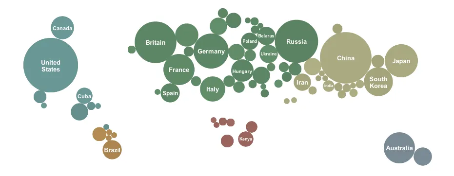
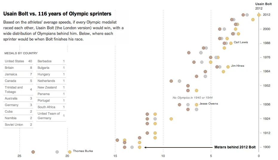
The results from the Olympic Games are a great data source for infographic designers, here are 2 examples from the New York Times: one that I like, and one that I do not like.

The country medal count bubbles is cute but not very useful. It tests the reader’s geography knowledge to figure out what the countries are that have no data label inside them. A simple bar chart will do a much better job, and will leave space for a second bar chart: inhabitants per medal. You would always expect a country with a larger population to produce more medals.

This overview of 100m running medals over the past century is great though. It transforms the basic finish time data into something much more interesting, where on the 100m track would each runner be the moment the 2012 crosses the line. The NYT also created a nice video to analyze the results.

Duarte launches Diagrammer

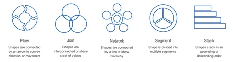
Nancy Duarte’s firm Duarte Design just launched an online market place for PowerPoint diagram templates: Diagrammer. You can select from a library of 4,000 diagrams that are ready to be included and edited into your own PowerPoint presentation. Each file costs $0.99.

I always found one of the best parts of Nancy’s first book Slide:ology (review of the book) to be the collection of diagram concepts. Now this collection has been digitized and automated.

There is one competitor to Diagrammer built right into PowerPoint, the smart objects. But somehow, smart objects never worked for me, they are awkward to edit and to fit into the look and feel of the overall presentation. Moreover, Diagrammer has a much more powerful classification method, helping you to zoom into the exact diagram you need (flow, 2D, 4 steps).

Diagrammer also competes with other template sites such as Slideshop. Slideshop has more elaborate graphics (not always a good thing) and a broader variety of slide types.

Diagrammer fills a clear need for diagrams in everyday, corporate, strategy-type presentations. One of the easiest ways to replace a bullet point chart is to shorten the bullets and put them each in boxes with a framework that shows the relationships between the elements. (Still, it might be hard to resist for many users to shrink the font sizes in each of the boxes and cram in some more text…)

Congratulations to Duarte with the launch of Diagrammer, it shows that they have an open mind to innovate presentation design. It is impossible for bespoke presentation design (like the service I provide) to free the world of poor presentations. Self-service technology might get us there eventually.