SlideMagic Blog

Frequent updates about all things presentations since 2008. Subscribe to never miss a post.

RSS
all posts

Search results for “web design”

It takes more than the slides

The Internet is full with research reports on any subject you ever wanted to explore. In theory therefore, it should be easy to Google together a pile of slides on a certain subject, “Frankenstein” a deck together and go on stage as an expert in a particular field.

Unfortunately, it is not that simple. The audience will figure out very quickly when your knowledge of a subject is exactly the amount of content that is written on the slides. It shows in the way you answer questions, it shows in the way you present your slides.

This can often happen when an executive in the technology industry gets invited for a conference to speak about “the latest in [fill in technology buzzword]”. People take too little time to prepare their talk, and the result is a stumbling performance that recycles some cliches about the subject.

The same is true in consulting firms, where a junior analyst gets charged with “pulling some slides together” on a subject and gets sent of to present to client at the last minute to stand in for a more senior consultant who could not make the slot.

What to do?

Option one is to adjust the topic you are speaking about, often conference owners will be open to this. Speak about something that is really close to what you do day to day. Even if you do not answer the big question on this huge issue everyone is thinking about, that very personal, very specific experience that you have will be very valuable.
Continue reading →
·Layout

My standard page layout

The empty template in my presentation app SlideMagic uses pretty much the same layout as my bespoke work in PowerPoint/Keynote for clients:

Big slide headline that can run over 2 lines (I like elaborate titles, similar to newspaper headings), without any graphical elements (lines, banners, logos)

  • Small logo in the bottom right, I compromise here and give in to most companies insisting that the audience should be reminded to whom they are listening on every page. Many clients want to move that logo left, which creates a graphical imbalance: the bottom right logo balances the weight of the left-aligned title in the top left. Also, a logo at the left creates problems with footnotes.
·Video

Corporate videos

As a presentation designer, I get to sift through a lot of corporate introduction videos, most of the time, I am looking for some decent still images that I can use as a background for an introduction slide about a customer or strategic partners.

A lot of money is going into these videos. Sophisticated motion graphics, upbeat music, soothing voice overs.

Most of these are hosted on YouTube, so you get a sense of how many people actually watched them. In most cases: a few thousand at best, but many have far, far fewer views. The majority of which is probably the creative team and the people reviewing drafts at the client.

Why? I do not have scientific evidence, but here are some possible causes:

  • There is actually not that much information in these videos, except for the usual buzzwords about helping improve the environment and making the world a better place. An analyst who wants to know what the group is all about, can spend the 3 minutes it takes to watch the video better in other places on the web site.
  • (Related) These videos are full of stock video cliches: pretty board rooms against a view over the park, happy families running in that park, a drone going up the corporate sky scraper.
  • In the case of conglomerates, a large part of the video is spent on justifying the existence of the group, what ties them together? This is a hugely important issue for the conglomerate management, but for the student, investor, journalist, customer, potential employee, it does not merit 50% of the 3 minutes.
Continue reading →

Looking good vs explaining well

Experts, anyone who is deeply into a subject, usually finds it very hard to explain a concept to a layman. They no longer see what is obvious to the novice and what is not, and lack the full, rich, memory picture that is associated with a buzzword or industry jargon term.

So often when I sit down with a client, they will point me to a website or presentation of a competitor / similar company that is beautifully designed: nice pictures, nice fonts, nice infographics. “I want something like this”.

They forget that these marketing materials are mere pretty packaging of the same buzzwords. Yes, they look pretty, but as a layman, I usually still do not have a clue what it means.

In these cases, I usually start asking questions. The client explains without noticing initially why I am asking the questions. After 10 minutes. I remind her what I asked her about and give proof that a pretty presentation does not equal a clear presentation.

Image via WikiPedia

·Layout

Making image grids in PowerPoint

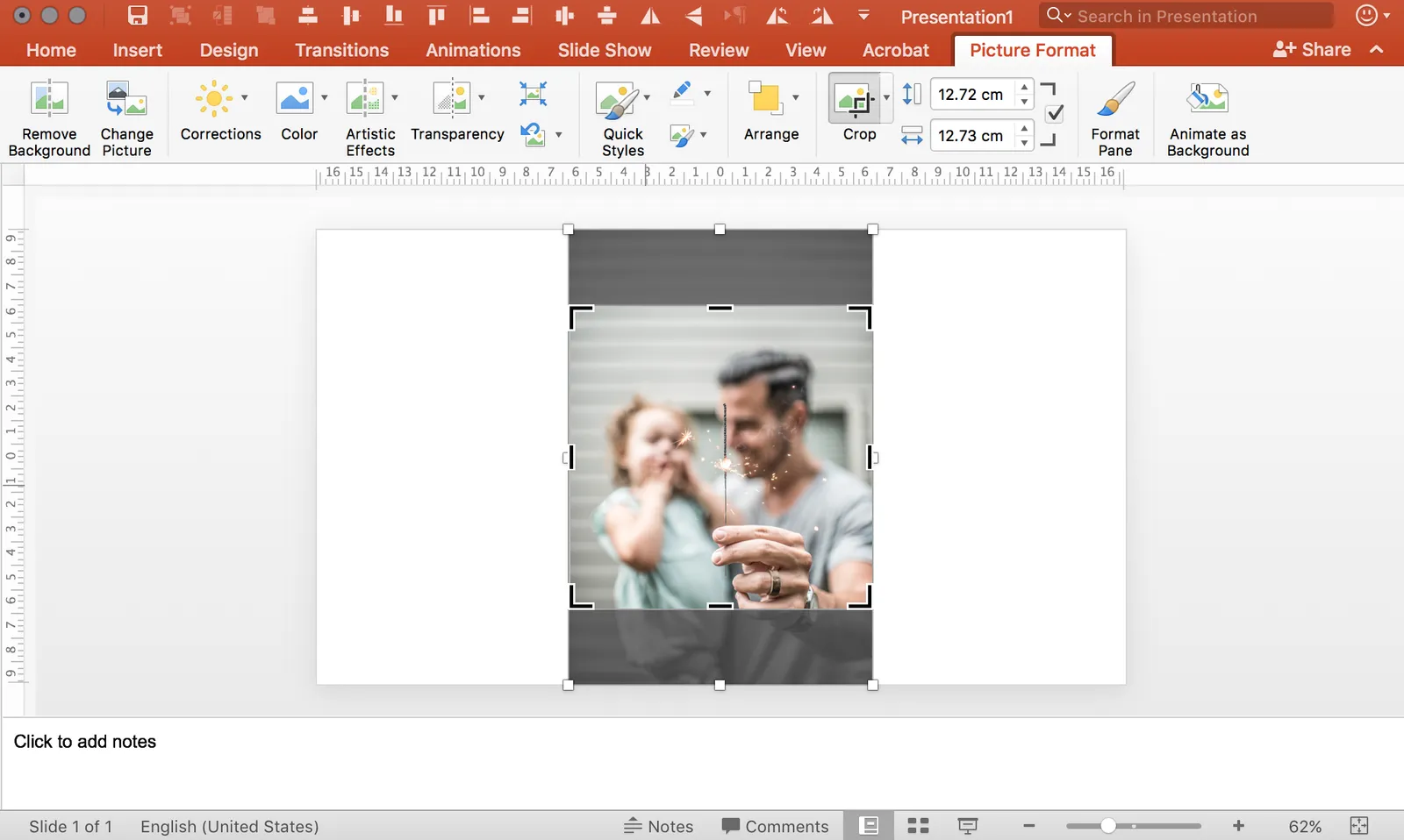
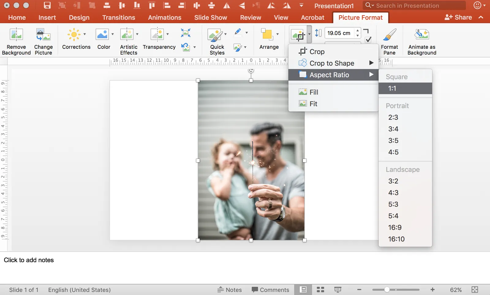
It is tricky in PowerPoint to make a nice grid of images that comes from different sources, in different sizes, and in different aspect ratios. How do you get them all the same size? It can be very tedious to crop them all to the same proportion, and then line them up correctly. There are always one or two that are wrong.

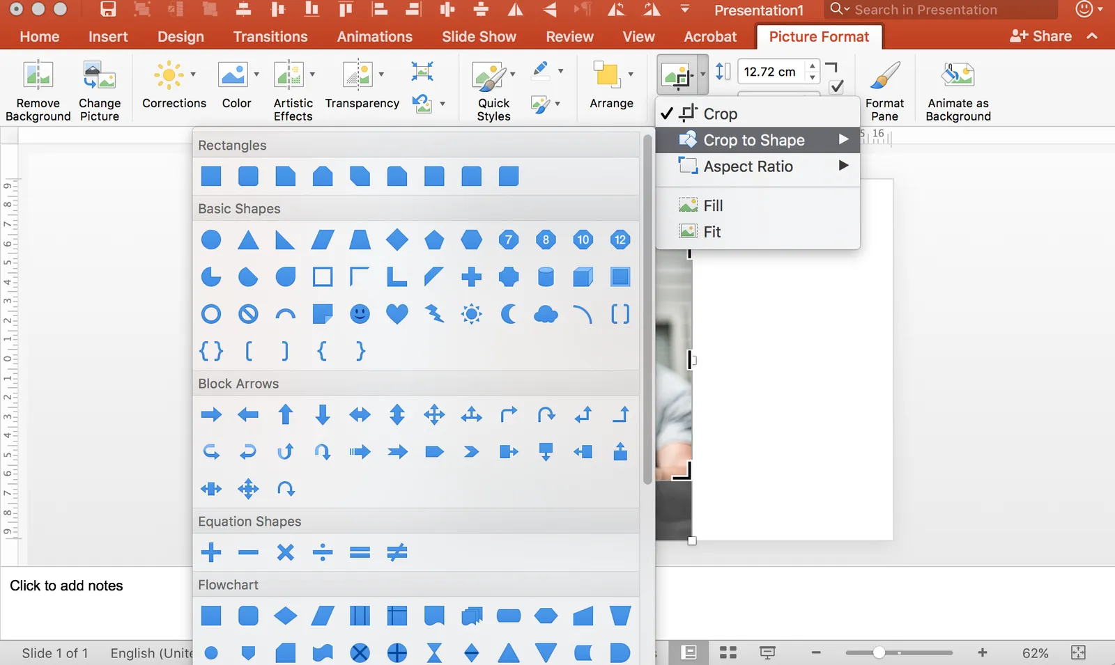
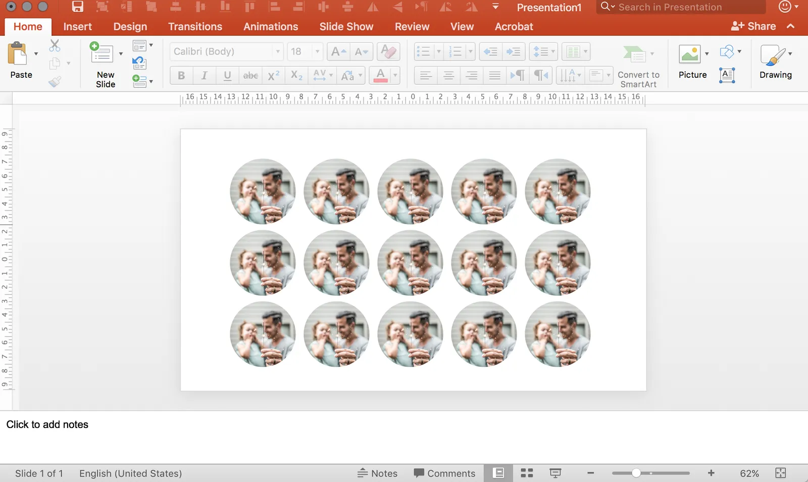
Here is what I do. Crop each image to a certain aspect ratio, don’t worry yet about the exact size. Now select them all and give each the same height, the width will automatically be adjusted as well! Pro-tip, crop to 1:1 and then try cropping to a circle.

In my presentation app SlideMagic, it is impossible not to lay out images in a grid :-)

Copying a look

You see a great layout in a poster, brochure, web site, but you find it impossible to replicate it in PowerPoint. You figured out the font, you copied the color codes, and it still does not look nowhere near the example. How can it be?

There are more variables when it comes to layout than just a type face and color:

  • How are colors used? Take a step back from your example page and try to estimate the % coverage of a page has a certain color. Yes, the accent color could match exactly, but maybe the designer uses it only very sparsely, and in fact the dominant color of the page is grey, not bright yellow.
  • How is white space used? You matched the font, but maybe those bold PowerPoint headlines and text boxes full of text does not fit the loosely spaced, thin text lines that the designer used.
  • What sort of images are in the example? Color or B&W? Busy or calm? People or objects? Stock images or “real” photos?
  • What sort of page element does the designer use? Graphs? Icons? Narrow columns of small body text? Big bold typography?
  • How are accents created? A bullet point? Bold? A different color? Is the main text color actually black, or a lighter grey, or a different color all together?
  • Does the designer use some sort of grid to group items on a page?
  • Where does the headline sit when compared to the other elements on the page. What is the proportion between the headline and the other elements?
Continue reading →
·SlideMagic

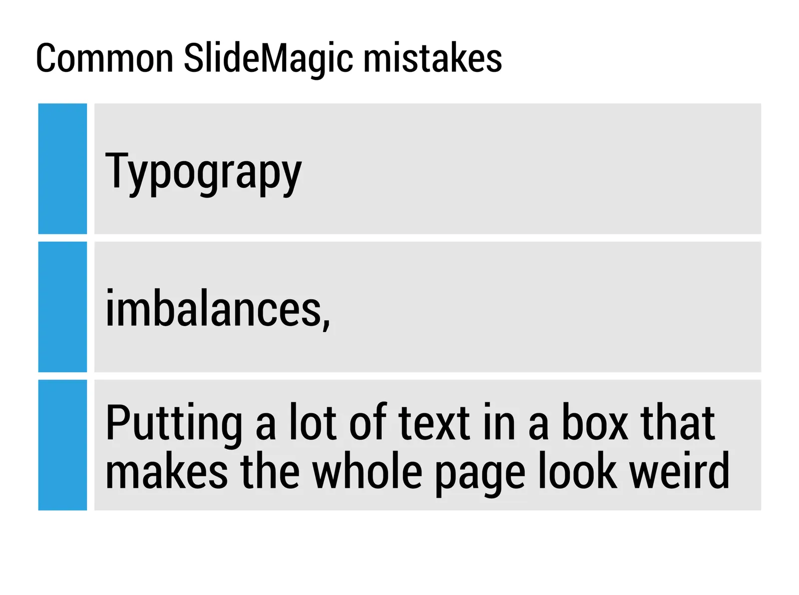
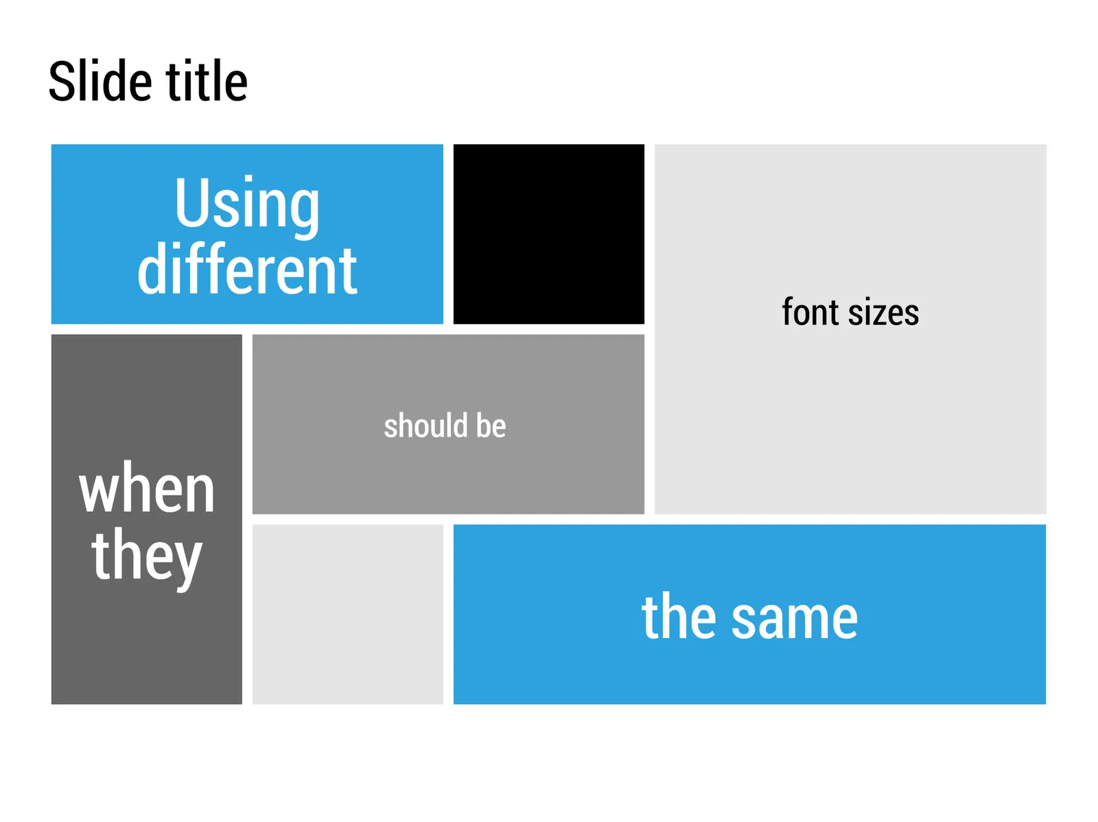
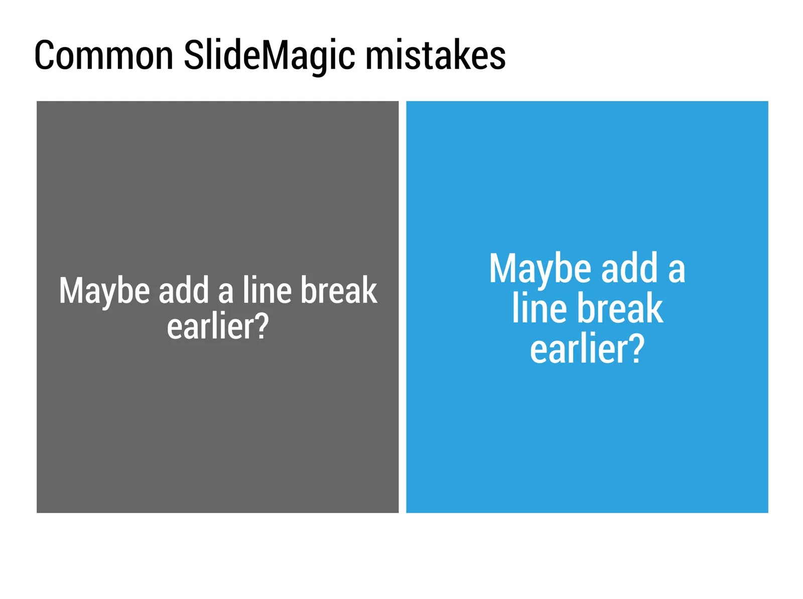
Common SlideMagic mistakes

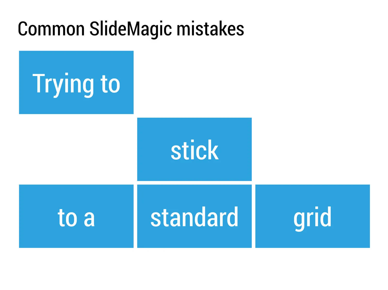
My presentation app SlideMagic will make life easier for every amateur designer. Still a few common mistakes sneak in that are hard to prevent with software. Most of them are related to the balance of typography on a page. Making sure that boxes contain roughly the same amount of text, and that signs are nicely balanced. See the examples below.

·SlideMagic

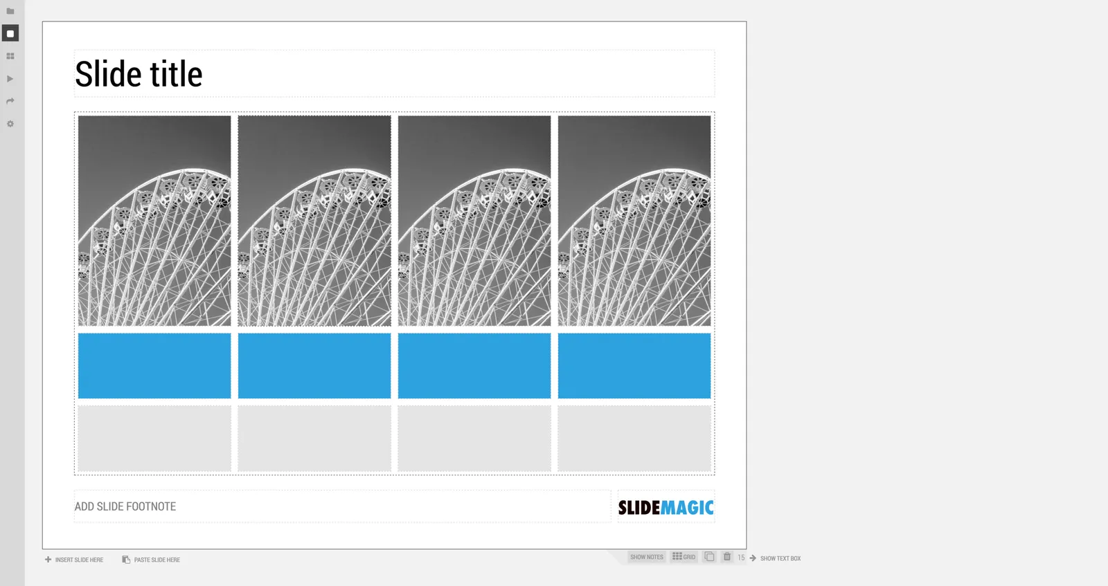
A new SlideMagic user interface

We just deployed a new, more minimalist user interface for presentation app SlideMagic. Have a look!. Some of the things that have changed over the past weeks:

  • Simpler menus: a very short set of tabs on the left side to help you switch between the application modes
  • A more intuitive approach to the slide clipboard where you can import single slides or entire decks
  • Smart insertion of rows and columns in the grid: new rows/columns will now copy color/layout settings from their neighbors

Let me know what you think.

·Culture

All the slide templates you will ever need

With my presentation app SlideMagic I aim to change the communication culture in corporates. People spend too much time preparing slides. They produce documents that are unattractive to look at, and spend far too much time falling asleep in conference rooms.

The solution: splitting the communication tools: Excel and PowerPoint for logging the analysis, and a new tool 100% focused at communicating an idea and getting to a decision. A super simple visual language does not allow you to get lost in crafting complicated slides, or worse - give up all together and just use bullet points on every chart.

In a business presentation you need very few visual concepts:

  • Listing and organizing stuff (yes, the dreaded bullet points)
  • Comparing, contrasting, things
  • Showing growth, trends, forecasting
  • Showcasing things (products, people, clients)
  • Linking one thing to another, impact, cause/effect, from-to

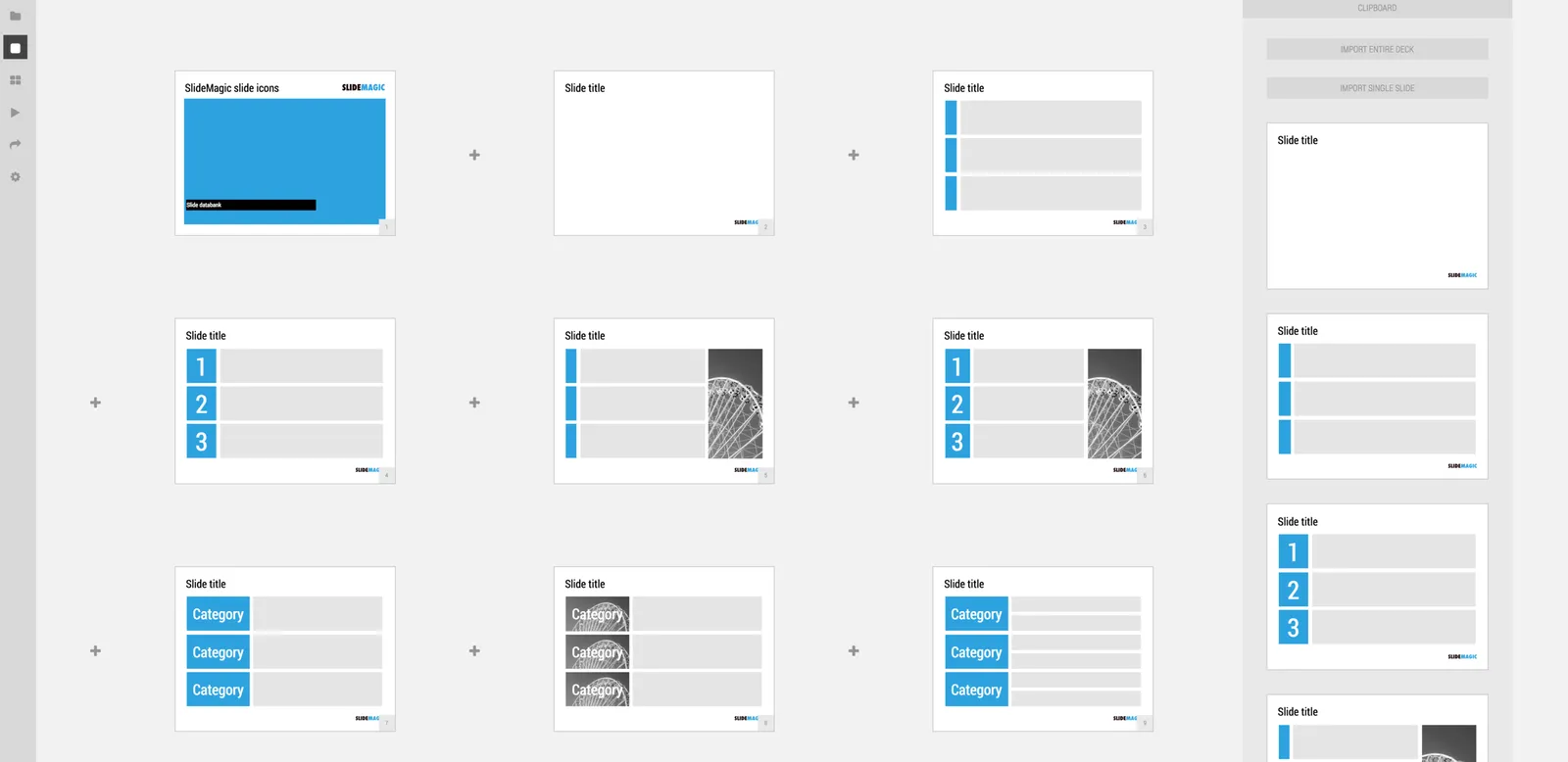
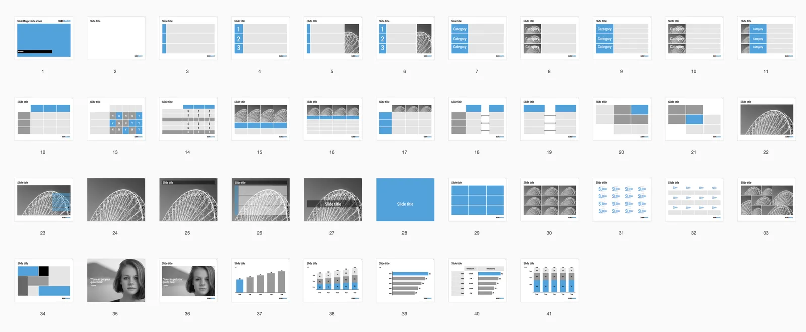
When you hit “insert” in SlideMagic, you get presentation with this list of slide templates. In my opinion they can cover 99% of your business presentation needs. Think about what you want to do (listing, comparing, forecasting, showcasing, linking), pick a template and adjust row/column counts and you are done.

If you want, you clone this entire slide deck in your own SlideMagic account via this link. Let me know which concepts that I have left out you cannot live without. Maybe processes, timelines?

·Advertising

"Messaging"

People ask me whether I take care of the “messaging” of presentations as well. I do, but I do not really connect to the concept. Maybe it is because I come from the world of engineering and consulting, not advertising.

“Messaging” is often used in a marketing context for a consumer audience, not an investor audience. Should we emphasize that this gadget is beautiful, or powerful? In marketing presentation you would say “now in 3 gorgeous colors.” In an investor presentation you would put a competitive analysis that show that the marketing strategy will focus on esthetics.

“Messaging” is often the basis for a design process that revolves around words and sentences. How should we call the benefit exactly. What slogans to use. I tend to think visual, and like to brainstorm concepts visually.

“Messaging” can sometimes come in the form of a prescribed flow of a presentation, we finished the messaging, now “just implement it”. Not my kind of brief.

“Messaging” can also mean sorting out the company/product positioning. This is a big piece of work that usually falls outside the scope of a presentation design project. No story, no presentation.

 Source: http://tpdsaa.tumblr.com/post/3106513440/submitted-by-copyguy

Source: http://tpdsaa.tumblr.com/post/3106513440/submitted-by-copyguy

So do I do messaging? It depends.