SlideMagic Blog

Frequent updates about all things presentations since 2008. Subscribe to never miss a post.

RSS
all posts

Search results for “web design”

·Layout

Knowing your audience

A follow-up on yesterday’s post about convincing the center when it comes to COVID vaccines.

Most people who create presentations are not marketeers or PR professionals. They hear people (including presentation designers like me), talk about how important it is to think about your audience when crafting slides. And when thinking about the audience, they don’t have much sophisticated data. Insights are likely to be basic: “They do not believe that we can get traction with our search engine that needs to beat Google”.

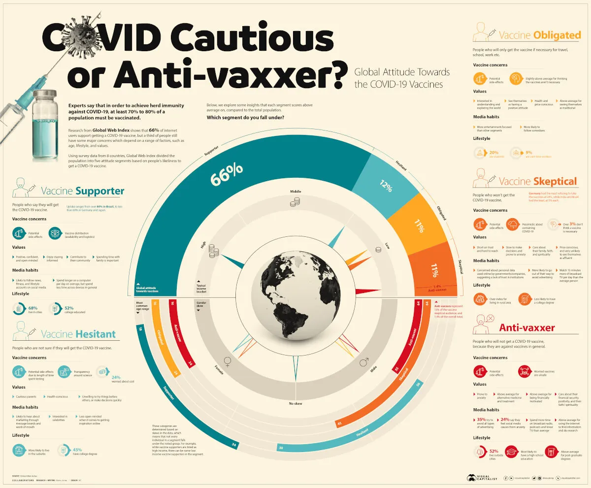
Global Web Index did research in people’s attitudes towards a COVID vaccine, the results of the findings are put in this visualisation by Visual Capitalist. The main message to me about this pretty but busy graphic is that it is complex, things are not clear cut.

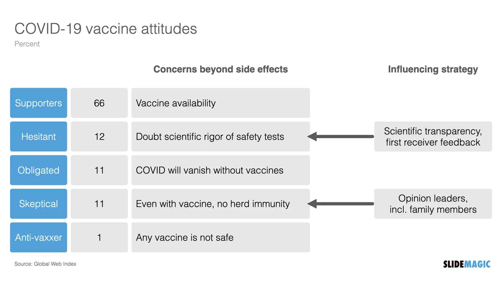
Here is my summary of the segments, and a possible communication strategy. (You can find this slide in the online template bank, or search for ‘covid’ in the SlideMagic desktop app)

Most business presentations will not have the luxury of a detailed audience analysis, but it is an interesting thought process of running through an imaginary one.

·SlideMagic

Updates to the SlideMagic PowerPoint Add-in (alpha)

UPDATE: THE MICROSOFT OFFICE PLUGIN HAS BEEN DISCONTINUED (30 JUNE 2026)

Microsoft made some updates to its Office API (and SlideMagic made some changes to its server), and as a result, the SlideMagic PowerPoint add-in starts working a lot better.

The SlideMagic PowerPoint add-in is especially useful for users who download PowerPoint templates from the SlideMagic web site. Most of you are people who were subscribers to the legacy template store (RIP). Since PowerPoint conversions are a pro feature of SlideMagic, the add-in is only useful for pro subscribers.

What has changed?

  • The add-in now remembers your login details across PowerPoint files No need to constantly log in (again).
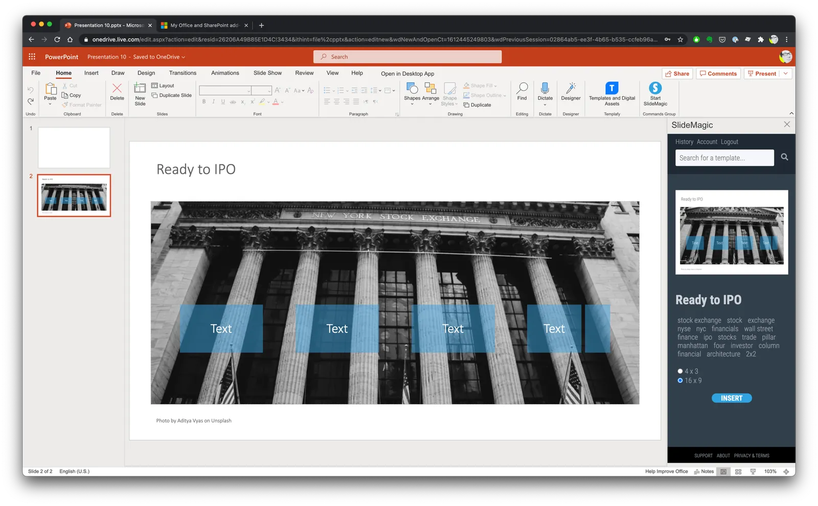
  • More importantly (thank you Microsoft), the SlideMagic add-in now adds slides straight into your existing PowerPoint presentation

The add-in is still an alpha phase, and things are tested for the moment in the online PowerPoint environment. I will submit it for another go for Microsoft approval to get it working with PowerPoint desktop versions as well.

Here is how to install the add-in:

  1. Download the file slidemagic.xml from this link
  2. Log in to your online Microsoft 365 account, click PowerPoint, and open a new presentation
  3. Select “insert”, then “add-ins”
  4. Select “my add-ins”, then “upload my add -in” in the top of the window (it is not available in the Microsoft store yet)
  5. Select the slidemagic.xml file you just download and upload it
  6. Go back to the '“home” ribbon

The add-in is installed. To use it:

Continue reading →
·SlideMagic

New 'no-title' layout

SlideMagic works with fixed positions for slide titles, subtitles, footnotes, and logos. Each slide looks organised, consistent, and the same.

Some slides call out for a slightly differently layout. Tracker pages for example. A simple text box that sites right in the middle of the screen. Up until now, SlideMagic would push these text boxes a bit down or to the right because of the required space for the slide title.

With a very simple check mark, I now created the option to remove titles from the slide on a slide-by-slide basis. It is a tiny adjustment to the user interface that can improve the look of layouts significantly. I am still putting a high hurdle when it comes to complicating SlideMagic. This is definitely not a complication!

While the user interface adjustment is easy, behind the scenes, there is a lot going on. Removing the the titles from a slide requires recropping of all the images on a slide. With SlideMagic’s new automatic cropping algorithm, this has now become possible. Imagine doing this for a slide with 40 client logos in a regular presentation design software, after which you come to the conclusion that the slide looked better with a title: re-cutting, re-cropping, re-distributing 40 images again. In SlideMagic, this is a button click.

You can check out the new features as of version 2.6.9

Photo by Boris Smokrovic on Unsplash

·Layout

It is all about box counting

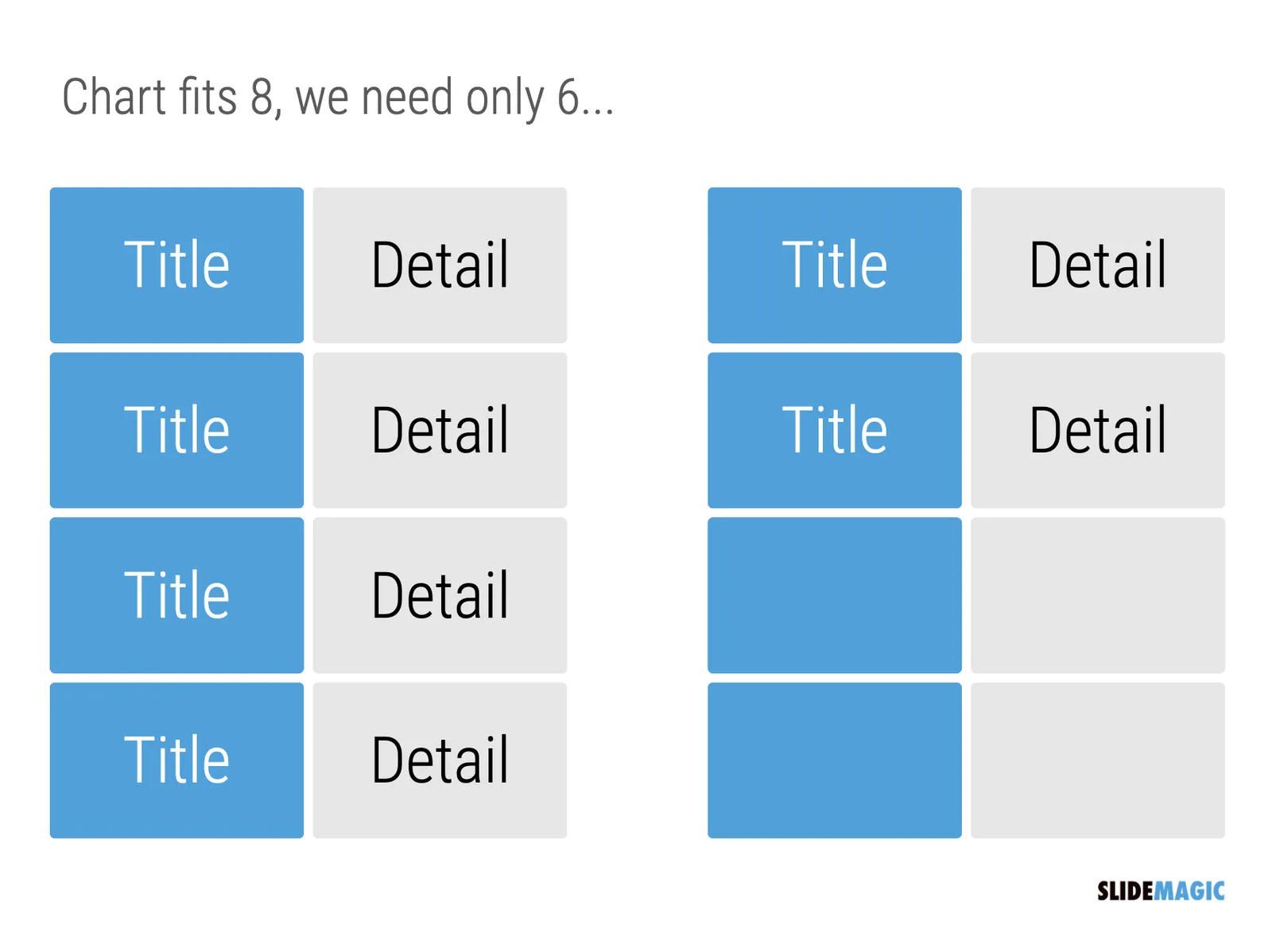
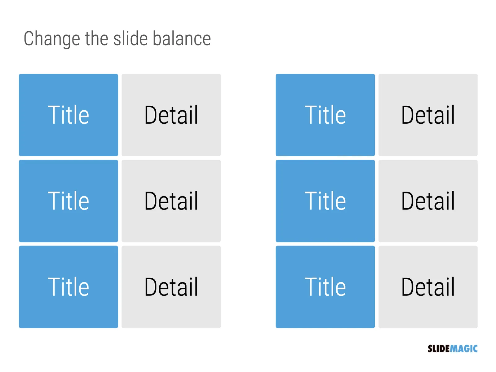
One of the biggest issues in business presentation design is adjusting frameworks to the amount of boxes you need. You had this great slide that fats 8 things, but thing number 5 and number 6 is no longer relevant, so now you need to rehash the whole slide layout…

I think this “bug” in the design process might be one of the biggest reasons for the popularity of bullet point lists: it is super easy to add and subtract things on your slide. And this is also the reason why pre-fab PowerPoint templates are so hard to use. The designer made that super pretty 8-box slide with sophisticated shapes, and 5 minutes before your meeting, you need to get rid of one without destroying the design of the slide…

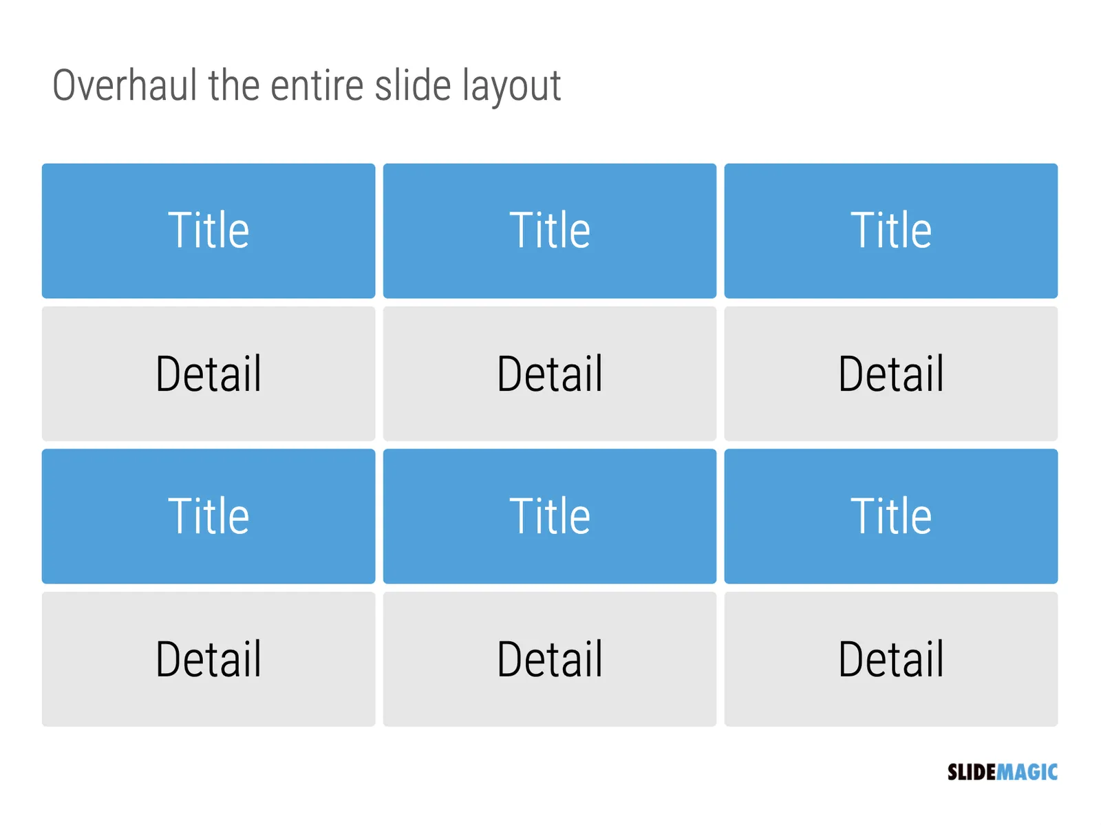
In SlideMagic things are super easy. Option one: it is easy to adjust the grid layout to match your new box count. Or even better: a new box count might merit an entirely new slide layout. In the latter case, you will have to copy-paste your boxes, but at least SlideMagic takes care of the fiddly task fo lining things up.

Here is a pro tip: box counting is the first thing I do when staring a new slide. How many items, how do they spread across horizontal and vertical dimensions? Can we consolidate points? Should we break them up across multiple slides? Once you have your count, it is easy to find a matching design.

·Layout

How to crop headshots in your presentation

The ideal design for a slide that shows your team is a group picture, all taken together. Unfortunately, these are almost impossible to produce. Teams change, and people are hardly ever in the same room (especially now with the virus).

The next best thing is a collage of headshots. Professional graphics designers have a specific approach to line these up properly:

  • Make sure that the eye line of all the head shots is more or less the same (at 25-33% of the image height
  • Make sure that the sizes of the heads are more or less the same

In PowerPoint and Keynote, this is an absolute pain to do. Getting different images to have the exact same size is tricky. Cropping images to position eye ines is tricky to do, and might undo part of the work that you did to get them to be all the same size.

In SlideMagic, things are easier, because it works with fixed shapes and smart cropping.

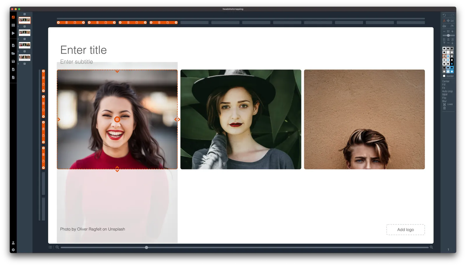
Below I plopped in 3 portrait images from the built-in image search engine of SlideMagic. In 2 of the 3 cases, the “AI” smart cropping algorithm did already a reasonable job, in the last case, totally not. But first things first, all images have the exact same size, and are spaced out absolutely perfect.

Next, we are going to drag the central dot at eye level for each of our team members and drag the images inside their boxes so the eye lines line up.

Continue reading →
·Layout

Seth Godin chart make-over: Venn vs. 2x2

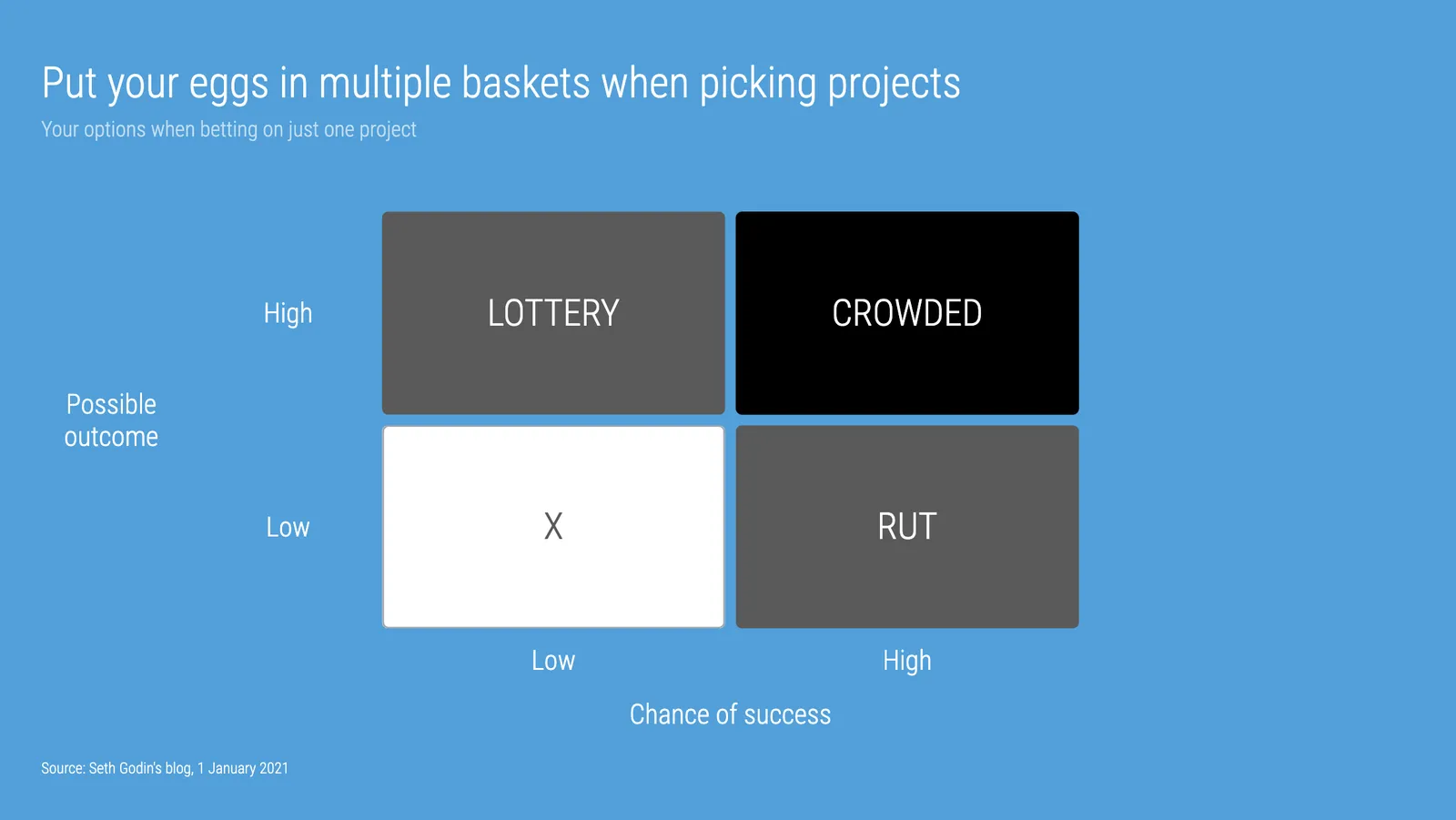
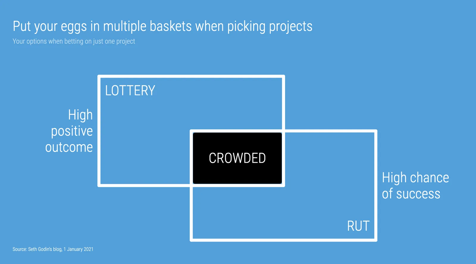
Seth Godin opened the 2021 blog with a post that argues not to put all your eggs in one basket when it comes to picking projects. (You could argue that my own bespoke presentation design projects fit in the “rut” category, and the SlideMagic software is a “lottery”, but on balance the risk of the overall portfolio is small with an option to win the lottery, even if it is modest).

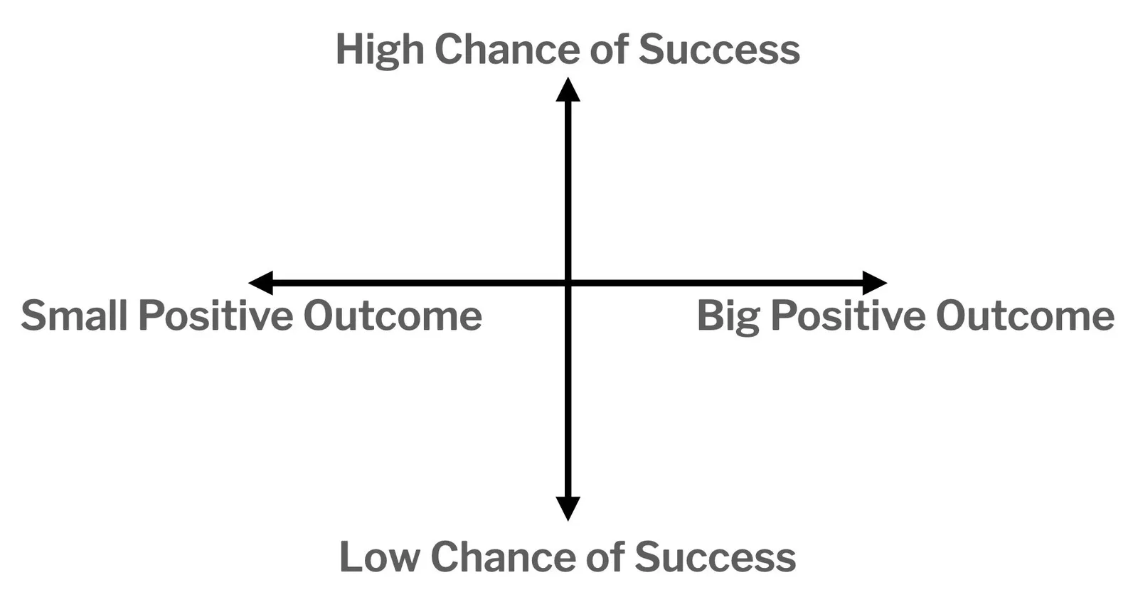
To illustrate his point, he used a 2x2 matrix.

The 2x2 works, but when looking for these type of charts consider a Venn diagram as well. In many cases, the low-low option is not really realistic (in this case picking projects with a low probability of succeeding, and with a low potential upside).

I added 2 charts to the SlideMagic database to show the 2 options, in a different colour scheme this time. Download them from the web or search for “seth” inside the desktop app to access them.

Saving time when making slides

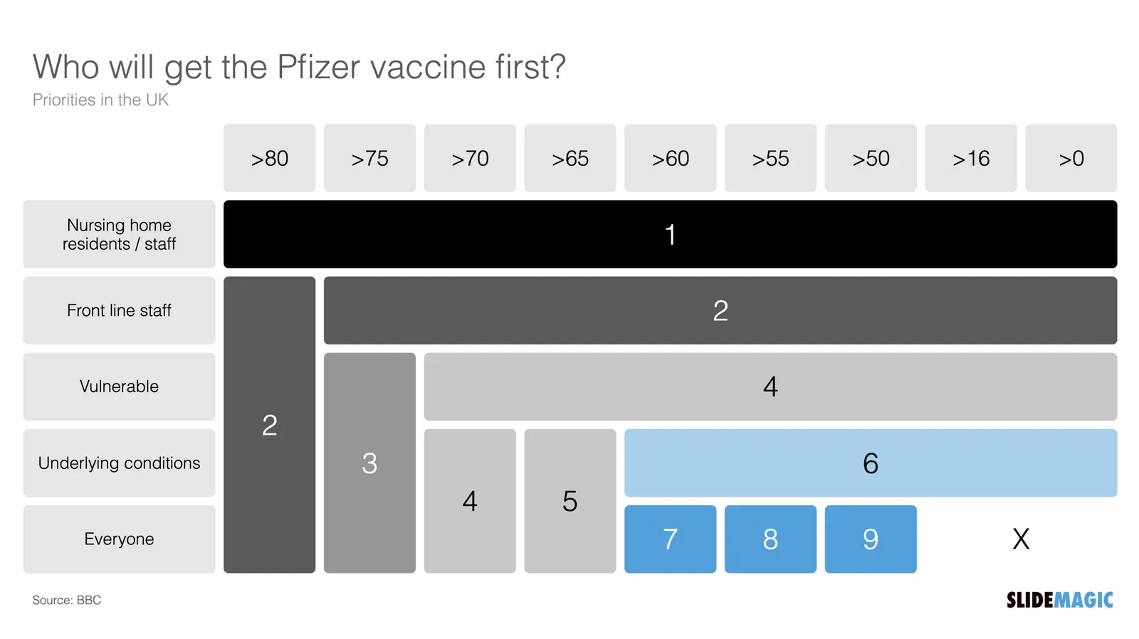
Yesterday’s slide about the UK’s vaccine priorities is a good example of the SlideMagic philosophy to creating presentations: making something that looks decent, very quickly, so you can get on with more important things than making slide decks. SlideMagic is for every-day-presentations.

What is done right:

  • You get the message instantly
  • The design is preserved in whatever screen or aspect ratio you choose
  • It is super easy to add/remove columns from the design without creating mayhem in your layout
  • Fonts and colors are sorted and fit instantly with the corporate branding

What the pro designer would have done differently for a big keynote address:

  • No duplication of shape labels
  • Line up the shape labels 1-2-4-6-X in a straight diagonal line
  • Nice L-shaped boxes by either creating a custom shape, using different padding margins across the slide, or using a clever stacked overlay of rectangles
  • Label the columns between the breakpoints, rather than “>70” labels

Adding each of these finishing touches would have added a lot of time, and make it a lot harder to apply changes to the slide (“oops, we have a 45+ category now as well, please fix it, I am on in 5 minutes”).

Maybe I find ways to solve some of the compromises above in the future in a different way, but in the mean don’t be embarrassed by this result and get on with the work that is really important. Spending slides is no longer an excuse for procrastination.

Continue reading →
·Layout

Focal point cropping!

********* UPDATE: The new focal cropping is now out of beta and part of the regular SlideMagic release **********

Happy new year to you all, 2021 has already an important feature update.

I am testing an exciting new feature for SlideMagic: focal point cropping. (I first spoke about this back in August.) For each image in SlideMagic, you can set a focal point, a dot on the most important part of the photo. This can be a face, a feature of your product, a quote on a screen shot for example. If you subsequently change the size or shape or zoom level of the image, SlideMagic will re-crop the image so that your focal point appears in the right spot.

I have seen many examples of focal crops in other applications, but no one did get it completely right. That small house on the mountain you focused still disappears on certain screen sizes, or pictures get completely stretched and distorted when resizing screens or changing the composition of your slide. In SlideMagic, everything stays in place.

A particular design decision in web technology standards made it particularly hard to do (without having to divide by zero). Over the winter break, I rewrote the entire image rendering engine of SlideMagic, which was a bit like replacing the foundations of a house while people continue to live in it.

A lot is going on here, in terms of underlying math and how the user interface works. I won’t spell it out in detail here, the app should respond naturally without you having to think about it. The basics are in place now, but I still see a lot of improvement opportunities to the image cropping algorithm including automatic object detection.


Continue reading →
·Data visualization

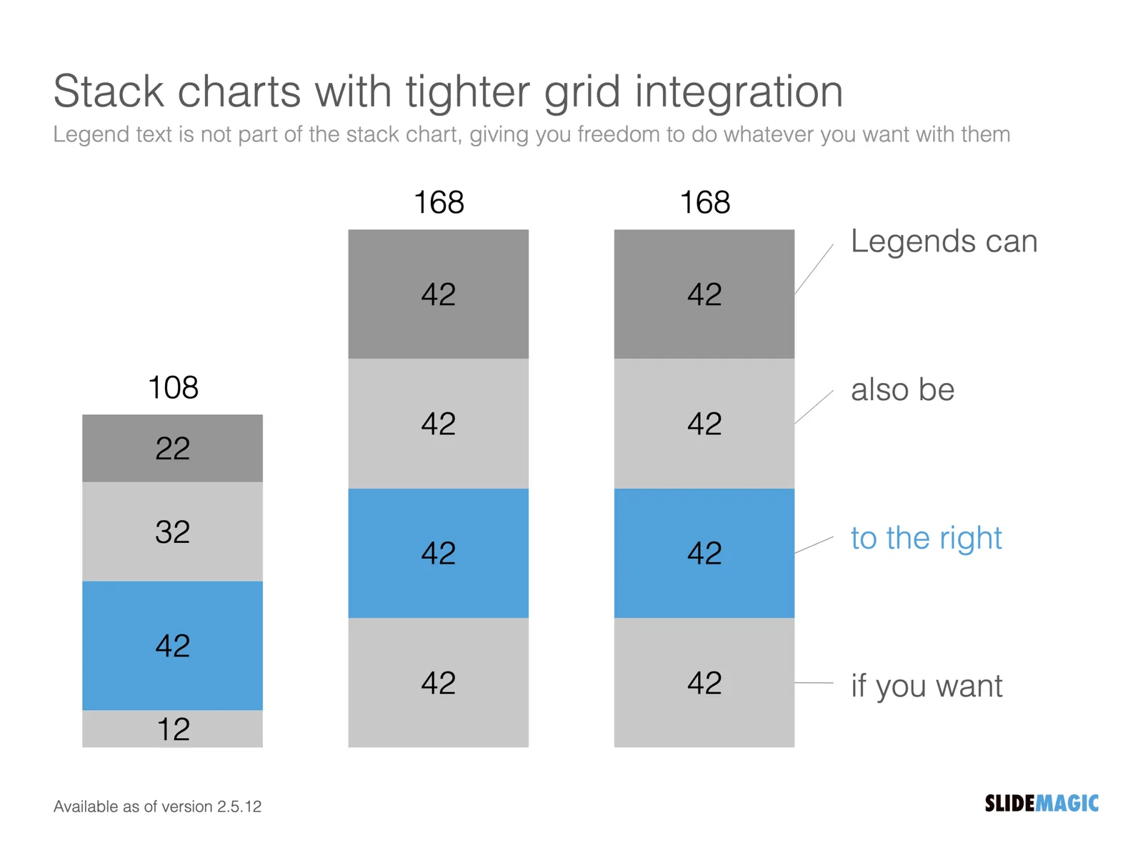
Stack charts with tighter grid integration

Stack charts are very useful. So useful in fact, that SlideMagic does not support pie charts (by design).

They are very easy to make in Excel, but using them straight in a presentation is tricky. First there is the overall formatting of the chart, then there is the legend which is never connected to the chart itself, and does not leave enough space for text other than ‘new’, ‘old’.

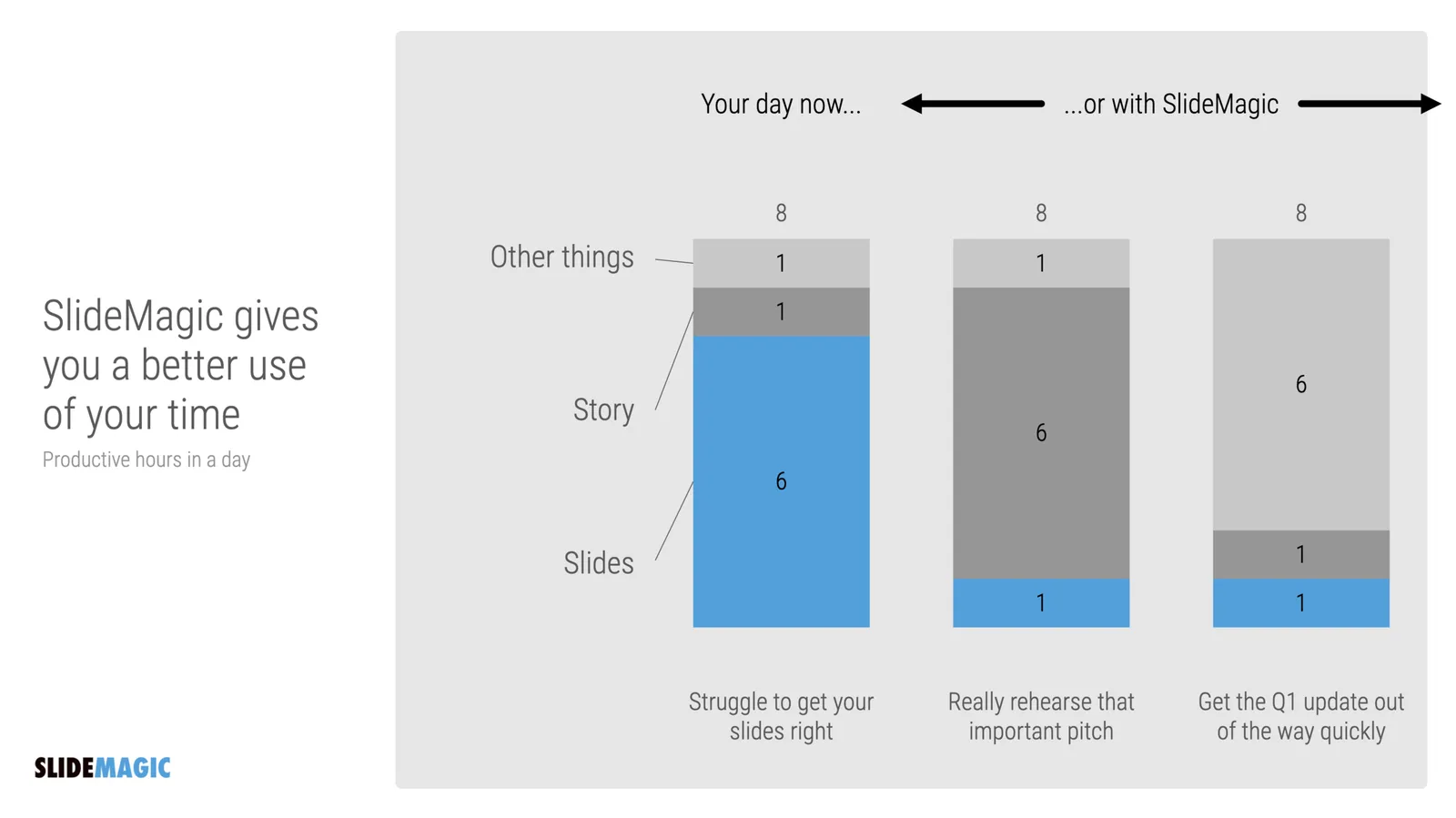
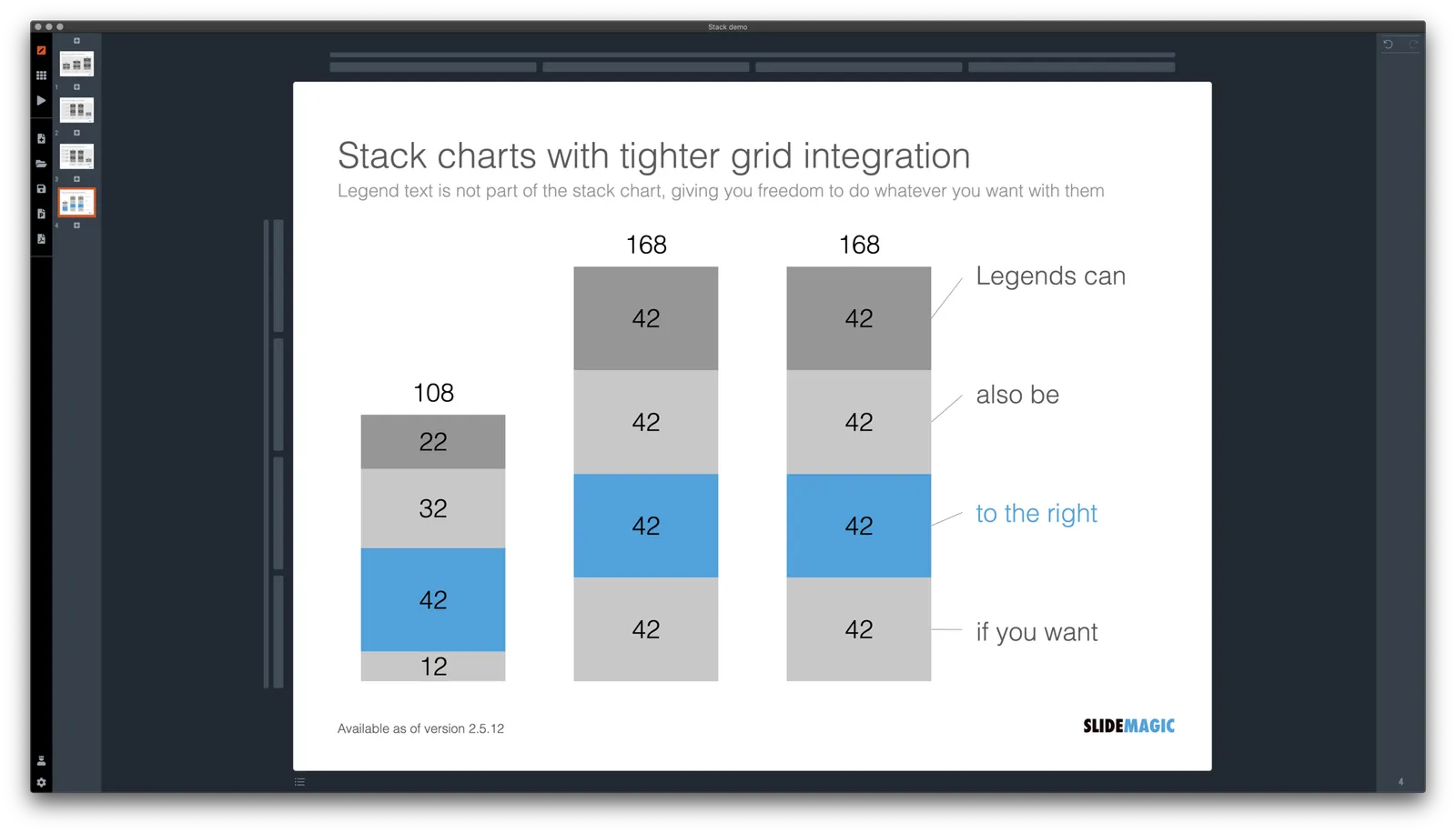
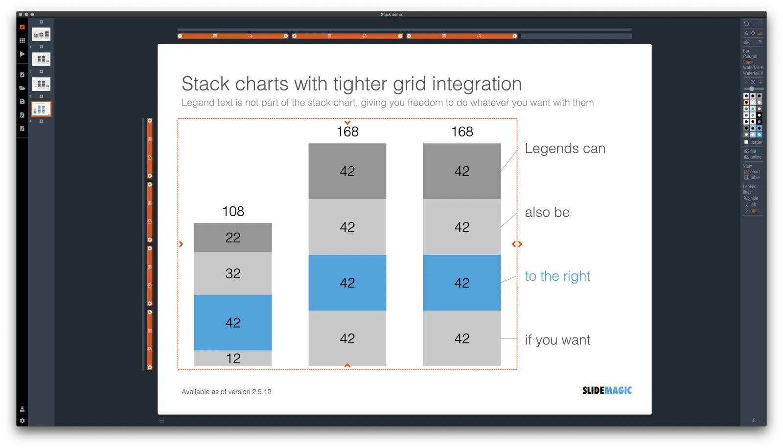
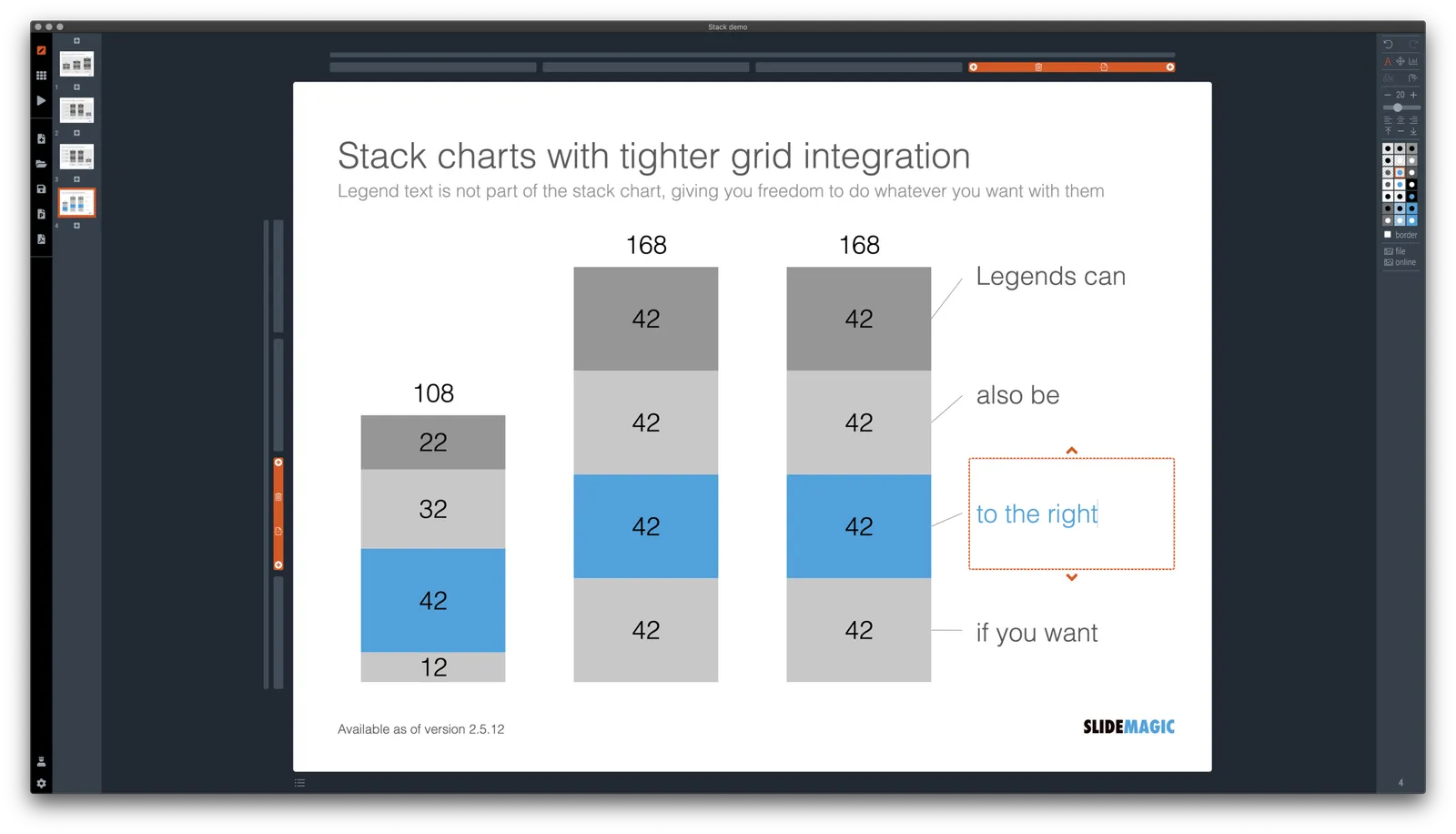
I just overhauled the stack chart in SlideMagic and forced to be tightly integrated with the slide grid. Adding/deleting rows to your slide will add/delete data series to your stack chart. Furthermore I have actually removed the legend from the stack chart shape itself, what is left is only the option to add lines that point to boxes outside the chart. This gives you total freedom to do whatever you want with the chart legend, small, big, or even huge text boxes. Everything lines up, you can even fit stack charts in tables if you want.

The charts below give you a sense of what the new engine does:

The old stack charts will continue to work in SlideMagic for the moment. If your charts have them, you can edit them. If you want to make new ones, click + and you can still make them. An old stack chart can instantly be converted into a new one by selecting it and clicking the icon.

Stack charts in the template database are still in the old format, I will convert them over the coming weeks to the new format.

Continue reading →
·Layout

Use the whole page

White space is a good thing in design. It makes text breathe, the whole page looks calmer somehow.

This applies to business presentations as well. Cut text that is not required, make images as big as possible, and your slide starts to look like a well-designed ad on a billboard.

However, in some cases, a business presentation slide is not meant to be a fashion ad. Think of the sales target data for the next quarter, or the new IT system architecture that you need to get approved. What I often see in SlideMagic is a “left over battlefield” with the final product of a complex table or system diagram. After many iterations it finally looks like it should look and everyone agrees to it.

In the process, the designer forgot to clean up, and remove rows and columns that are no longer needed. In SlideMagic, you can get rid of them with a few clicks and your entire diagram or table will scale up instantly, in the right proportions.

Yes, you gave up some white space around the edges, but overall the chart is more practical. To make things calmer, consider cleaning up data and text in the cells of your diagram instead.