SlideMagic Blog

Frequent updates about all things presentations since 2008. Subscribe to never miss a post.

RSS
all posts

Search results for “web design”

·Design

Squeezing more text inside a PowerPoint shape

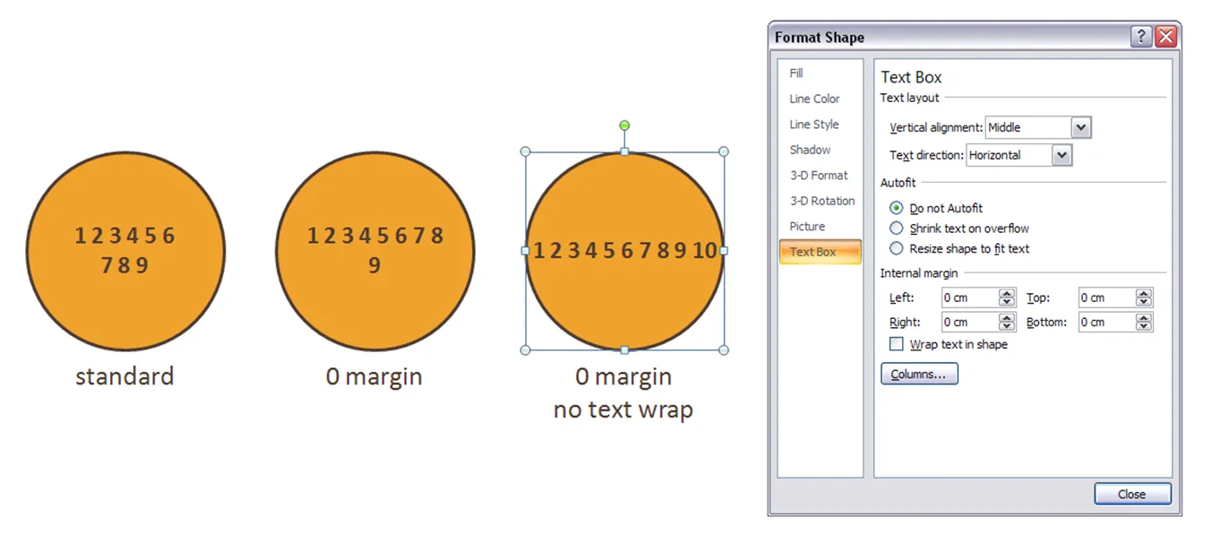
Circles are beautiful shapes to work with. Unfortunately, PowerPoint’s standard settings make it hard to fit in text. To get a bit more space, got to “format shape”->“text box”:

  • Set the internal margin to zero
  • Switch off automatic word wrap

·Design

Symmetrical shapes - hold shift while drawing

Symmetry should be avoided in slide layout. Symmetry in shapes on the other hand is beautiful. Hold-down shift while drawing to create a shape with equal hight and width, and in the “size ribbon” click the box to lock the aspect ratio.

·Design

Images with emotion - Flickr versus stock image sites

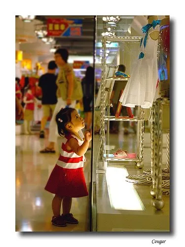
Stock images can be cheesy, staged, unnatural, cliche, especially when it comes to getting a shot of “real” people with real emotions. Try Flickr or other image sharing services as an alternative to stock image sites.

Here is a great, spontaneous and real image that caught my eye today. Look at the emotion in the girl’s eyes, great light coming from below.

Original (in larger size) here on Flickr, picture taken by Studio Cougar. Always check copy right and license restrictions before using Flickr images in your presentations.

·Advertising

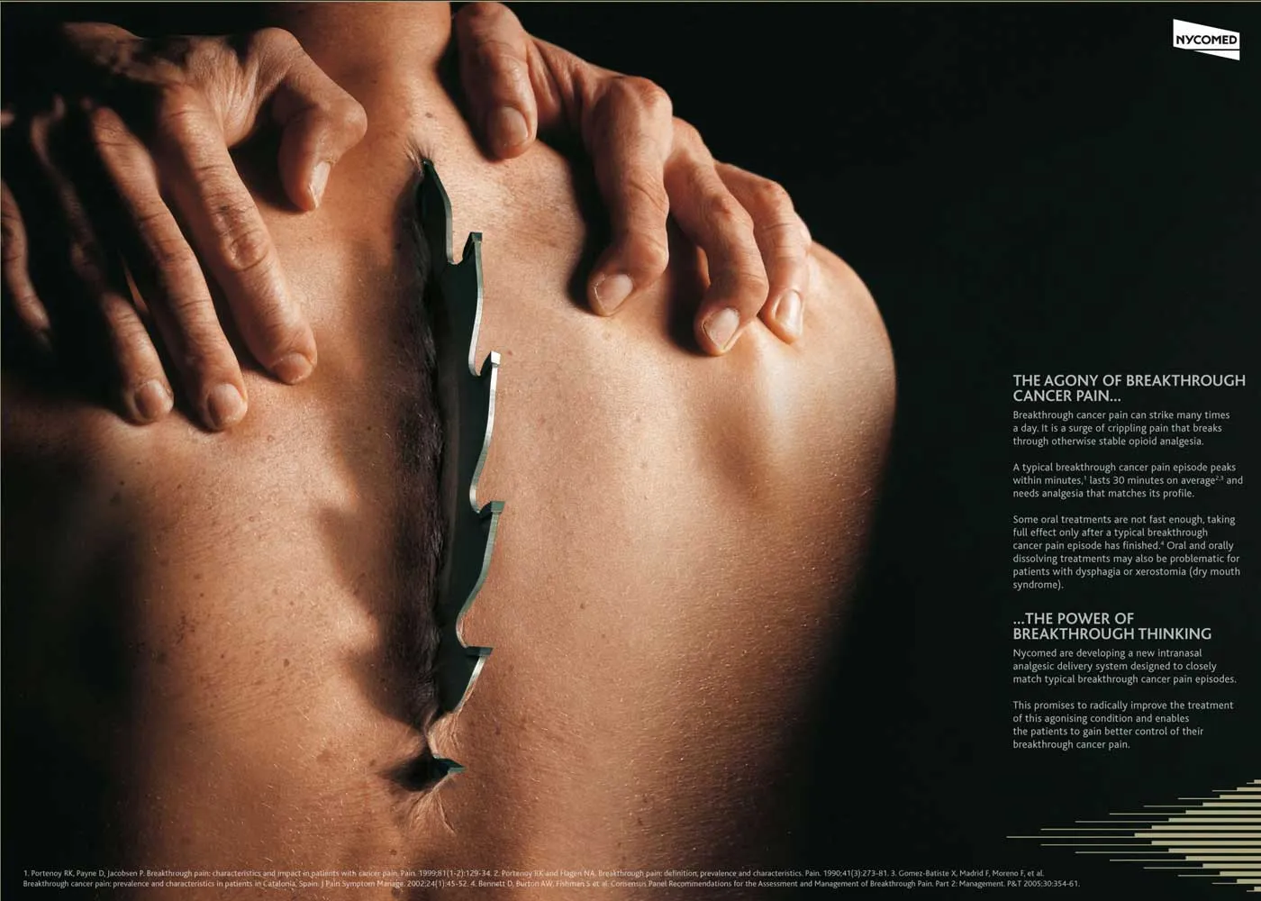
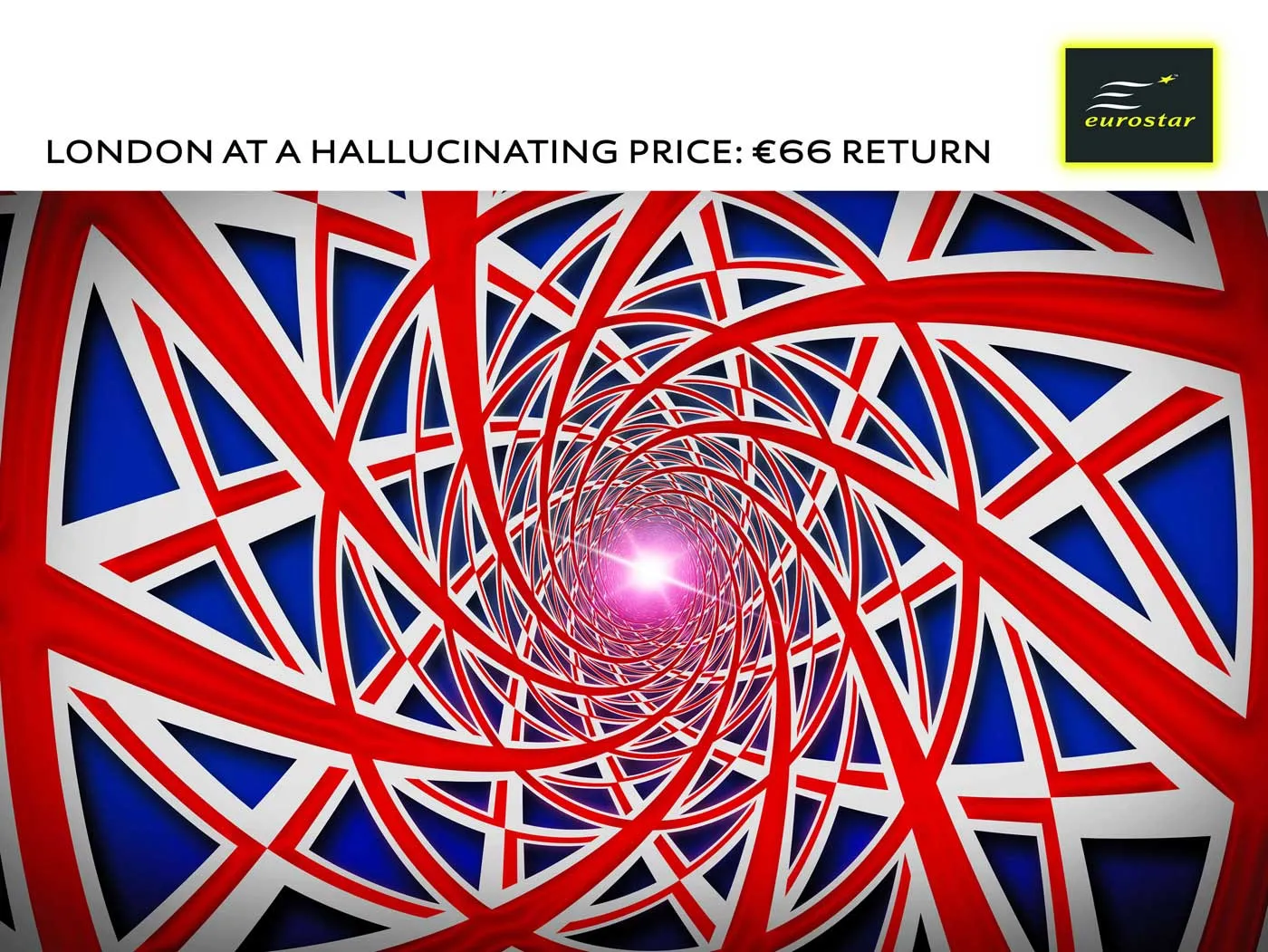
Too much - "painful graphics"

Before I argued that slightly irritating the audience’s senses could support your presentation. Two cases of overdoing it:

More details about these ads on Ads of the World: Nycomed and Eurostar. I recommend adding this blog to your RSS reader.

·Design

One more quick post: Kawasaki on Santa's perfect VC pitch

An example of a “perfect pitch” by Santa according to Guy Kawasaki. An overview (of more serious) web resources about writing pitch presentations to Venture Capital firms can be found here.

·Design

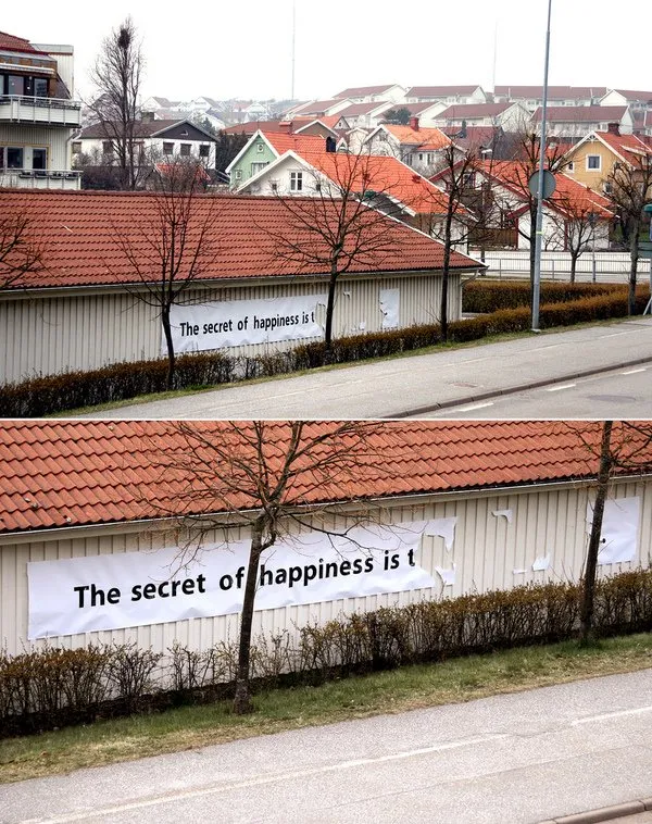
Street art - "the secret of happiness is..."

I stumbled on an interesting street art project (more about creator "Elay"and more images here).

  • In the spirit of the season: happy holidays to everyone, and hopefully you have found the secret already or will find the secret soon.
  • The image is an example of how leaving stuff out (of a PowerPoint presentation) can stimulate your audience to fill in the details themselves. Like (good) authors of novels, film directors, etc. try to do.
·Design

Graffiti and crossing things out with a red paint brush in PowerPoint

Crossing things out in an immaculate PowerPoint slide with a rough, red paint brush can make a point strongly: “with our technology you can skip buying that new server”

I use a simple PowerPoint 2007 “glow” to get a graffiti-style effect. In the image below, I selected the “Boopee” font (standard in PowerPoint 2007) to which I applied a red glow and a gradient text fill (bright red, with a darker red). The background image was purchased on iStockPhoto. Let me know in the comments if you need more detailed instructions.

The French are just so good in inventing words: “taggeur” for graffiti artist (or vandal). Brilliant.

Be sure to avoid setting yourself up for disaster when using non-standard fonts in a PowerPoint presentation.

·Design

Bleeding edges - you can use them both for images and text

A “bleed”, or “bleeding edge” is a page with a graphic extending over the edge of the page. I like to use them a lot in PowerPoint presentations.

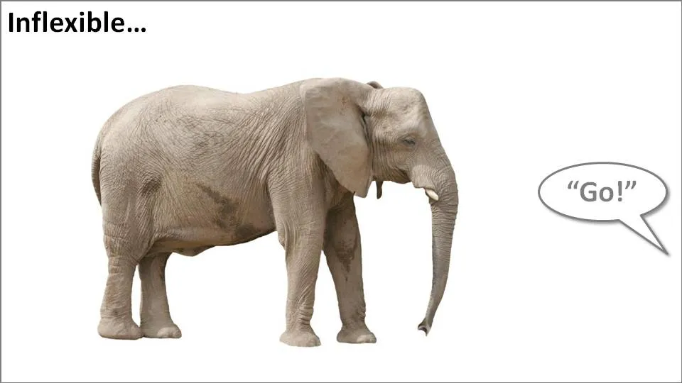
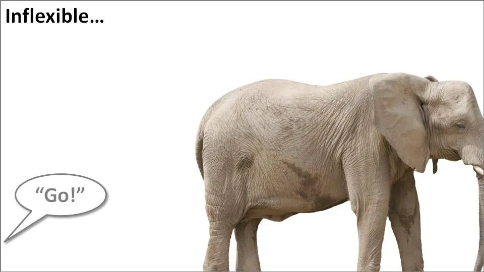
Take the following example. When the elephant is positioned in the middle of the slide, the composition is not really interesting. Have him walk off the page and insert a bit more white space makes it a lot more interesting (our friend just stands there, ignoring all things around him).
Pushing things a bit further, you can use the same technique for words/typography as well. The brain does not always need clean typography to be able to read. You probably remember this text (I do not know who wrote it, or whether the research actually happened):

i cdnuolt blveiee taht I cluod aulaclty uesdnatnrd waht I was rdanieg. The phaonmneal pweor of the hmuan mnid, aoccdrnig to a rscheearch at Cmabrigde Uinervtisy, it dseno’t mtaetr in waht oerdr the ltteres in a wrod are, the olny iproamtnt tihng is taht the frsit and lsat ltteer be in the rghit pclae. The rset can be a taotl mses and you can sitll raed it whotuit a pboerlm. Tihs is bcuseae the huamn mnid deos not raed ervey lteter by istlef, but the wrod as a wlohe. Azanmig huh? yaeh and I awlyas tghuhot slpeling was ipmorantt!

An example of letting words “bleed” off the page (I used to highlight problems with current solutions in the market for a client in the technology sector):


Continue reading →
·3D

More 3D: positioning text with a reflection in PowerPoint

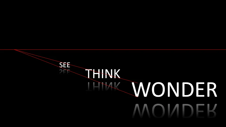
On today’s SlideShare front page is a nice presentation by Martin Pure:

Marketers See Think Wonder

Following on yesterday’s post on 3D objects, you can see that “something is wrong” with the alignment of the objects. The use of a reflection (a “Web 2.0” effect that I only use very rarely) implies a 3D setting.

You can apply the same guide lines thought to correct things. In addition, you can change the size of the font to emphasize the feel of a 3D environment.

My comments were all about positioning of text. Do not misunderstand me, I like this presentation.

·Design

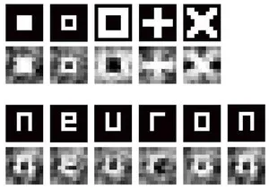
Presentation shortcut: "scientists extract images directly from brain"

Presentations are all about brain-to-brain transfer:

  1. Idea in presenter’s brain
  2. Idea transferred in presentation
  3. Idea in audience brain (hopefully)

Japanese scientists are working on the shortcut: extracting images directly from someone’s brain(!).

There are some ambitious objectives for future research:

  • Read someone’s dreams
  • Read someone’s thoughts
  • And: “read [someone’s] feelings and complicated emotional states”

Until now, it has been very difficult to transfer feelings and complicated emotional states in a PowerPoint presentation. You had to resort to writing a novel for that…

Via Pink Tentacle