SlideMagic Blog

Frequent updates about all things presentations since 2008. Subscribe to never miss a post.

RSS
all posts

Search results for “web design”

How to make your slides look elegant and "designy"

I came across this question on Quora: how to make your slides look elegant and “designy”?

I don’t really like the word “designy” but I understand what people mean by it. My answer to this question: copy something you like. Almost everybody can see good design when they see it, very few can create good design from a blank sheet of paper.

And, most people are very poor at copying. They want to make the slide look like the one from Steve Jobs or that 1960s Swiss graphics designer, and while the example is pretty simple (gradient black background with a certain font), they deviate from it. It is like telling a young kid to draw a house in 3D perspective, they don’t copy what they say (3D space perception is not really developed yet), but rather draw what they think they see. My advice, copy every design aspect: fonts, colours, white space, slide margins, the whole composition.

But in PowerPoint or business presentations in general, there is an extra problem: there are a number of different types of slides that are suited to different types of design. Sometimes you can use a big image, but sometimes you need a more traditional data slide, or yes, a list of 3 bullet points… And, consistency is very important in a well designed presentation. The slides all are visually related.

My solution to this problem: the framed slide. Even most of my image slides are framed in a white border. Some designers might think it is not very professional, but I find that it looks very good, and is very practical to cover a wide range of slides. When I can, I will drop in the occasional full-page image, or alternatively, I can play with the frame and have things “pop out” of it.

Continue reading →
·Layout

Slideuments and graphics designers

Many designers with excellent skills in web and/or print design somehow cannot deploy their talent very well in PowerPoint/business presentations. I have been thinking hard about why this could be.

The key challenge I think is the tight relationship with content and design. In print/web the design of a page does not really change that much if the content changes (it is still a block of text, an image, and an icon that fit in the same overall grid). In a business presentation, everything goes upside down when your competitor analysis needs to include 3 instead of 2 dimensions.

The second reason is - I think - that both people who write presentations and designers who polish them, stick to the conventional slide format: title across the top, list of bullets.

Now here is an interesting experiment for a 100% graphics designer who is not allowed or does not have the knowledge to touch any of the content (the classical print graphics designer situation). Assuming the presentation is a slideument (meant for reading rather than presenting).

Hand over the material in a word processor, as a long text file rather than a partly finished PowerPoint presentation. Now give the designer total freedom to present this material in any form she wants, even in any software she wants, using any page layout she wants.

Changes are you might get a pretty good lucking slideument by taking “PowerPoint” and its familiar layout out of the equation.

Image via WikiPedia

Design in Tech Report 2017

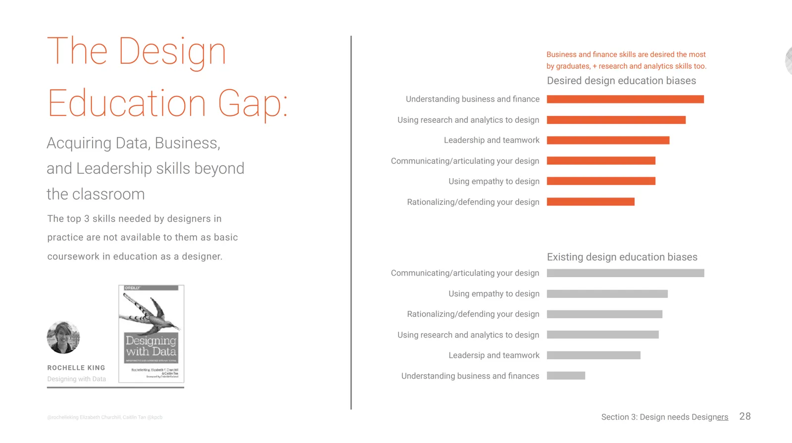
I participated in the survey for the 2017 Design in Tech Report by John Maeda. It is full of interesting facts and figures about the state of design.

One insight that resonated with my is the design education gap. Aspiring designers get zero education in business or engineering when studying for their degree. My presentation design business is the direct result of this.

As I blogged, earlier, the design itself of the document is also interesting. It is a consulting-style deck with lots of information and facts, meant more for reading than a stand up presentation. This is a document format that is probably the most common in business today.

  • Some elements are similar to the ones you can use in my presentation app SlideMagic. Grey colors with only one strong accent color. The use of 16:9 to extend slides with a full-text “explanation box”
  • Good use of typography: titles, subtitles, text, quotes (the latter surrounded with lots of white space)
  • The font is nice and elegant, but will make the document not very readable on old VGA projects and/or monitors. You see in the SlideShare rendering that things start to go wrong. This is the reason I went for a heavier font in SlideMagic.

Anyway, this document is a good reminder to look at when you look at your own PowerPoint doc. Why does yours look bad, and John’s look good?

·Layout

Learn slide design from Teletext

In The Netherlands the old Teletext system is still up and running online. Now ported to the web and mobile apps, the 1970s clunky graphics are still there. Its designs fits 2017 actually very well:

  • Simple but consistently applied fonts and colors create a recognizable visual identity and make things clutter, distraction free and clear
  • Text space limits are really credible, so content writers need to make sure that everything fits in. The result: well-written headlines, and clear paragraphs.
  • A 3-digit menu system that is remarkably effective to get to what you want to know quickly.

Today’s presentations and web sites can learn a lot from that old UI.

·Software

PowerPoint Designer - first impressions

Microsoft has been adding a number of features to PowerPoint recently. One of them is Designer. In the Design tab of the ribbon, a new button appears on the right “Design Ideas”. Clicking it generates alternative layouts of your slides on the right side of your screen.

The layouts are pretty nice. Microsoft has “automated” the design of 2 types of slides:

  • Image collages, multiple photos get put in different suggested grids, with place for a title
  • Process bullet points that can be translated to horizontally spaced out sequences of equally sized shapes.

Both are useful. Layman designers usually have no idea how to crop a nice photo collage, and translating that bullet list into a horizontal sequence looks nice, especially on wide 16:9 screen.

But here comes the but.

  • The algorithm only works on these types of slides, so layman presentations will look inconsistent as same slides cannot be improved by the algorithm
  • And in case of the bullet transformation, PowerPoint needs to analyze the text with language processing, to decide that you are describing some kind of process. I had a hard time to trigger the algorithm, and in the end typed the exact same text as was used in Microsoft’s explanation web post.

Microsoft is on the right path, these suggested layouts look a lot nicer than the SmartArt objects. And, getting layman designers to use some sort of grid is the biggest possible improvement you can create in slide design.

But I think it will take some time before language interpretation will be so sophisticated that PowerPoint understands the meaning of a slide and can pull a suggested layout from its library. That’s one step above asking Siri to book a movie for you.

Continue reading →

At Web Summit - Lisbon early November

Wearing the hat of a startup CEO (SlideMagic), I will be attending Web Summit in Lisbon the 2nd week of November. Let me know if you are there as well and would like to shake hands.

Image via WikiPedia

·Creativity

Designing on small screens

I have argued many times before here that design work on small screens is difficult. It is OK to fix typos in a presentation on a tablet or phone, but the small screen is not the right interface to focus your creative energy. This was the reason that my presentation design app SlideMagic launched as a web app rather than as “mobile first”.

The issue is not constrained to graphics design. Recently I started venturing in iPad apps that aim to be perfect replicas of ancient analog synthesisers. The Moog Model 15 iPad app is a technical wonder by packing so much sound in a small device, and offering a graphical user interface that enables you to connect wires everywhere.

 Keith Emerson in front of a Moog synthesizer  ( image from WikiPedia )

Keith Emerson in front of a Moog synthesizer  ( image from WikiPedia )

The problem is the lack of screen real estate. You have to scroll constantly to go from one end of a wire to another. You cannot get the full picture of what you are doing. An I think that the experience would not have been much better on a laptop either, still to small. You need a very large monitor to get the same experience as standing in front of the actual instrument.

 This goes further I think. Laptops, and before that, crappy 768 pixel, 80x25 character monitors were big contributors to the design mess in business presentations. A big empty white board works better to design charts than a small A4 piece of paper.

Continue reading →
·Layout

A business card web site

I made a brief side step into web design last week, when a VC fund for which I created the fund raising presentation needed a web presence as well.

This fund (like many other businesses), needed a simple “business card”, a decent, professional-looking web presence that works on all types of browsing devices. It was not trying to sell a product to consumers, it was not giving access to a content library, it was not powering a market place.

Many of these business card web sites look poor:

  • People pick the wrong platform. A template that offers too many features, that can only be maintained by a web developer.
  • People let the design be driven by the menu structure that the template offers, rather than the content
  • People enthusiastically create active content sections (blog, news, links to social media pages) that then are not maintained.

For business card web sites, keep things very simple, but over-invest in the design of the web site. And design does not mean spectacular effects, video, and clever popups. Does the page look balanced and good (on both large and small screens). Pretty much like you would design paper/print work.

Presentation designers vs. other designers

Every other project, I encounter other designers (web, print) at clients, and sometimes we end up having discussions about my project. Feedback I often get:

  • I use very basic fonts
  • I use old fashioned shapes, I do not use icons
  • I frame images on slides rather than letting them “bleed” of the page

Part of this is personal taste, part of this has to do with the world of presentations, which is different than other design disciplines

  • Fonts:
    • Presentations get edited by many people, on many different operating systems, all the time. These machines are unlikely to have the required custom fonts installed. Brochures are designed once and sent to print, presentations are live documents edited by groups of people.
    • Presentations are business documents that need a calm and professional look. Cute fonts might look nice on one page, but 40 pages in (once you got down to next year’s budget data), you get tired of tehm
  • Shapes and icons
    • Icons work in UI design, or on small mobile phone screens. Icons work if the user can remember them, see them often, repeatedly (the floppy disk to save a file for example). Icons that are less clear (a factory to visualise business), or cliche (dollar signs to show revenue). These icons take up space and do not add much value
    • Basic shapes without sophisticated borders and straight angles are calm, easy on the eye, and are very efficient to hold text and can be edited by non-designers
  • Framing images: there are a few types of presentations slides. Big images is one. But there are also tables, graphs, text pages, and girds of images/text boxes. While big images might look good bleeding of the page, it makes the design look less consistent with the other pages in the deck. Hence that I frame them most of the time, to make the title pop out of the slide without the need for semi transparent text backgrounds. Have a look of some of the classic graphic designers from the 1960s, they often frame images as well in white space.
Continue reading →
·Layout

The web page has become the style guide

A decade ago, a company’s look & feel could be tightly controlled by the corporate communications department, with tight brand guidelines and consistently executed print advertising.

Today that design capability is fragmenting: PowerPoint presentations, product PDFs, web pages, mobile apps. Design is everywhere. Especially in large corporates that span multiple countries/continents it becomes hard to find what the corporate language actually is.

When in doubt, I revert to the corporate web page to get inspiration for a PowerPoint design.

Art: Gerard van Honthorst, The Concert, 1623