Keeping titles readable over busy images
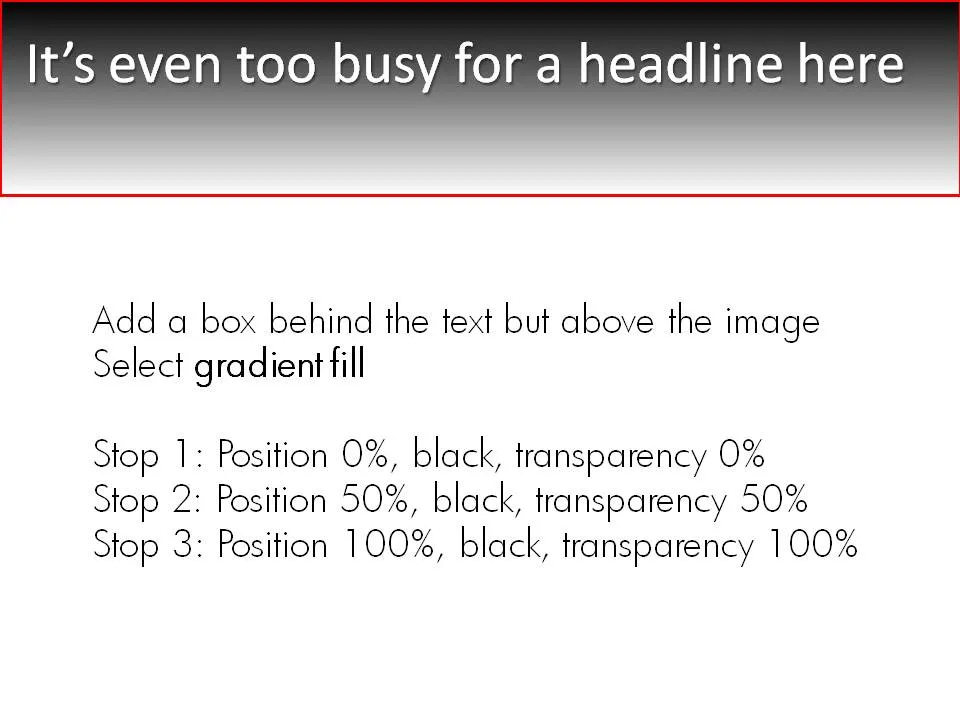
A simple gradient box behind an image title can make sure it stays readable, even if the background is very busy. Image under a CC license by maistora on Flickr.




Frequent updates about all things presentations since 2008. Subscribe to never miss a post.
A simple gradient box behind an image title can make sure it stays readable, even if the background is very busy. Image under a CC license by maistora on Flickr.
Sometimes it just comes all together, right now. Everything falls in place. And investors better move fast to benefit from the opportunity before it’s gone. A set of big simple arrows can visualize this.

Smart companies leverage money and man power invested in them to do great things. How to visualize this?
One option is to go back to high school physics class and use a good old pulley system.
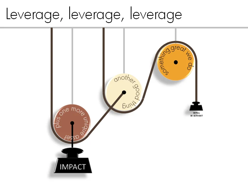
See a previous post about how to get circular text in PowerPoint.
Sometimes a presentation is just a discussion of a series of beliefs or points. Each section of the presentation is devoted to one statement. Big-font section separators are followed with a few more charts adding detail and explanations. Why not play around with fonts a bit on these separators? A summary page could consist of PNG captures of the all the tracker pages in the presentation. In this way, it looks a bit more interesting than six bullet points.


This ad uses a concept that can easily be replicated in presentation slides. Find a silhouette of let’s say a shark, and fill it with small gold fish shapes and you’re done.
I used something like this once to show how small individual components of an information security architecture can create a formidable defense against cyber crime if they coordinate their activities well.

A larger image can be found on Ads of the World.
More light summer posting. My Squidoo lens is filled with useful resources for presenters (blogs, books, presentater tools, videos). Have a look. Add more content. Vote existing content up or down. You can even buy some useful things, affiliate link proceeds are donated to charity.

More light summer posting. I only recently discovered that the weekly iStockPhoto free images expire after a number of weeks. Do not forget to download them on a regular basis, and pick the very large size enabling you to zoom in dramatically if needed.
The fact that they are picked by iStock editors adds a nice bit of randomness to the stream of images. For example, here is last week’s:

Right at the start of a presentation I always create an opportunity for the speaker to introduce herself. What visual to use for this? Definitely not a boring bullet point summary of your CV. Put a personal image that describes something unique about yourself. It can be frivolous in an informal setting, and in more formal presentations, a scan of your business card (“so last century”) can be a good background.

Apologies for blacking out spam-sensitive details.
Microsoft Office is a tightly integrated application suite. Inside Excel you can find pretty much the entire arsenal of PowerPoint drawing and charting tools.
For certain types of presentations, you should consider using Excel as the presentation tool instead of PowerPoint. Quarterly results presentations are an obvious candidate:
Here is what an Excel presentation could look like. Charts are laid out on the left side, data is put in on the right side. It takes some time setting things up and making all the links work, but once you do, you got yourself a very powerful tool (click image for a larger picture).
Every VC pitch presentation needs to talk about distinctiveness. There are many slick stand-out-from-the-crowd images for sale on stock image sites. This ad from Comex paints (via Frederick Samuel) triggered another idea. The comic character blending in the background is a nice setup page to introduce the problem. After this slide, you can talk about how you are making a difference in the market.