

SlideMagic Blog

Frequent updates about all things presentations since 2008. Subscribe to never miss a post.

RSS
all posts

Search results for “pencil”

·Creativity

Paperless creativity - iPad calculators

I am continuing my experiment to create a completely paperless creative workflow to increase my mobility. Until now, I had to settle in my creative corner, have my pencils around, have my paper around, before I could get in the mood to do serious design work. I reviewed note taking apps here, now it is the turn of calculators.

Whenever I design a presentation, I almost always have a calculator open on my desk. I design all my data charts by hand, the old fashioned way, doing the final step completely analogue to make sure that resulting slide is really the very best to convey the specific message I want to get across. The calculator is used to calculate the % breakdowns, and to do the final check whether the whole thing adds up. Small calculation errors can distract the audience and undermine the credibility of your analytical work. (I she cannot get the numbers in the chart to add up, what about the underlying spreadsheets?)

So, over the past decades I have used the famous HP 12C as my sole calculator. First in hardware form, then as an app on my iPhone. Since spreadsheets arrived in the early 1990s, I have no need anymore for sophisticated NPV calculations on a calculator. I was simply used to the user interface of the machine, to such an extend that I replaced it for about EUR 100 with a new one a few years ago.

The iPhone HP 12C works, but is not perfectly convenient. I always fiddle with the landscape-only orientation, and the buttons are a bit too small to be convenient. So the iPad solves at the least the button size issue. Like note taking apps, there are an infinite amount of calculator apps available for the iPad (including the build in one).
Continue reading →
·Gadgets

Review: iPad note taking

Handwritten notes are very important in presentation design. I use 2 kinds:

  1. A very small note book with a beautiful leather cover to take meeting notes
  2. The back pages of old print out for slide design (I take more pages out than I add, the pile is shrinking fast)

For writing I use my favorite pencil: the Lamy 2000 (review).

Let’s look at application 1 first: meeting notes

Although I love my luxury micro note book, there is a big problem with analogue note taking: finding stuff. Since you write sequentially, and often use poor handwriting, it is hard to access notes that are part of a specific project (I can have more than 10 things going on at the same time).

Digital note taking on an iPad can solve this: simply create a note book for every project.

The key problem is the iPad-hand interface. Steve Jobs always was against using a styles, he correctly reminded us that we have 10 of them already. That is true for navigation, but not for writing large pieces of text (fast). The biggest problem is seeing what you do. Big fingers are getting in the way of your eyes, leading to illegible scribbles. And after a while you get tired of holding your finger straight. So there is no escaping from a style.

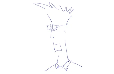
An iPad stylus needs to have a fat tip with a soft surface, mirroring the texture of a human finger. The resulting line can still be highly thin though, getting drawn at the center of impact of the soft tip. To show this effect, see fashion designer Karl Lagerfeld sketch drawings live on stage during the LeWeb 2011 conference in Paris last year (skip to 19:50).

Continue reading →
·Gadgets

First sketches with the Wacom Inkling

The Wacom Inkling Digital Sketch Pen (affiliate link) is a tool that lets you draw with a regular pen after which a sketch can be transferred to Photoshop or Illustrator for further editing. No, it does more than a regular scanner. First of all, it allows you to draw in layers and preserve them in the editing software. Secondly, the hardware is so small that you can take it any where you want.

My box arrived yesterday in the mail and the experience confirms what I have seen so far in the promotion video (my sketching skills have some way to go though). The product comes in a box the size of a regular pencil case. The pen and the receiver fit in nicely. Clip the receiver at the top of the page, and start sketching. It is as simple as that. One button opens a new file/page, another button adds another layer. The software is easy to install and works great.

The only drawback for me is that sketching has to happen with a ball point. I prefer a soft tip pen, or best of all a thick pencil to draw. There might be technical reasons why Wacom stuck to a ballpoint for sketching, but hopefully they will release a pencil-based scanner in the near future.

Milton Glaser: To inform and delight

The wonderful thing about movie streaming services like Netflix is that it opens up a long tail of movies that you normally would not buy on DVD. I am digging through the art and design section and stumble of some really interesting documentaries.

Last week, I watched “Milton Glaser: To Inform & Delight ” (affiliate link), a documentary about U.S. graphic designer Milton Glaser (probably best known for the design of the I heart NY logo). The film provides excellent food for thought for any designer. Here are some random insights from the movie.

An album cover for Bob Dylan (fragment) that became a symbol of the 60s
  • A designer should not everything on a silver plate to the audience, but leave something to solve. His I heart NY is an example of that.
  • Art and design create symbols for people to connect. Through art they have something to share rather than killing each other. Milton thinks this is the gift of art
  • Upon graduation from high school and after his decision to gor art rather than science, his art teacher handed him a pencil box as a gift and said: “Do good work.”. Makes sense.
  • The movie title was inspired by a quote from the Roman poet Horace: “The purpose of art is to inform and delight”
  • Another good one: “drawing is thinking” to describe the intuitive process of free sketching on a white sheet of paper.
  • And his insight that every object is defined by its opposite. It reminds us how important it is to use contrast in design.
Continue reading →
·PowerPoint

Mindmapping on the iPad: iThoughtsHD versus DropMind

Triggered by the iPad touch interface, I started to use mindmapping for the first time in presentation design. Mindmapping is a process in which you jot down ideas and the connections between them quickly, and edit, clean up, and move things around later to get a more organized picture. I must say, it works a lot better than my previous approach: the pencil and a piece of paper. Especially since it is a lot harder to lose that piece of paper with your notes on it.

I purchased 2 iPad apps: iThoughtsHD and DropMind. iThoughtsHD was designed specifically for the iPad, and is the cheaper of the 2 ($10 versus $50 for DropMind). The DropMind app is an extension from an existing suite of desktop and web applications. The latter probably explains why it took a relatively long time for DropMind to come out with the app, a working iOS 4.2 version only appeared last week in the app store.

When reading my impressions remember that I am a light-weight mind mapper, just using it to structure ideas for a presentation. Reading around on the Internet it looks like mindmapping is a whole design approach taking things much further than I do.

For the purpose I use it for, iThoughtsHD works perfectly fine. The interface is straightforward and clean, and it is every easy to export mindmaps to PDF or sync them using a Dropbox account.

DropMind’s user interface looks a little bit more sophisticated with more graphical options. When you buy the iPad app, they also offer a perpetual license for the desktop client, and the web app. You can exchange mindmaps between the applications. There is a wide arsenal of tools available that I did not yet have time for to explore. The one drawback I found is that when you export a map to PDF or JPG, the resolution seems to be very low (not an issue with iThoughtsHD). I think this is a bug, or maybe I did not configure the settings correctly).

Continue reading →
·Design

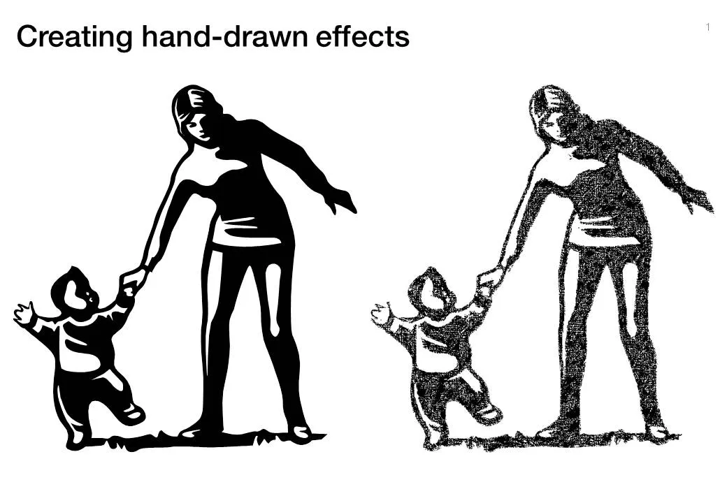
Hand-drawn figures in PowerPoint

Another excellent clip art manipulation on Tom’s Rapid e-learning blog: how to create characters with a hand-drawn feel:

  1. Select a cartoon-style clipart
  2. Ungroup and strip out background elements
  3. Copy and paste as PNG
  4. Apply PowerPoint 2010’s new pencil sketch filter (or use Photoshop’s)
  5. Increase brightness, soften contrast a bit.

·Design

Logos on PPT slides / logos on corporate gifts

It’s the time of the year for corporate gifts. Many of these could be really nice, where it not for that huge corporate logo that makes you shelve a beautiful pencil instead of using it. A waste. If your gift is nice, you do not need to remind people that it was you who gave it to you, they will remember.

Most corporate PowerPoint templates waste a lot of screen real estate on elaborate graphics to make sure that the audience does not forget who the employer of the presenter is. This is not only a waste of space, but these graphics also disturb the overall balance of the slide. A far better way to reinforce your corporate identity is to use the corporate colors consistently through your presentation. No need for logos.

So far, a consistent message. But what if the presentation is poor, and people walk in and out of the conference room, check email, make a phone call or get a much-needed coffee? In that case, you might need a reminder of who is speaking when you re-enter the room. Maybe template designers just anticipate this situation…