

SlideMagic Blog

Frequent updates about all things presentations since 2008. Subscribe to never miss a post.

RSS
all posts

Category VC/investor pitch

·Keynote

Months in advance

Waiting with the preparation for your presentation until the last minute is not a good idea. At 3AM at night before the 9AM meeting, you are not the most creative person in the world.

The other extreme is useless as well. Preparing for a big presentation months ahead will not help you get better results. When the content is not ready, none of your colleagues are focused on it, you are simply freewheeling and wasting your time.

Sometimes I see the long lead time in big companies that prepare for a big investor day. Work starts 3 months before the deadline, but people only start to focus for real 4 weeks in advance.

And yes, the best option is somewhere in the middle: start a few weeks (up to 6) before with thinking about what you want to say. Put it aside, get back to it, maybe design one slide all the way to the end in the look and feel you want, and slowly iterate your way to presentation day.
·Keynote

Personal chemistry

Now you hear it from VC Fred Wilson himself: personal chemistry is hugely important in the VC pitch process. What does it mean for your presentation? That your body language and interaction in the meeting are as important (maybe even more important) than the actual content of the slides.

A pitch meeting is an excuse for a venture capitalist to figure you out. How are you to work with?

·Investor presentation

Amateurish format or no format?

It requires some skill to get a presentation to look professional. And when you are a boot strapping startup, I think most investors will forgive you if you did not have time or money to get your investor slides look completely perfect. You decided to put your effort elsewhere, rather than spending it on PowerPoint looks.

So, the bare PowerPoint template with a tiny logo on the bottom right looks, well, bare, but you could still say it is professional, sort of. Worse is when you put in a lot of effort and the results do not look good:

  1. Clashing colours
  2. Too childish, or too cute for predominantly machine/male investors
  3. Tacky, cheesy stock images
  4. Super complex gradients and other template graphics that take over 50% of the slide surface

No format works for an early stage startup investor pitch with a good idea, it will not work in a sales presentation though.

·Investor presentation

Investor pitches evolve

As your company evolves, so will your investor pitch. At the idea stage, you are mainly concerned with explaining your idea and establishing you as a credible entrepreneur.

But with a product up and running, a few customers, and some revenues, investors will turn to other things like customer acquisition cost, churn, customer close rates, whatever is relevant for your industry. Inevitably, your deck will become less creative and resemble more a standard business presentation full of numbers and data.

Do not use the pitch deck from last year for your next investor meeting.

·Investor presentation

Big co versus small co

I have seen big improvements in the presentation design of my startup clients over the past year. In some cases when the design is adequate, I have to admit that my involvement might not be the best return on investment for a start up on a tight budget.

Whereas startups are adopting new design and story telling ideas rapidly, the opposite is true in big corporates. Corporate culture (“This is how we do things here”) is reflected in PowerPoint decks that look pretty much the same as they did 5 years ago. Managers go through the ranks by continuing to use PowerPoint like they used to do, and new recruits get told to stick to the format.

When designing for a startup, we can dive straight into the content of the presentation, when designing for a big corporate we first go through a process to convince them that a visual presentation can still be serious.

·Investor presentation

Fitting the trend

The world of Internet startups is filled with buzzwords: SoLoMo (social, local, mobile), freemium, wearable computing, big data, social sharing, sticky eyeballs (2000), monetization, consumerization to name just a few.

I see many startups trying to force-fit themselves into one of these trend boxes. You start with the buzzwords, then steal charts about the buzzwords from analyst reports (“online video will be huge in 2017”), and then present a diluted story about your company, showing how it fits in.

A better alternative is to explain how your company solves a big problem in a unique way and worry about the buzzwords later.

·Investor presentation

Investor infographic

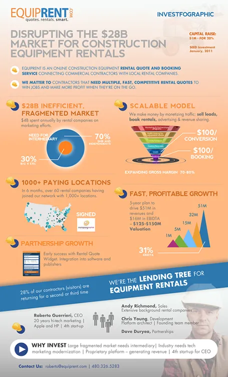
Equiprent is raising money, and put together an infographic to attract the attention of investors (found it on the Cool Infographics blog).

What I like about it:

  • One page Executive Summaries are boring and yes, this is a much better way to grab attention. Equiprent is realistic and does not think that this graphic is landing them the investment. Its sole purpose is to get a 5 minute phone call to discuss the next steps in the fund raising process
  • The company is not afraid to get the fact that they are fund raising out in the open: it says so, it shares their suggested valuation, and it states how much they are raising in return for what % of the company. I feel that the benefits of publicity and reaching more investors outweigh the drawbacks (putting some of your company secrets out in the open). The fund raising process can be much more open than hush hush discussions in small venture capital meeting rooms.
  • The infographic itself catches the basic points of an investment pitch, if an investor is convinced that all the claims are true, she will for sure invest in the venture.

Some feedback on where it can be improved:

  • From a design perspective: some objectives on the page can be aligned better
  • Content-wise: maybe the fragmentation point can be beefed up more. It is the core argument of the pitch. I have no immediate suggestion how to do it better though
  • Financial projects look impressive, but have little credibility without the accompanying assumptions
Continue reading →
·Investor presentation

"I get it"

Yesterday, Seth Godin posted about us thinking that we can absorb anything in 140 characters. Part of it is true, but part of it is that we fail to fully immerse into something.

Busy venture capitalists often show this behaviour. In the first few seconds they try to put your idea inside the framework of other similar ideas in your field of business and they get it, they think.

Think about this when you prepare your investor presentation and put emphasis on those aspects that are different, not that obvious. Even to the point where you make it extremely explicit: “I see what you are thinking, but no, this is not the [FILL BLANK] for [FILL BLANK]. Let me explain why.”

·Investor presentation

The 5 minute meeting

Some venture capitalists might invite you for a “5 minute meeting”. The idea is not to conduct a full formal pitch, but rather have a casual get together to get to know you and start a longer-term relationship that could end up in funding later on in time.

Of course the meeting will be a bit longer than 5 minutes, the time limit is just a deterrent for your to craft a huge 1 hour pitch deck. Also, the 5 minute meeting enables to VC to interrupt and question more without coming across as rude by cutting you off all the time. This dialogue is a quick way for her to zoom in on issues.

How to prepare?

  1. Prepare a very short verbal pitch: cover yourself, and cover the idea.
  2. Cover the idea. Make sure that the VC actually can understand what it is your doing (I have seen many pitches in pitch competitions where the presenter failed on this very basic requirement). This means, using normal buzzword-free language, and cutting content that is not yet relevant in this stage of the fund raising process (detailed financials, system architectures, etc. etc.)
  3. Present yourself in an interesting way. There is all the professional stuff, but maybe add a bit of unusualness, so the VC will remember you as the guy who likes to monocycle (for example). And do not forget that the main way you present yourself is in between the lines, how you come across in the meeting.
  4. Only prepare slides when your really cannot describe things with words: a 2x2 matrix of all the competitors in the field for example, which takes 30 seconds to describe but can be communicated in 2 seconds with a drawing. Have these slides in your back pocket: either on an iPad, or - yes - as a paper print out.
  5. When the VC is not deciding whether to invest right now at this moment, it is actually OK to show some uncertainty and vulnerability and ask advice about how to build your business.
  6. Listen. Pay attention to what feedback you get, answer the questions you get asked rather than pressing play on your standard pitch. This is a dialogue and a test case for what it is like to work with you in the longer term
·Investor presentation

Consultants cannot pitch

The other day I was asked to provide input on a pitch deck prepared by a respected consulting firm. The idea was the result of a consulting project, the results of which for document in a hefty, detailed, and structured document that everyone agrees was great for reading background material, but not really right for presenting/pitching. The team took the first step by cutting down the number slides (not changing them) in an executive summary presentation.

My advice for consultants who want to pitch: start from scratch and design a completely new presentation specifically aimed at selling, pitching, fundraising and leave the big data Bible as back up.

What goes usually wrong in executive summary decks that are created by chopping slides out of a master pack? Some examples.

  • The team has probably been working for months on the project and as a result, they see the discussion of the problem as totally trivial and cut down a lot on the charts that adress the issue, most of them probably generated early on in the project, or even during the project definition phase. The consultants forget that to the outsider who hears about the issues for the first time, it is not that trivial. On the contrary, it is often easier to pitch the problem, than to pitch the solution.
  • The problem section usually involves data, and consulting data charts are loaded with facts and figures and tables. Most consultants actually violate one of the cardinal rules of one message per slide. Go back to your drawing board and pick one statistic/trend that is really crucial to sell your problem and make a super clean/clear data chart that just shows that, nothing else
  • As we get to the solution the consultant often forget to describe what it actually is. We show histories of how the initiative has been used in other parts of the world, who is involved, but hey: what is it that you actually want to do? To the consultant it is obvious, to the audience not.
  • Describing the initiative or its impact can be done in dry text bullets with low emotional appeal. But why not use pictures? Show the project in action. Profile the people that benefited from it in big page filling images. Create human stories. People relate to this much better than dry data. Yes, I want to help this girl in the picture!
  • Consultants are always shy, and hesitant to take a strong position. (Yes, you could take option B but it has these disadvantages and it depends on this scenario C panning out that way). As a result, it is actually unclear what is expected from the audience: contribute this amount of money to do X, Y, and Z. Get over your shyness, and spell it out the call of action bluntly.
Continue reading →