Raising seed money
This is a pretty informative deck about pitching investors for seed money by **Steve Schlafman**a VC at RRE.
Raising Seed Capital from Steve Schlafman
Thank you Paola Bonomo.


Frequent updates about all things presentations since 2008. Subscribe to never miss a post.
This is a pretty informative deck about pitching investors for seed money by **Steve Schlafman**a VC at RRE.
Raising Seed Capital from Steve Schlafman
Thank you Paola Bonomo.
The beauty of a verbal story is that it forces you to stick to one sequential story line. In a direct dialogue you need to weave your big thoughts together on the spot, right there with the instant feedback of the eyes of your audience signalling “Uh oh, I am losing the plot here”.
When writing prose, this clean story line can go missing. You write a sentence, go back, edit it, add a buzzword, put in a tangent/exception, copy and paste the section somewhere else. Soon, the clear, instant, on the spot, story line is gone and replaced by a page out of a business school text book.
In visual slide design something similar happens. You start with an idea for some visual concept, but then things get added (ROI, customers, social engagement) and before you know it you have a diagram that is really useful for you, the designer, as an aide memoir of what your business is all about, but the audience is losing the plot.
When designing a presentation, try to stay as close as possible to that fresh, on the spot, story line with which you started out with. Stick to very basic visual compositions (a trade off, best of both worlds, elimination of a layer) and visualise your story around that. Add distractions and complications later, after the big idea has settled in.
Seth Godin notices how - because of information overload - we have stopped reading/absorbing things with the full nuances, referring to “TL;DR”: too long, did not read.
You as a presentation designer need fight against this behaviour as well. Dense boring slides do not get attention, instead people apply their mental models and think they already understand what you are gong to say.
The obvious approach to this is to design visually attractive slides to grab people’s attention. But visually striking images is only half the work. Your story itself need to have interesting and unexpected turning points as well. An unexpected fact, an unexpected contradiction.
People do not really think something is too long: they think something is too boring to read: TB;DR.
Your audience has mental models of businesses in their head. For example, if you are raising money for your own new venture capital fund, people expect to see that you only invest in companies with a clear competitive advantage, great management teams with track record, that you as an investor are hands on, that your investment team is great and that the carry is 20%. All venture capital pitch decks sound like that.
If your approach to the business is different than the mental model, you need to explain it carefully upfront, explain the pure mechanics of the situation, before launching into the more emotional part of the presentation (showing how great your team is, and how great the investment opportunity is).
Your different model might be completely obvious to you, it is unlikely to be the case with an audience who hears it for the first time. I you wait for it in the back of the presentation, your audience all of a sudden will be confused (“Wait a minute?”) and the questions/discussions you are going to get in the end are practical ones, not about the great investment opportunity, but how exactly your fund works.
A client told me the other day that she had seen many of my presentations, and thought they were really good, but all very simple. Her story would for sure be more complicated… It made me smile.
I realised that I hardly look back at my notes from a briefing meeting when designing a presentation. The big story is designed from memory, only for facts I need to revert to my scribbles.
I guess that your brain gets used to recording stories when you design presentations for a living. When I listen to someone (more important than seeing an existing presentation) I record the information by creating a story flow in my head that is more memorable than scribbles on paper.
A 20 minute presentation is usually to short to carry a live product demo. You might run into technical difficulties, and you are losing time/attention with banal product features such as logging in, etc.
In those cases it is better to use application screen shots, rather than the real thing. You can still point at your computer and say that there is a working prototype, and that you are more than willing to take people through in a separate, longer meeting.
The next level up is to crop/magnify the screen shots and focus only on those aspects you want the audience to see. Your Skype window, menu bars, and all other unnecessary screen real estate can be cut out.
Next level up: put big, bold, explanation arrows explaining what the user should see. Say that it is a really minimal UI, if it is minimal.
Now here is the big difference. Do not just structure your product demo alongside the feature list of your app. Instead, create a user story and let the app screens flow with the story. You can also include visual images that are not screen shots into this story board. Even better, link back to story elements you have used elsewhere in the presentation.
A product demo is a user story, not a list of features.
In many draft/briefing presentations I see, there is a page 1 that was inserted after the full presentation was finished. It contains the things the presenter really wants to say.
Do not feel guilty to discard almost the entire presentation (slides 2-50), take page 1 as a story board to build up the entire presentation from scratch, focussing just on the things you really want to say.
The three weeks of work you invested in page 2-50 where necessary to get you to write page 1, which you can now turn into a full presentation in less than a day, because the full picture is crystal clear, very different from where you were 3 weeks ago.
I came across this image the other day, showing retention rates of students by delivery form. A lecture is the worst, teaching others is the best. I am not sure about the accuracy of the exact percentages, but there is something to the overall hierarchy presented here. And presentations are definitely somewhere high up there.
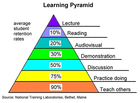
But we can learn from this pyramid to make our presentations better.
How could you get to teaching others in a presentation?
Doing the product spec slides of your sales presentation is relatively easy. The big picture, how you position yourself versus the competition is harder. It is tempting to start with the easy bits and worry about the difficult things later. Still, I suggest to take on the positioning first since all other slides will depend on it. Moreover, it is the overall product concept that you are selling, not the features of individual products.