Constantly checking readability
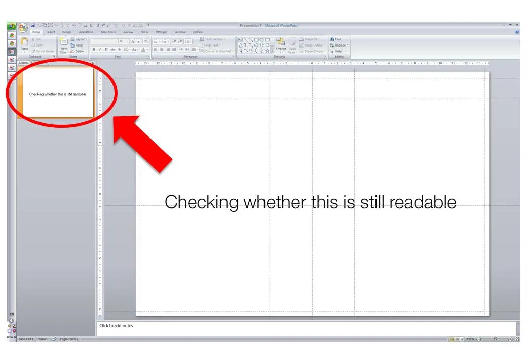
When I design my slides I usually leave the outline pane open on the left side of the screen, so I get a sense of what an audience member sitting in the back row might see when the slide gets presented.


Frequent updates about all things presentations since 2008. Subscribe to never miss a post.
When I design my slides I usually leave the outline pane open on the left side of the screen, so I get a sense of what an audience member sitting in the back row might see when the slide gets presented.
Microsoft is quietly rolling out its office applications in the cloud. They announced that the web-version of major Office applications are live, at least in a number of countries/languages. In Israel I could get it to work. Try for yourself here.
I have been following these in-the-cloud initiatives closely, and must conclude that Microsoft stands a good chance to be the winner. I chose Microsoft over Google docs for a recent project that involved collaboration in multiple countries.
It looks like the world is dividing into 2:
The learning curve of switching user interfaces of Office applications is huge (read: costing a lot of money in downtime and helpdesk support), and for a big corporate to switch means that everyone is required to change habits: the 25-year old tech savvy analyst, the 60 year old secretary of the CEO, the CEO herself, to name a few. It’s just hard to move them out of the Microsoft world.
Ultimately, the big corporates will move Office applications/data into the cloud, there are significant benefits to collaboration and simply finding stuff. They will go with Office Live though, and not with Google Docs…
I do not use standard Microsoft PowerPoint templates very often, but I must admit that I was pleasantly surprised by this 2010 calendar template on the Microsoft web site. That saved me a lot of time in designing a kick off presentation for a new project. Tons more here.
HTML5 is a major revision of the HTML language that powers web pages (Wikipedia link for the details). You can find an example of a presentation designed entirely in HTML5 here. Use the cursor left and right keys to navigate between slides. The presentation does not have a good design, but it gives a flavor of the capabilities of HTML5.
Could HTML5 become the default file format for all presentations, decoupling software that creates presentations, environments that display them, and sites that build a social infrastructure for sharing on the web?
I am curious to hear the perspectives of readers which a stronger technical background than mine.
Thank you Eyal Sela for suggesting this link.
File sizes are getting out of control. YouSendIt is a tool to overcome size limitations on email attachments, but it has one big drawbacks though: confidentiality. If you do not sign up for the premium version, anyone who gets her hands on the file link can download it.
One solution is Google Docs. Recently, Google updated the service and it is now possible to upload and download files that are not in Google’s propriety format. Plugins such as OffiSync create a seamless integration between Microsoft Office and Google Docs. The advantages:
I am making radical shifts to the way I work with my IT infrastructure. Over the past week, I have moved many of the software tools I use “in the cloud”.
I am learning a lot here, and get lots of inspiration for new blog posts, but let’s talk about one thing at a time: how likely is it that presentation software such as PowerPoint will move into the cloud. Unlike spreadsheets and databases, I am not that optimistic.
At first sight, it seems like the benefits of going into the cloud should apply to presentation software as well: access from anywhere, group collaboration, easy sharing, no more file size issues with storage and email.
There are two aspects to cloud processing: online storage and collaborating with shared files using online tools. Online storage is incredibly useful for presentations, files get increasingly big/harder to email. It is the online collaboration that is the problem.
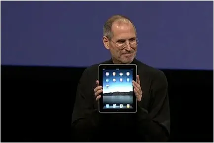
Apple launched the iPad yesterday (watch Steve Jobs present here): a device positioned in between a smart phone and a laptop computer. The big differentiator is a very large screen and a user interface that can be manipulated using the touch of a finger, exactly the same way you interact with an iPhone.
Would could this new device mean for presentations? My first thoughts:
I am very excited about the iPad. The geek reviews might have found technical imperfections (no multi-tasking for example), but the fundamental revolution is the big touch-based user interface that have brought computing in general and presentations specifically a bit closer to a natural human interaction.
By now everyone knows that using professional images in your presentation is far better than ripping images from Google image search or clipart: higher quality photographs, isolated subjects on a white background, detailed search capabilities including required colors or available white space for type, and last but not least: no copy right infringement issues.
With the increase in popularity of stock images also came a backlash: many photographs were so cliche and/or over-used that designers increasingly start to look at other image sources with creative common licenses (I like Flickr a lot).
Price is another issue. Online stock image sites used to charge around $1 for each image. At that price you could afford to buy volumes and volumes of images, try them and discard them if they were not appropriate. Prices have gone up significantly recently, requiring a change in the creative process: design your presentation with low-resolution comps and only buy your images at the very last stage of the project.
Technology is about to put new power in the hands of stock image buyers. Many stock image sites contain the exact same image, but offer them at different prices. Differences in price are the result of general pricing policies (driven by the strength of the brand of the stock image site) or sophisticated dynamic pricing algorithms, setting image prices based on the number of downloads/views (more popular images become more expensive).
SpiderPic is a price comparison search engine for stock images and let’s you decide from which source you want to buy the image. You key in the search term, the site presents the available options, and once you select a candidate it lists other sites that offer the image (and at what price for what resolution). Once you made your selection you are linked through to the relevant stock image site to complete the purchase transaction.
The mobile phone screen is becoming a mainstream outlet for content. Services such as SlideShare have become so popular to share presentations (=ideas) to mass audiences that presentation designers have begun to adjust their style to suit this type of viewers. What happens if you add these two trends up?
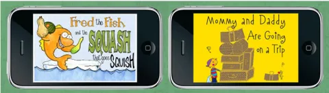
Swiss Miss pointed me towards a new iPhone app: iStoryTime, enabling kids to flick through narrated children’s stories. (The same target segment as Story Bird). Animoto allows you to create beautiful animated videos on your iPhone, it is just another example of a visual language that is suitable for the small screen.
Squinting to read a blog RSS on your phone, scrolling left/right and up/down to understand the big picture of a web site, maybe there is another future for presentations here: the ideal format to spread an idea on a mobile device through a series of clicks.
The constraints are simple: a small screen, and no presenter is present to explain things. I wish we had these constraints in PC PowerPoint:
That would do a lot of good to many presentations that are written as we speak.
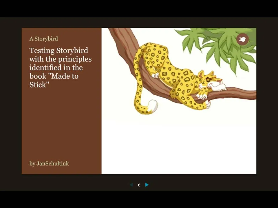
More and more online presentation tools are popping up. A recent one is Story Bird. You select artwork from an artist and are offered a simple interface to weave images of your choice together into a story.
The service is targeted at family/children and works well. Narrowing down the degrees of freedom (artwork in a consistent style, simple page layout [image + big font text]) makes it easy to create and share professional looking stories. You can invite others to collaborate with you as well.
Maybe the biggest application of this service is in education? There is a business presentation version of this application possible as well. Replace the image bank with non-cheesy useful presentation images (you only need a few hundred to cover most business presentations) and you have an alternative template to the PowerPoint bullet points. “Ayne can make Presentation Zen-style presentations”). Cutting the available slideware tools to the minimum helps focus the presentation design amateur on the story.
My first creation can be found here.
Via Orli