SlideMagic Blog

Frequent updates about all things presentations since 2008. Subscribe to never miss a post.

RSS
all posts

Category Sales presentation

·Investor presentation

Sales versus investor presentations

CEOs are used to doing the company’s product sales pitch. When they look for investors or acquirers for their company, it is temping to just press play and do that same sales pitch again. But they can be very different stories.

An investor needs to hear the sales pitch. It makes her believe that the company makes products that people want to buy. Also, it shows that the company CEO is actually good at selling (or not). But investors needs more: strategy, financials, margins, funding requirements, and a more explicit comparison versus the competition than you would put in the sales deck.

Potential acquirers might not be interested at all in the sales pitch. Maybe they are considering to buy the company for a very specific asset they need. (Technology, people, distribution). Acquirers need a very specific, tailored presentation. To make it, you need to put yourself in their shoes and resist the temptation to hit “play” and run the sales pitch.

Image from WikiPedia
·Video

Video briefing

You know how to give that perfect sales presentation, but do you sales reps in the field as well? Probably not. One way to get them to say the right things is write the messages down in bullet points that can be read of the screen. But that does not create the most engaging presentation for your potential customers.

A better approach might be to record yourself delivering the presentation on video and share that with people in the field.

·Investor presentation

"It takes too much time to get to the solution"

Clients say they get this feedback after giving a pitch. The initial reaction to this would be:

  • Cut slides from the deck
  • Take the specifics out of your text, make it shorter and more high level
  • Combine multiple slides into one

The danger of this is that you end up with a few slides of highly generic and dense bullet points.  Remember:

  • Slide count does not equal time spent presenting them
  • Smacking someone with the solution in their face instantly takes away the opportunity to lead them by the hand in an interesting story that covers the problem you are trying to solve.
  • The best way to sell the solution is to sell the problem

Here is what I do:

  • Create a super short intro slide that explains the audience what you solve and what you do. So they can stop guessing about the point you are trying to get to.
  • Now, lead people through a sequence of visual slides that highlight the problem, slowing down sufficiently to make sure that the audience “feels” the issue. “Production cost is too high” is too generic. Why is it so expensive, and why could no one do it cheaper until today?
  • Then, present your solution and use the framework of the problem you set up in the previous section to mirror your product against markets that are out there in the market today

Image by David Felstead on Flickr

·Sales presentation

Conference booth slides

Presentations that run in conference booths have a few special requirements

  • Smaller screens, probably a 16:9 aspect ratio. One set of people will stand close to watch it, the other will see the screens far in the distance. The screens become part of the overall branding of the booth. For the latter group, it is important the the graphical look & feel of your company pops out. Not through the use of big logos, but by applying the corporate colours boldly.
  • Viewers are unlikely to watch through the whole thing, but rather look at a slide here and there out of context. There is no one nearby to explain, each slide needs to stand on its own. This calls fro big bold visuals, with a clear headline that spells out the message of the slide.
  • Go for a relatively slow page rotation. If you are focused in the office, the presentation might run very slow, you have read the slide 10 times over before it goes on to the next one. In a conference booth, especially with more screens, things can start to look ver nervous when each screen is moving quickly.
  • Related to this. If you keep the differences between the layout of the slides similar, the page transitions will look less dramatic, creating a calmer overall feel of the presentation

Art: Pieter Aertsen, Market Stall, 1569

·Sales presentation

Why many vendors find it hard to sell to the "C-suite"

Many of my high tech clients hire me to design a product presentation that gets them higher up in the client organisation, the so called C-suite (CEO, CTO, CFO, etc.). The IT department buys features and equipment in a tight budget, the CEO can spend more money on what she sees as strategic priorities for the company.

The approach that vendors typically take is to frankenstein “business benefits” slides to the existing technical slide deck.

  • Market research slides that show the ever growing bytes of Internet traffic
  • 10-line quotes of customers who feel more flexible now
  • An Excel spreadsheet that shows how one custom managed to save $42,345.87 in 2013
  • A list of recent technology buzzwords (cloud, flexible, scalable, ROI)

I usually try to go for a different approach. Start with a blank sheet of paper. Trash the traditional system architecture charts. Cut the “business benefits” slides. Instead, I create a presentation that explains why this particular IT problem is so hard to crack, and how clever the client solution is.

The result is a presentation that looks “simple” to techies. “Simple” does not mean “simplistic”. It just does not use the complex looking visual language that engineers have gotten used to since graduating form university: network diagrams and acronyms.  Two engineers can communicate using these slides, but the content that is transferred actually has little to do with the network diagram on the slide. If you are not an engineer, you don’t get it. And as a result, most of the C-suite will not get it and send you back down stairs to IT.

·Sales presentation

Keep the CEO in the loop

Investor presentations usually start with the CFO (who naturally puts a finance spin on the story), then the Marketing Director adds product positioning, the Sales Director puts in a highly detailed benefit analysis: the result 3 presentations.

Why is it so important to have the CEO involved early in the process? She is the only one who has a view on the story that cuts across finance, marketing, sales. An equity investor audience is different from a client, is different from a tech conference, is different from a traditional bank that provides loans. More importantly, she is likely to have to make the pitch herself, and so she better is in sync with the slides.

You cannot delegate the investor pitch design, or give the super high level input “you know the story, pitch that we are more flexible”. Time to roll up the sleeves.

Art: Gustave Caillebotte, The Floor Scrapers, 1876

·Concepts

How to present pros and cons

A question came in on Twitter the other day:

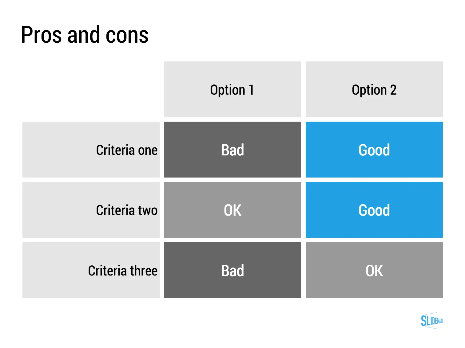
My answer is: a simple table, like this one I prepared quickly in my presentation app SlideMagic (you can clone it to your own SlideMagic account in the presentation template file that contains on the slides I have used on this blog).

The difference between a good pro/con slide and a bad one is not the design in itself, it is how your present the argument. A presentation slide is a tool to get a decision, it is not a laundry list of pros and cons that you evaluated in your analysis. Put your analysis aside, and design from a blank sheet of paper:

  • Group similar arguments together, if an argument is sort of the same, combine them
  • Sort the rows in the table in such a way that things visually line up. For example you start with rows where both options are “good” (all blues), then do the "OK/good"s, then the "OK/OK"s. etc.
  • Isolated and focus those arguments that are going to drive the decision and/or are controversial. "Option 1 is cheaper, option 2 is faster but the what will make the difference is whether we think [criterion 3] is important.
  • Cut words rigorously until you have a page that is still meaningful but does not look cluttered.

Art: weighing of the heart versus the feather of truth

·Investor presentation

The impatient audience

When I am reading I switch in different modes:

  • Losing yourself in a novel and forgetting the time
  • Digging through an article to find the acquisition price that was paid for a company
  • After having failed to resist the click bait title, looking for the answer to the question it raised
  • Absorbing every background aspect of the making of a certain music album

“Newspaper” journalists often get this wrong. They think they are writing for a person sipping a glass of wine and sitting in front of a burning wood fire, while most often they are not.

Hardly any business presentation is digested in the lounge chair. The audience:

  • Has no time
  • Is constantly distracted by calls, emails, messages
  • Thinks that they know it all already and tries to put your idea in a box that is familiar
  • Is clicking down and clicking down and wondering when they get to the point already

The captive TED Talk audience is in the lounge chair sipping wine. The venture capitalist is scrolling down your slides on her mobile while wondering whether the elevator button “1” or “0” will get you to the lobby.

BTW: Happy 2016 to everyone!

Art: Edouard Manet, Young Woman Reclining in Spanish Costume, 1862-1863

·Investor presentation

Your audience has heard it before

You are only aware of your own sales or investor pitch. Your audience (investors, clients) sit through dozens of them. After 10 sales or investor pitches in a certain industry, they probably understood the key industry trends, and in their heads they are wondering how you are different from the others.

Have the “101” slides ready, but the body language of your audience should tell you whether you are the first presentation they are watching, or number 12.

Image by Malcolm Carlow

·Sales presentation

Sales presentation versus strategy presentation

They are different.

  • Strategy presentation. In most cases, the audience of a strategy project recommendation presentation understands the context. A large part of them probably participated in the project (steering committee meetings, interviews, doing analysis). Therefore, the presentation can be highly in your face, conclusions upfront, in a strict logical order. Pretty much like the classic consulting presentation.
  • Sales presentation. Your audience will be less familiar with the background, you need to drag them in a bit slower, show that you understand their problem, etc. And, logic only is unlikely to lead to a sale.