SlideMagic Blog

Frequent updates about all things presentations since 2008. Subscribe to never miss a post.

RSS
all posts

Category PowerPoint

·Keynote

Give your eyes a break

When someone emails you a PowerPoint presentation, PowerPoint remembers the screen size that was last used. If that version was created on a small laptop, the slides will show up as tiny rectangles on a big desktop monitor.

All the time I see people making edits to presentations in tiny tiles. Why not give your eyes a break and scale up the slide to fit the page? Getting rid of toolbars, the speaker notes field, and reducing the outline on the left will deliver some more screen real estate.
·Keynote

Changing a corporate template

I am close to convincing a large client to change its corporate presentation template (at least for one event). Here is my strategy:

  • Convincing people that a high-profile, external event merits a format that can deviate from everyday documents that are mainly used for internal audiences
  • [But this is the most important one] Comparing the 2 template options not based on a blank slide, but on one of the most important slides of the entire event. Seeing a straight comparison of what is, and what could be for one of the most important messages of the company makes deciding easy. You pick the one that looks better.
·Keynote

Pause slides

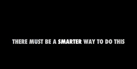
Some slides require a more dramatic introduction than just plopping it on the screen. I often use a blank slide wit a teaser sentence (not “the solution”) for this purpose. It breaks the flow and brings the audience attention back to the presenter.

·Images

Gestures

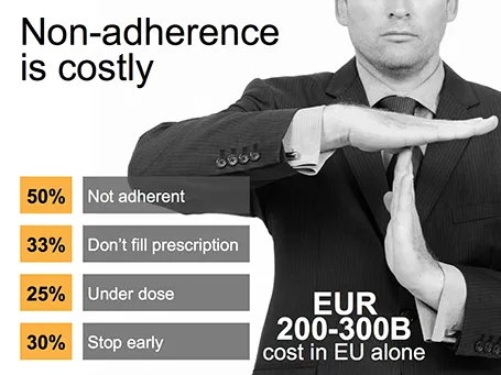
Sometimes simple human gestures make the most powerful background images. See the example below about people not being compliant with their medical prescription.

·Keynote

iPhone mock ups

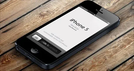
Many high-tech presentations involve some sort of show casing of a mobile phone app. This site has a number of iPhone mock ups that could work great in presentations. With elementary image editing skills, you can take a front-facing image and past your device screen shot in. More advanced Photoshop users can probably get the 3D tilting to work.

The full list of iPhone mock ups are here on Design Beep.

Someone suggested this link on Twitter, but I forgot who it was… If it was you let me know and I will give you credit.

·Keynote

Saving time with files

An annoying part of my workflow is clicking through file hierarchies to open and save documents and images. I do not understand why it took me around 20 years to figure out to pin the folders of the current projects I am working on to left of my file open menu. On the Mac, you simple dag a folder onto the side bar (you can do something similar in Windows as well).

·Concepts

Found it!

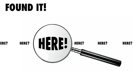
A client spend a lot of time and effort looking for a solution to a problem, until they discovered it in an unexpected place. The chart below is simple to make: a magnifying glass and different font sizes (and a transform font effect if you want), that is all.

·Concepts

Zap!

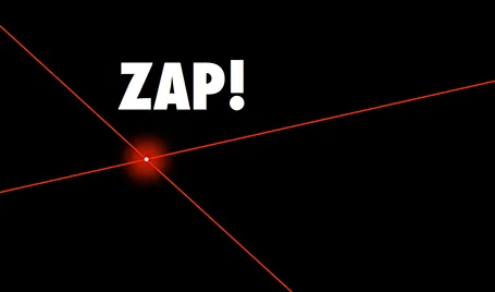
In case you want to use laser beams in your presentation, they are easy to make: red lines, black background and a small dot with a huge red, semi-transparent glow.

·Keynote

Marker nostalgia

I sometimes think back of the early 1990s, before we started putting Microsoft Word text pages on overhead transparencies using a photo copier. The only thing you had was an empty transparency and a big marker. The resulting slides were a lot more creative than many of the bullet point slides of today.

·Keynote

Presenting the presentation

A client was using a presentation to explain the presentation to people who had to present it. After a short discussion, it was decided to try to design a presentation that could be understood instantly by the presenter. If the presenter gets it, the audience probably understands it as well.