Redundant table column headings
I try to get rid of them, most of the time it is obvious that a column contains a company name, a date, or a comment. Sales, profits or acquisition value are a bit more tricky.


Frequent updates about all things presentations since 2008. Subscribe to never miss a post.
I try to get rid of them, most of the time it is obvious that a column contains a company name, a date, or a comment. Sales, profits or acquisition value are a bit more tricky.
Every startup pitch has a hockey stick chart that shows its financial path to glory. As a result, investors will not believe it by simply looking at it. You need to explain what she has to believe in order for the end point to be true. What are the 7 numbers you need to multiply in order to reach that $50m in year 5? If she believes in 4 of the 7, and she buys into your methodology to calculate the potential, then you she might connect the year five dot with the 0 today.
I do not like the term “executive summary”. It suggests that if you are senior and executive enough, you are somehow rising above the masses who are swimming and drowning in detail. Most executive summaries are over-summarised with buzzwords and hollow phrases.
Clients often ask me to write an executive summary of a presentation, and I usually say they do not need one. A careful selection of the key slides of a presentation is much better suited for the purpose. Nobody likes to read 2 dense pages of prose, flicking through a number of visual slides is much more interesting. As a result, the message gets across better and faster.
Videos in your presentation can be powerful, but embedding them using a YouTube link that needs a working Internet connection is a risky strategy in a live presentation, technology always fails when you need it most.
The website keepvid allows you to download YouTube videos to your computer and embed the video file in your presentation. The program comes with a few health warnings though:
Maybe stupid, but until recently I hardly ever used a slide template for a visual. My template used to be the white or black page, and everything on it was created from scratch. Data chart, insert followed by 15 actions to kill the standard PowerPoint formatting. Same for tables. Same for text boxes.
So, I am a late discoverer of the slide template. It requires some time though to set things up in a clever way. Maybe I gave you an idea as well.
Another big time saver: a custom toolbar, here is a very old post on the 19 buttons you need in a PowerPoint tool bar.
President Obama’s key influencing strategy for convincing the audience of the need for tougher gun control laws in the US was appealing to shared values, the values of parents in the audience and in front of television and YouTube screens.
And it is interesting to see how he did it; taking time to let the point sink in, emotionally. The President elaborated about the process of raising a child, letting it separate from you with pain in your heart. In the end he came back to that emotion by mentioning the first name of each child that was killed. If he had just put in the elevator pitch “we need to protect our children”, it would not have been convincing. We have heard it too many times from too many politicians.
The same is true in business presentations: just giving the sound bite is often not enough to let the audience feel the point you want to make.
Scientist do not yet agree whether lying makes people touch their nose, but the popular belief is so strong that you better avoid getting rid of that annoying twitch at critical moments in your presentation: “… and this is how I will save the company! ” [scratch] [scratch]
As part of my attempts to write a PowerPoint killer I am researching all the presentation apps that are currently available. Today, I have Google Presentations a test drive.
Web apps have come a long way, and the overall user experience is pretty much the same as local software: snappy and fast (that is, if you are connected to the Internet). Right-clicking, dragging, drop downs, it all works. Google Presentations is integrated into the Google Drive environment which makes accessing and sharing files really easy.
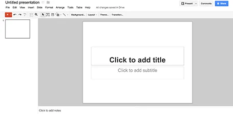
While I think that PowerPoint is too bloated with features, Google Presentations is still at the other extreme of the spectrum. Here are the things I a missing:
Google is making huge improvements in the design of its software, gmail, Google+, mobile apps all look fantastic now. Google Spreadsheets are already a workable alternative to Microsoft Excel sheets. With some additional features, Google Presentations can be come a credible PowerPoint alternative as well.
The majority of my presentations have either a pitch black or bright white background. But now that monitors are getting Retina-like resolutions, it becomes possible to add a tiny, tiny texture to the background. Here is a site that has a few candidates: subtlepatterns.com. (Update 7 April 2017: new link https://www.toptal.com/designers/subtlepatterns/
On the average crappy VGA office overhead projector this effect will not come out though.
I have started to wireframe my PowerPoint/Keynote killer in… Keynote. Presentation design software is excellent to make mock up web sites or mobile applications, no need for special software. You have all the shapes at your disposal and can add basic interactivity with hotlinks that point to other slides in your deck. You can design icons yourself or use standard packs such as these, or these to make things look even more real.