

SlideMagic Blog

Frequent updates about all things presentations since 2008. Subscribe to never miss a post.

RSS
all posts

Category PowerPoint

·PowerPoint

Microsoft Office Mix

Microsoft is working to add interactive features to PowerPoint presentations: real-time hand writing, audio/video of the presenter for off line viewing, analytics (who looked at what slide for how long), etc. A more elaborate description here on ZD Net. At the moment, Mix is just an add-in, but it could be a preview of what directions Microsoft will be taking future versions of PowerPoint.

Microsoft has opened Mix for preview, but it requires PowerPoint 2013 (i.e., does not work on a Mac).

My hunch is that the world needs simpler presentation software (working on it), not more complicated, but I am open to be convinced of the opposite.
·Data visualization

Funny

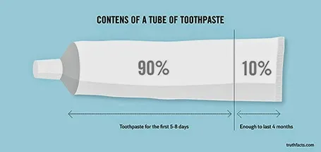
Most infographics are a bombastic compilations of overcomplicated, trying-too-hard, visualisations of facts that are not always that insightful. These simple graphs by Danish writer/artist duo Mikael Wulff and Anders Morgenthale are well executed and actually pretty funny.

A compilation of charts here on the Zero Hedge blog, and here is the web site of the original creators Wumo.

·Delivery

Where is that chart again?

The majority of slides in an average presentation are the bubble wrap that protects the real content. These slides are summary pages, set up pages, and lists of bullet points to remind the speaker what she should be saying next.

One indication that a slide is really needed is that you often look for them in one on one meetings. “Hey, wait, where is that email, with that attachment, with that special slide that I made a while ago.”

Spend more energy making slides like these.

·Delivery

"That took no time at all"

Many younger employees in big corporations have now understood that presentations with many slides that cover one point each are more effective than short presentations full of dense bullet point slides.

Their bosses might not be there yet.

I found an effective strategy to convince them: design the deck the way you want it, and have a test run. In 25 minutes, your boss understands that it takes the exact same time to present that longer presentation.

·Keynote

Visual shelf life

The other day I pointed out to a client that the colours of the corporate sign on top of the building were starting to fade. No, not that many customers of the company drive by the building every day (HQ is in Tel Aviv, customers are all over the globe), and yes, you can still read the sign and understand what company occupies the building. But still, it is the more subtle cultural signal of how the company sets its priorities, mostly influencing the employees who are making things happening every day.

The same applies to the look and feel of your presentations, if it looks worn out and tired, the audience might just think that the same is true for the company as a whole, and maybe their suspicion is right…

·Delivery

Zooming without Prezi

If you save your PowerPoint or Keynote file as a PDF and use an iPad with a PDF viewer to project your presentation, you can pinch and zoom into slides without sophisticated slide design techniques or special tools such as Prezi.

PowerPoint for iPad does not support it (yet).

·Keynote

The bar is rising

Compared to 10 years ago:

  • Your audience has sat through many more presentations
  • Your audience has watched many TED talks
  • Your audience has eliminated the patience to waste time digesting formal communications (big wordy business documents)
  • Your audience has probably seen/heard many ideas that are similar to yours
  • Your audience has become better at digesting information from multiple channels, devices, quickly

The bar is rising.

·Keynote

Bad form

Most form designs are a total disaster. Full of text (long prose) and cluttered, it is impossible to find the information you actually need. Especially if you are a non-Hebrew reader living in Israel, and need to pay a water bill online. The basics of 1) which web site to go, 2) what numbers to enter on the site, and 3) by when to pay are totally unclear.

There is a strong parallel with poorly designed presentation slides. Most forms are designed with the issuer in mind: it follows the structure of the IT infrastructure. Most forms follow a classical form template that has been used for decades, nobody is challenging whether a different layout might by more effective.  Most forms lack any form of human language.

·Keynote

Scientific slide analysis

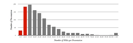
Here is a piece of research that extracts the font sizes, fonts used, lines per slides, slides per presentation of a 1,000 random presentations downloaded from the Internet. Lots or Times New Roman, lots of text, tiny fonts, endlessly long presentations. We knew it intuitively, but now there is the hard data to back it up. Research by Tim Theman.

·Data visualization

Place holder and data charts

I realised that most presentation slides I create fall in two categories:

  1. Data charts that have information in them that would be impossible to convey verbally (a graph, a table with financial information, a ranking of competitors)
  2. Place holders with some powerful visual (picture, typography) and is merely a placeholder for the story told by the presenter

Things go wrong if you mix them: showing hard core data with a cute picture will not work, putting up a detailed consulting framework as your place holder will not work.