SlideMagic Blog

Frequent updates about all things presentations since 2008. Subscribe to never miss a post.

RSS
all posts

Category Gadgets

·Design

Office for iOS - yawn

The column by David Pogue in the NYT says it all: the long-expected launch of Microsoft Office for iOS is a non-event.

As I am slowly progressing with the design of my own PowerPoint alternative, I start to realize that phones and tablets require a fundamental rethink of what a user actually wants to do in a presentation design/delivery context. I have not cracked it yet myself either but am trying hard to solve the problem by trying to disconnect my thinking completely from how desktop presentation design applications have been set up over the past 30 years.

·Gadgets

iPad without the new car smell

Immediately after the iPad launch, doing a presentation on the device was cool and innovative. Now that the new car smell has worn off, the iPad has become another common device in our IT setup (light, small, touch, crappy file system). What are the implications for presentation design?

  • More people do not carry their lap tops everywhere anymore. As a result, you might find yourself running a presentation from an iPad in a 1-on-1 meeting. Not because of it is cool, but because it is the only screen around.
  • Increasingly, people open email on mobile devices. Remember that a PPT file does not look great when opened on an iPad without the right apps. And it is unlikely that your boss, or potential customer, or potential investor has this software installed.

So what I end up doing is saving a animation-free PDF version of my important presentations (no font rendering issues) and keep them in Dropbox alongside the PPT master file. The iPad has become a workhorse.

·Delivery

Crappy VGA projectors

Screens on computers and mobile devices are getting better in 12 month cycles. I design presentations on 2 giant 27" displays that show a lot of detail and reveal the most subtle color shade differences.

Then you put your presentation on a conference room overhead projector that has been sitting there since 2002… The screen resolution is so small that it takes you 5 minutes to find your application windows, and when you finally get to show the slides in presentation mode you will notice that white and light grey is the same color, and that almost black grey is actually bright grey, and that orange means pink.

Test run your designs for the crappy conference room projector.

·Gadgets

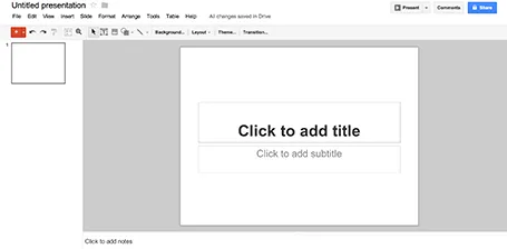
Google Presentations review

As part of my attempts to write a PowerPoint killer I am researching all the presentation apps that are currently available. Today, I have Google Presentations a test drive.

Web apps have come a long way, and the overall user experience is pretty much the same as local software: snappy and fast (that is, if you are connected to the Internet). Right-clicking, dragging, drop downs, it all works. Google Presentations is integrated into the Google Drive environment which makes accessing and sharing files really easy.

While I think that PowerPoint is too bloated with features, Google Presentations is still at the other extreme of the spectrum. Here are the things I a missing:

  • Big, big problem: you cannot crop images
  • Poor integration of data charts (you need to create the chart in a Google Spreadsheet and then copy it across as an image
  • If you create custom templates, everyone can see and use them

Google is making huge improvements in the design of its software, gmail, Google+, mobile apps all look fantastic now. Google Spreadsheets are already a workable alternative to Microsoft Excel sheets. With some additional features, Google Presentations can be come a credible PowerPoint alternative as well.

·Delivery

4:3-ing that LCD screen

Most people design their slides for a the 4:3 aspect ratio of older TV screens and computer monitors (I still think it is actually better than 16:9).

Increasingly conference rooms are using large 16:9 LCD screens that are much brighter than the traditional on screen projectors. And most of these 16:9 screens are set to stretch 4:3 input signals. As a result your slides will look bloated.

Grab that monitor remote (you cannot control this from your computer) and set the aspect ratio to 4:3 before you start presenting. The tech person present usually will say “What, you want those black bars?”. You can answer affirmative. Your slides will look much better, and if you use a black slide background, no one will even notice the black vertical bars.

P.S. Ancient post that touches on slide backgrounds.

·Gadgets

Trackpad U-turn: back to the mouse

With the advent of Mac OSX Lion I moved to using a track pad for all those fancy swiping features. However, I am back to a regular mouse. For intensive design work, a track pad strains my wrist too much. You constantly need to lift your hand slightly above the track pad, which starts to hurt. Using a mouse, I can put my hand and wrist in a completely neutral position without straining any muscle.

·Gadgets

Content creation on iPad

I have been experimenting a lot with using my iPad as a laptop replacement. It boils down to getting used to a new user interface: designing slides in Keynote works fine, and even building a spreadsheet in Numbers might be more intuitive on a touch interface, it is easier to navigate around cells. Strangely enough picking up a regular pen and paper feels a bit weird the first second after all that digital handwriting.

There is a very big issue though, an issue that was solved on the PC in the mid 1990s: multiple application windows. Quickly getting the data out of a PDF, running a side calculation in a spreadsheet, browsing through your images before putting them in a deck is simply not possible yet.

Here are some features that should be baked into a future tablet operating system:

  • Touch-friendly application switching that does not create the cluttered window mess of regular computers
  • A universal file format so you do not have to worry about in which application to open what
  • A new clever archiving system that is not (only) dependent on file names and directories, maybe find files based on the time you were working on them, based on the people you cooperated with.

Maybe the successor to Microsoft Office is not a new series of software, but a standard file format that covers text, graphics, and calculations on top of which everyone can build applications.

·Gadgets

iPhone Keynote remote

I recently used my iPhone as a remote control to move between slides for an on-stage Keynote presentation.

This is one of 2 ways you can now use an iPhone/iPad to give a presentation. The first is to run the presentation in the device itself and connect it to a screen via an Apple TV (or a cable if you are sitting around a conference table). The second, is to use your iPhone/iPad to control a computer via WiFi or Bluetooth.

I used the latter. While it did work there are 3 glitches, one of which is a big one:

  1. Both your iPhone and your computer need to be hooked up to the same WiFi network, which requires some fiddling with technology. For some reason Bluetooth failed to connect the devices. So it is different from using a standard plug and play Logitech remote that works always in a second. Budget time to make it work.
  2. You move between slides by sliding the screen, which is a movement that is a bit hard to do with one hand. I would have preferred it when the volume + and - buttons would have been allocated to do this, like in the camera application.
  3. And here is the big one, your remote can get stuck in the middle of a presentation. It happened to me twice where I had to wait for some buffer to clear before I could move on to the next slide. Not good when you are standing in front of a big audience.
Continue reading →
·Gadgets

The best iPad stylus

I now have almost completely eliminated paper from my workflow after I switched to hand writing on the iPad. My meeting notes are better organized and searchable, and I can now make design doodles in multiple colors on which it is much easier to erase part of your sketch. I have tested 3 iPad styli extensively and the best one is the Adonit Jot:

  • The Cosmonaut is a cute, beautifully designed, fat pen that resembles a whiteboard marker. Nice for my kids to draw, but not suitable for writing or precision drawing. The fat tip makes it impossible to see what you are writing. I am also not a big fan of the rubbery material on the outside.
  • The Wacom stylus is built of quality materials, feels nice and light and writes comfortably. A close second. The soft tip wears off quickly.
  • The Adonit Jot is my favorite. A small, flat, transparent disk protects your screen while giving completely visibility what you are doing. A very nice, heavy build quality. The disk makes a clacking sound when you write, some if you might find this inappropriate in meetings with other people. I bought the Flip version that has a pen on the back (which I actually never use).

I did extensive research on the web before buying my own styli, and discovered that there is a huge difference in personal preferences. So you are likely to buy a few before finding the one that fits you best. (The links in this posts are affiliate links).

Continue reading →
·Gadgets

iPad "books"

Whenever there is an innovation in visual communication, people initially struggle how to use it best. Hand-written text scrolls did not have page numbers, spaces between words, or sentences. The first ads were either paintings or primitive, poorly designed pamphlets. Color and photography took some time to be used properly. It took 10 years or so after the arrival of PowerPoint before Garr Reynolds had his insight and write Presentation Zen, and he is still busy convincing the world to kill the bullet points as I am writing this.

So here we have this iPad and the iBooks writing platform that enables anyone to create apps that incorporate touch and can be read away from the office chair. I have started to write an app on this platform myself and am constantly changing my approach. I started with the concept of a book in my mind (pages of text with images), but then discovered all this other things you can do: Prezi-like zooming diagrams, embedded slideshows, videos, Keynote presentations, questions. This is not a book writing tool, it is a software development tool. All these visual tools were available before on the web: zooming images, videos, data visualization. But somehow they never made it as the basis for the development of visual stories. I think the fact that an iPad can be used away from the office chair/screen will change that.

Nancy Duarte recently ported her book Resonate over to the iBook platform and the result is beautiful. And it gives some good examples of how new visual techniques are more than just making content prettier or more spectacular. Many of the effects in the Wired magazine iPad edition are just like poorly used animations in PowerPoint or Keynote: interesting, but they do not add to the story. When Nancy analyzes a speech by Ronald Reagan, it is just very useful to be able to watch the actual thing alongside.


Continue reading →