SlideMagic Blog

Frequent updates about all things presentations since 2008. Subscribe to never miss a post.

RSS
all posts

Category Design

·Colors

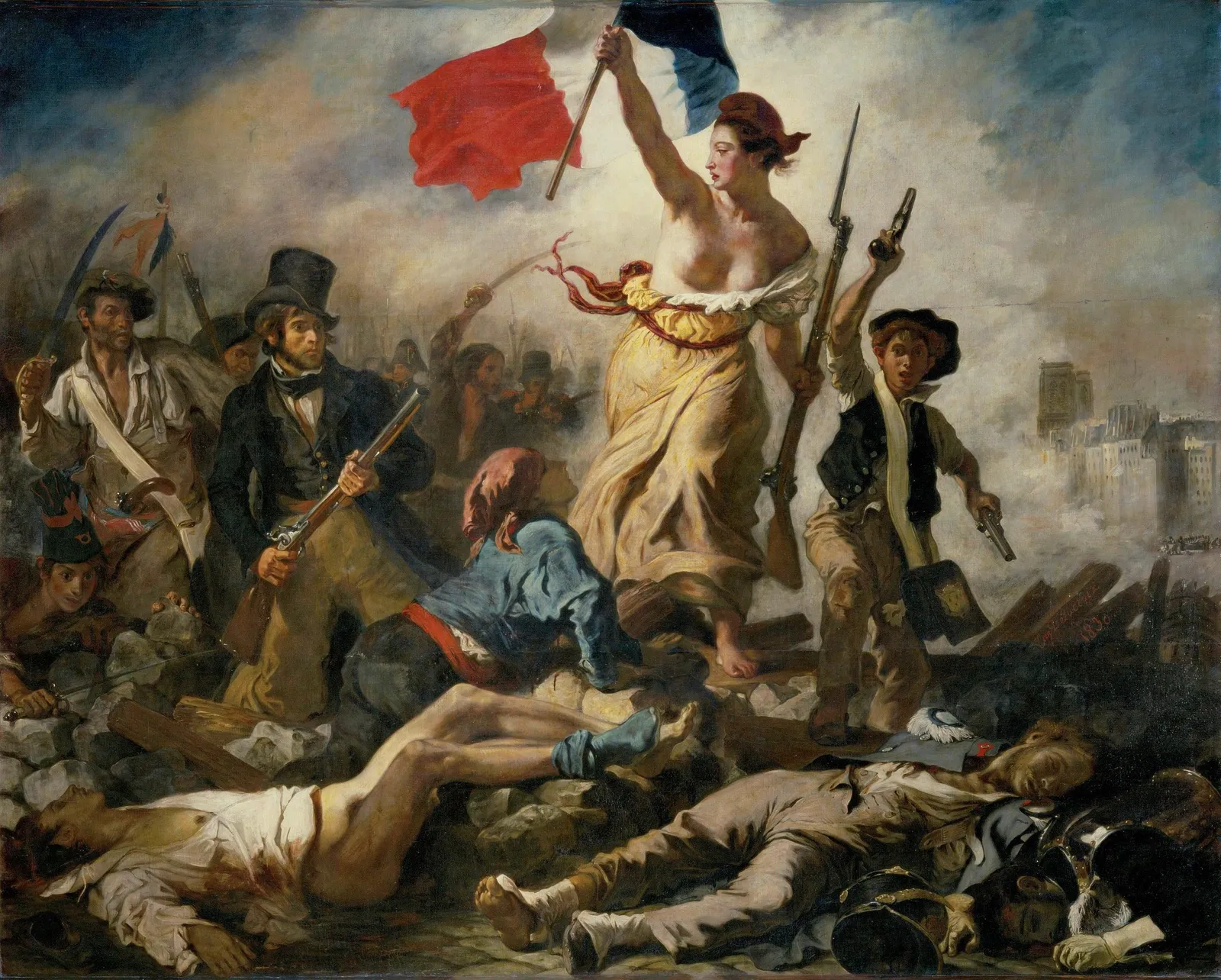
Changing the color of the French flag

President Macron of France changed the blue color of the French flag. He made the blue darker again, after it was set to be the same blue as that of the European Union flag back in the 1970s. (Then president Giscard d’Estaing thought the different shades of blue clashed during photo ops).

I agree with Macron, the darker blue looks better, flags have a history, and i don’t think the two shades of blue clash at all. When doing design work, pay attention to flags. They have very specific colors (like logos), and very specific aspect ratios.

·Design

Organized randomness

This is a tricky thing to do: create a layout of seemingly random elements that look good together. I need to deal with this now for the new venture I am setting up

It is a process of constant iteration. Put one type of elements, put another. Add text and titles. They shift the weight of the page, so everything has to move around again, different screen aspect ratio, another shuffle. Repeat, repeat.

Subconsciously, your brain is scanning for anomalies in the unwritten rules of a layout. You don’t know what they are, but you see it when you break them. For example, including one angle in the path above that is “sharp” (i.e., smaller than 90 degrees, would stand out.

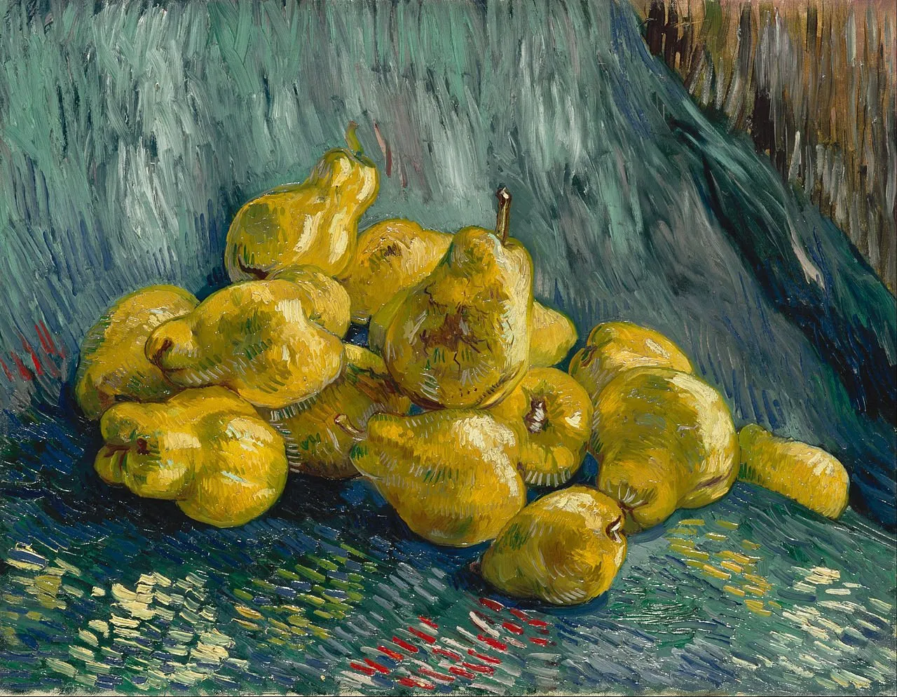
Architects have to deal with this a lot, or painters laying out the “random” elements of a still life painting.

In the end, we are all artists.

·Colors

Messaging group avatars

“Upload a profile picture” is the question you often face when creating a new messaging group for an upcoming event, a school parent group, etc. Most people go for a relevant picture, for example the class group photo of last year’s end of school year party.

But avatars are tiny and often have a circle shape. What jumps out most to the user is the dominant color of the image. So the best solution for avatars for these temporary messaging groups is a big bright colorful square (will be come a circle after uploading) with a big bold letter or number. “52” on green for the birthday party, 2 on purple for the 2nd grade parent group. Easy and effective.

(Pro-tip: use SlideMagic to create your avatar…)

·Design

Prototype design

I am currently working flat out on a new business that my wife and I are putting together in the field of healthcare. With a bit of luck, we can take the covers of at the JP Morgan Healthcare conference in San Francisco next January. (Hopefully after that I can boost the SlideMagic product more, I have a few interesting ideas).

I am becoming better and better at designing web front ends, fusing what I am learning about HTML, CSS, and JavaScript, with what was already in my head when it comes to slide, spreadsheet, and data dashboard design.

I am surprised of the impact the look & feel of a prototype makes on early users. Investing in design can take a lot of time, and can be wasted when you are taking your product into an entirely new direction.

My approach is similar to presentation design. Focus on easy wins that make your product look professional and organised, and skip the “marketing design” for the moment.

  • Minimal effort on the public facing web site

  • No investment in “flashy” animations, videos, and other spectacular effects

  • Instead get the little details right that make a big impact, and fixing them does not take a lot of time:

    • Layouts of screens
    • Lining things up
    • Colour contrasts
    • Font size and emphasis
    • Rounding of numbers
    • Etc., etc.

Having a prototype that looks good makes it also a lot more fun to work on.

·Design

The right proportions in design

Certain layouts and compositions look right, others seem wrong. We can see it, but we can’t point our finger to exactly why.

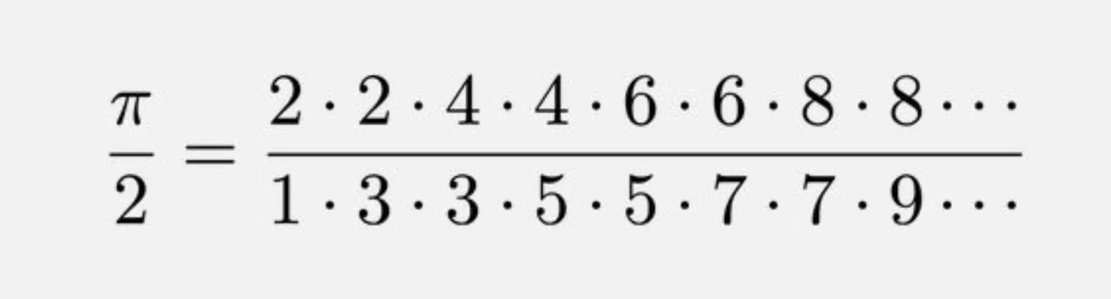
This formula for the constant pi got my attention:

It is the so called Wallis product, a beautifully simple representation of a number that seems very random, the first 50 digits of pi are 3.14159265358979323846264338327950288419716939937510……

Pi governs the shapes of rounded shapes, , waves and much more. The elegance of a circle is simple. But it is governed by a complex set of harmonics and ratios that all relate to each other. Beautiful designs have them, beautiful music has them. In most cases, we only appreciate the end result without grasping the underlying logic.

·Colors

Picking a useful accent colour

SlideMagic uses a simple colour scheme: (just) one distinct accent colour and lots of shades of white/grey/black.

What are good accent colours?

  • One that stands out

  • (This is the tricky bit):

    • One with good contrast with white
    • One with good contrast with black
  • One that fits with your brand and/or industry, or the opposite one that really sets you apart from everyone else in your industry if that is what you want to do.

  • One that you like

People often forget about number 2, which cuts off a lot of creative possibilities with your design

Photo by Daniele Levis Pelusi on Unsplash

·Advertising

Using brands in presentations

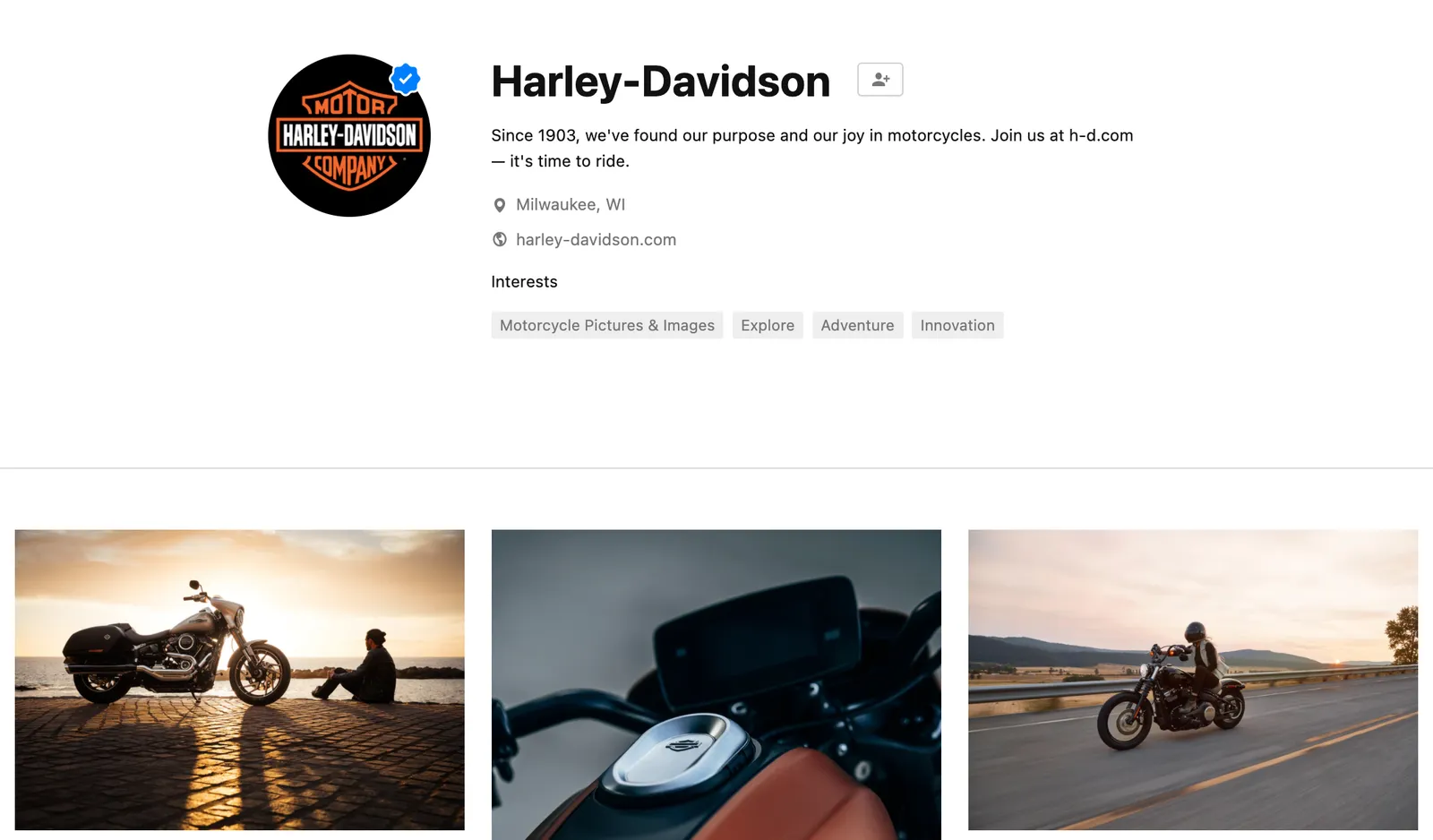
It is usually hard to find good images of products made by well known brands that are of high quality, not obstructed by advertising copy and free of copyrights. Free photo site Unsplash is trying to change that by building up a revenue model where photographers post (and get paid for) posting images with brands in it. (Curated for quality by Unsplash and endorsed by the brand in question).

This is very useful for presentation designers. Looking for a nice Harley-Davidson motorcycle? Here you go.

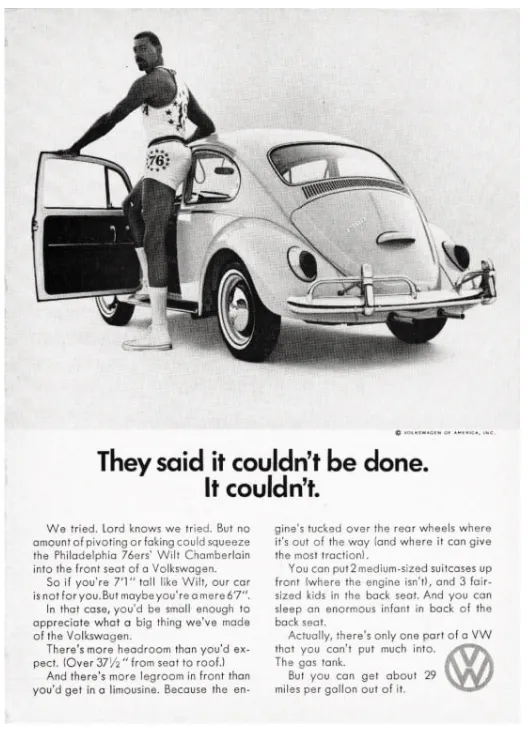
I agree with Unsplash’s observation that advertising has deteriorated in quality over the years.

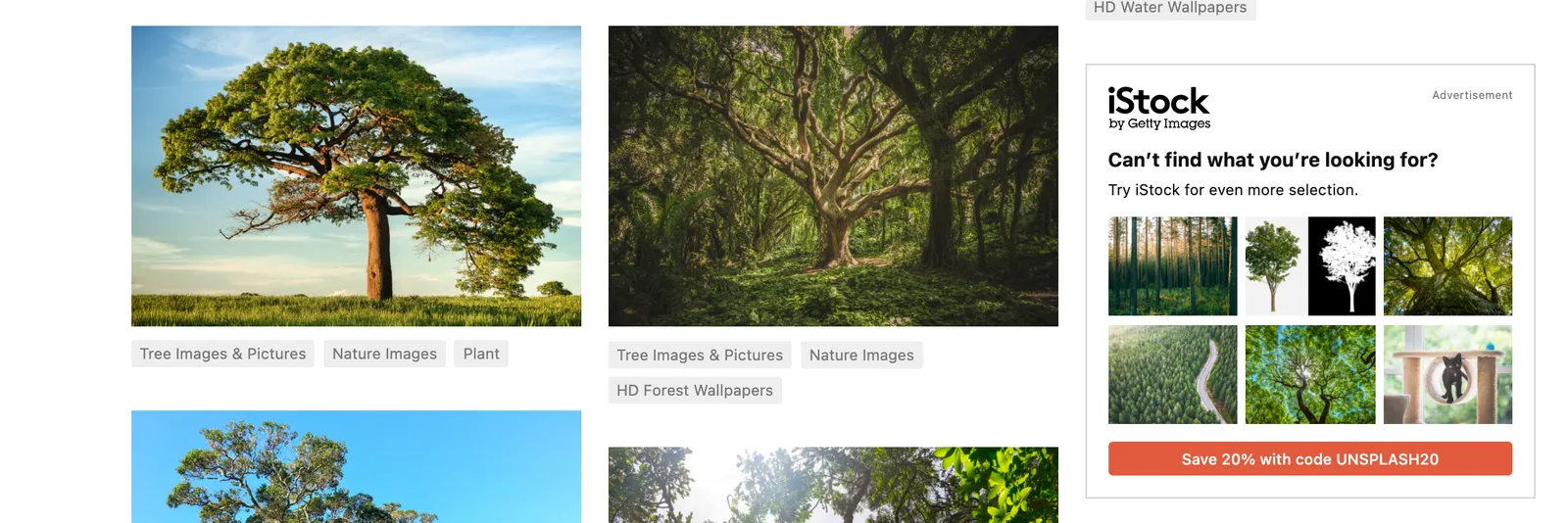
But on their own web site, they can do a bit better with ads for their new shareholder/investor….

Photo by Harley-Davidson on Unsplash

·Design

Will the designer change your text?

When I started making pitch decks 15 years ago, there were not many people who called themselves “presentation designer”. Now the world is flooded with them. But “designer” is a very broad term used by people with varying skills.

Most “before and after” examples on designer’s web pages are beautiful makeovers of slides. Better fonts, better colours, a nice image. It all looks a lot better. But makeovers are makeovers: the fundamental layout of the slide almost always stays the same, and the text always stays the same.

Maybe this is the question you should ask a potential presentation designer: do you rip up the slide, change the headlines, round up numbers, regroup boxes (these 4 points are actually 3), etc.

The text changer is a very different designer from the makeover artist. And very often the text changer might not be very good at design. (The SlideMagic bespoke design pitch was the unusual combination of skills in one pair of hands).

There are different types of designers, but there are also different type of projects, and different types of clients. I had clients who were not that happy that the first draft of their redesigned pitch deck had almost no resemblance to the original.

The SlideMagic presentation software is designed to reduce the dependence on a makeover designer. The average corporate presentation creator can focus on structuring her story, putting the right messages in, and slides will look pretty decent without the need for a drastic cosmetic overhaul.

But, if you are looking for “presentation designer”: know what type of client you are, know what type of project you have, know what type of designer you need.


Continue reading →
·Design

Pick your battles

Professional designers can do it all:

  1. Give slides a professional look
  2. Come up with innovative visualisation concepts that make messages stand out
  3. Use advanced software features to craft technically complex slides

The amateur designer is in a different position and needs to pick her battles. That amazing visual concept of the elephant riding a convertible car does not really work if it does not look picture perfect. That very clever consulting diagram does not really contribute when it actually does not support your message.

You do not need to be a graphics designer to ensure number 1, a decent professional look of your slides. Simple designs can look great (look at Swiss graphic design for example).

When in doubt, drop ambitions on point 2, and 3, and but never compromise on 1. (And this is exactly what SlideMagic is trying to do).

·Concepts

Chart make-over: UK vaccine priorities

I took on the challenge from this tweet:

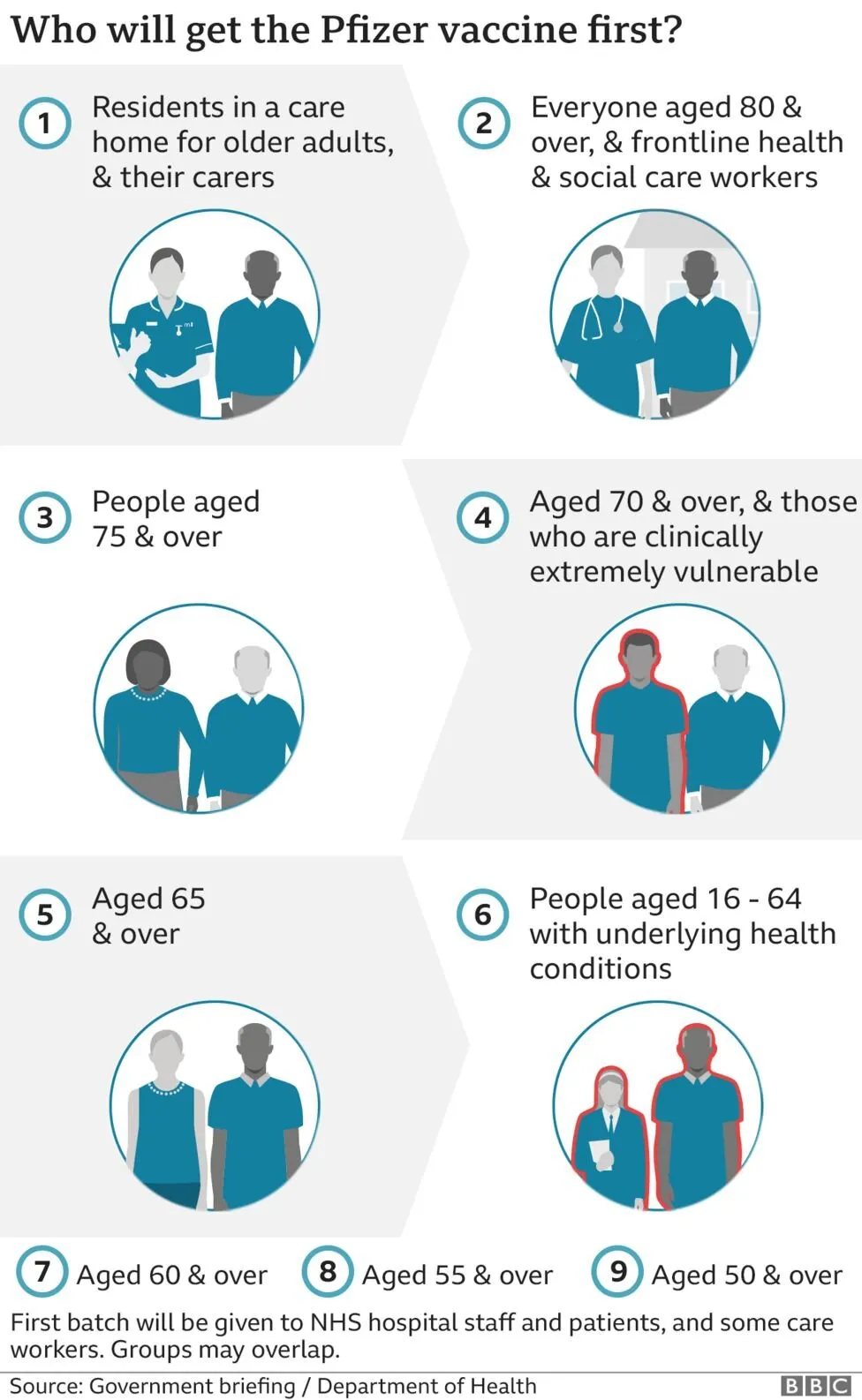
The embedded tweet is obscuring the image, here is the original taken from the BBC:

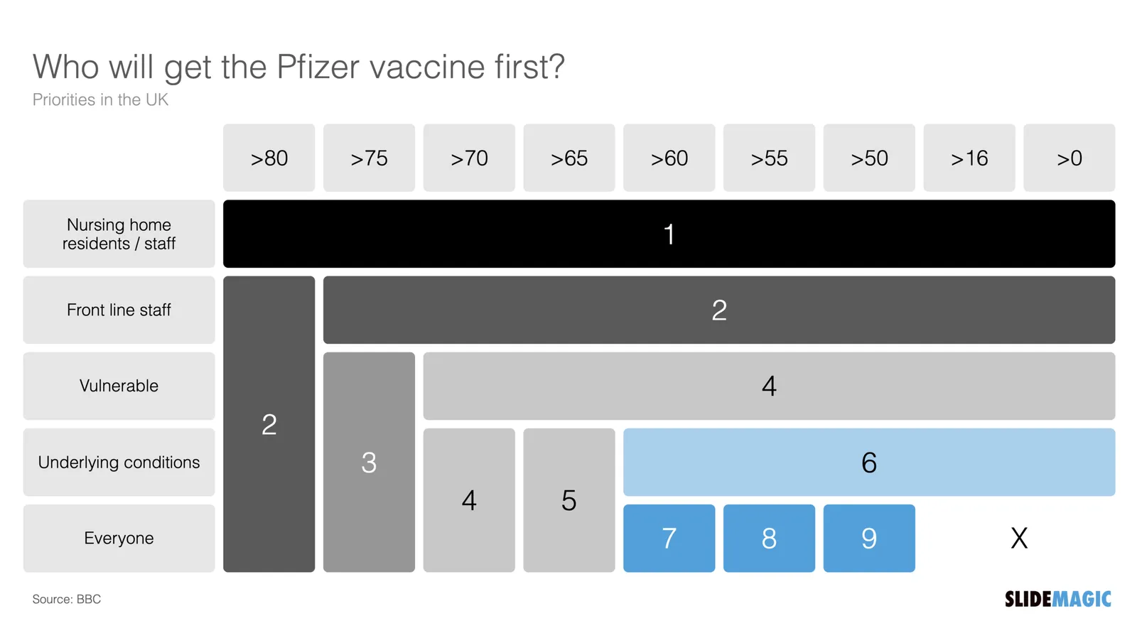
I think these icons are very cute, but are very hard to understand. I quickly put the following together in SlideMagic.

In the philosophy of SlideMagic, not the design of a pro, but very clear and very quick to put together. Notice how I kept things simple, by including the theoretical 0-16 years in nursing home residents, there won’t by any but the big horizontal bar shows the message “everyone” and maintains the visual harmony.

I have added this vaccin priority slide to the SlideMagic template database. You can access this slide for free by simply searching for “vaccine” from within the SlideMagic desktop app.