

SlideMagic Blog

Frequent updates about all things presentations since 2008. Subscribe to never miss a post.

RSS
all posts

Category Delivery

·Data visualization

Boring frameworks

If your business has 15 sales channels, it makes sense to review their performance using the same framework: easy to compare, and you make sure that you are covering everything that needs to be covered.

If you work with management consultants, you will notice that they love this approach. You get presented with a framework, asked to fill it out and then - here is the mistake - the 15 analyses are put on the overhead projector for a nice morning-filling channel performance review session.

Analysis slides are not the same as presentation slides. Keep the boring, structured deck as reference material. But, when presenting: try to break the logical structure. Focus on what is different, remarkable, requires attention. And since each of the 15 channels are different, you will find that these stories do not fit into one framework.
·Delivery

Where is that chart again?

The majority of slides in an average presentation are the bubble wrap that protects the real content. These slides are summary pages, set up pages, and lists of bullet points to remind the speaker what she should be saying next.

One indication that a slide is really needed is that you often look for them in one on one meetings. “Hey, wait, where is that email, with that attachment, with that special slide that I made a while ago.”

Spend more energy making slides like these.

·Delivery

"That took no time at all"

Many younger employees in big corporations have now understood that presentations with many slides that cover one point each are more effective than short presentations full of dense bullet point slides.

Their bosses might not be there yet.

I found an effective strategy to convince them: design the deck the way you want it, and have a test run. In 25 minutes, your boss understands that it takes the exact same time to present that longer presentation.

·Delivery

Zooming without Prezi

If you save your PowerPoint or Keynote file as a PDF and use an iPad with a PDF viewer to project your presentation, you can pinch and zoom into slides without sophisticated slide design techniques or special tools such as Prezi.

PowerPoint for iPad does not support it (yet).

·Delivery

Aide memoire

Many speakers use bullet points to remind themselves what story to tell the audience next. Turn back to audience, say “Uh, and also…” Read out bullet point. Turn back to the audience. Then, improvise (often a very engaging) story. These people actually do not need slides at all. The story is in their head, they just need to be prompted to get the flow going. Two solutions:

  1. Use simple speaker cards instead, and forget about slides all together
  2. Create highly visual prompts: a picture, a slide with just one word on it and use presenter view to avoid having to turn your back on the audience
·Delivery

Do not overdo it

A VC complained a about a Prezi presentation today: a combination of motion sickness and impatience (using 30 slides to make a totally obvious point that could be made in 1).

There is nothing wrong with Prezi if it is used right:

  • Use zooming effects to support your story: zoom in on a technical diagram for example, hop in and out of a time sequence, focus on parts of your product, highlight different areas of a map. Zooming for the sake of zooming is not helping anyone.
  • If you are in a small meeting, leverage the non-linear navigation to have a good interactive discussion. Random story sequence shifts for a big audience makes everyone miss the plot.

Everyone knows that 30 slides with 1 message is better than 1 slide with 30 bullet points. However, obvious points can still be made in 1 slide. I see a lot of presentations on Slideshare that use one spectacular photograph after another to [click] make [click] a [click] totally [click] obvious point (especially social media and/or mobile cliches).

·Delivery

The nose is a lie detector

When people make big statements in a presentation they get a bit nervous (“we are the cheapest solution in the market”) and often cannot suppress the urge to touch their nose to get rid of that subtle itchy feeling. Train yourself to be strong and do not touch your face when making big claims.

·Delivery

From 90 to 100 percent

Sometimes I work with really good presenters that already have a really good presentation. How to get from 90 to 100%?

My approach would be to sit in the audience of a real live presentation, or watch an entire presentation from start to finish on video. Then, create a series of slides that exactly mimic the story. Take out slides that do not really add anything and are just a prompt for the presenter to tell a story. Add black slides to switch off the projector all together. Use very simple graphics and words to support a story. Be a movie director and look at each frame of presenter and slide together.

·Art

Presenter backgrounds

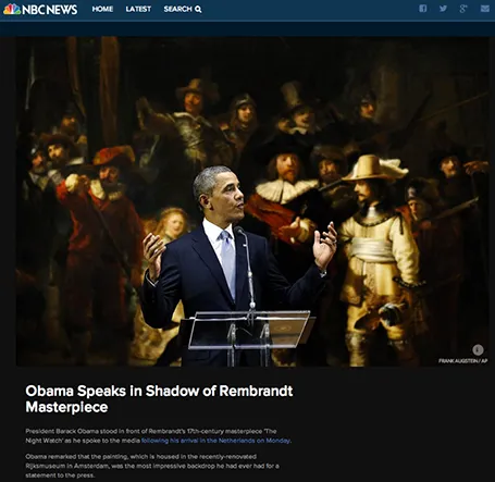
The Obama press conference yesterday in front of Rembrandt’s The Night Watch is an example of how a nice presenter background can make a big visual impact. The dark painting background looks great in close up photos, although less interesting from a distance.

Conference organisers should think beyond the curtain, blank wall, or list of sponsor logos.

·Delivery

Speed up

OK, you learned how to make visual presentations and now you have a beautiful deck with lots of slides full of powerful images.

The next thing is to adjust your presentation style. In the old days: people used to present a slide: take time to read the bullets, elaborate on the graphs, go off on a tangent, improvise a story. Each slide would be up for 5 minutes or more.

With a 50 slide visual deck, you need to speed things up and be prepared. Make the point of the slide (and no other point) and - click - on you go. You are no longer presenting slides, slides are supporting your story in the background.