SlideMagic Blog

Frequent updates about all things presentations since 2008. Subscribe to never miss a post.

RSS
all posts

Category Creativity

·Creativity

2 great creative movies

Here are 2 movies I recently watched that talk about the revolution in the creative industry and how individuals can now deliver the work that a few years ago only could be done by big firms. This is also true for my own firm, where I often work alongside big PR or Investor Relations consultancies.

Indie Game: The Movie is about independent game developers realising their dream and incorporating some very personal stories in their work

PressPausePlay is a more general film covering a lot of creative disciplines

·Creativity

The hard bit

There are 3 levels in presentation design understanding:

  1. Spotting that a presentation looks really good (99% of people can do this)
  2. Spotting that a presentation actually does not look good (this is still relatively easy, although a surprising number of people, including some who call themselves designers, are unable to do this)
  3. Creating something that looks good, this is the really hard bit

A bit of modesty here: I too find myself stuck in level 2 often with my own work, pulling my hair out why it just does not come out right. In the end it is usually good, but it takes effort.

·Creativity

Paperless creativity - iPad calculators

I am continuing my experiment to create a completely paperless creative workflow to increase my mobility. Until now, I had to settle in my creative corner, have my pencils around, have my paper around, before I could get in the mood to do serious design work. I reviewed note taking apps here, now it is the turn of calculators.

Whenever I design a presentation, I almost always have a calculator open on my desk. I design all my data charts by hand, the old fashioned way, doing the final step completely analogue to make sure that resulting slide is really the very best to convey the specific message I want to get across. The calculator is used to calculate the % breakdowns, and to do the final check whether the whole thing adds up. Small calculation errors can distract the audience and undermine the credibility of your analytical work. (I she cannot get the numbers in the chart to add up, what about the underlying spreadsheets?)

So, over the past decades I have used the famous HP 12C as my sole calculator. First in hardware form, then as an app on my iPhone. Since spreadsheets arrived in the early 1990s, I have no need anymore for sophisticated NPV calculations on a calculator. I was simply used to the user interface of the machine, to such an extend that I replaced it for about EUR 100 with a new one a few years ago.

The iPhone HP 12C works, but is not perfectly convenient. I always fiddle with the landscape-only orientation, and the buttons are a bit too small to be convenient. So the iPad solves at the least the button size issue. Like note taking apps, there are an infinite amount of calculator apps available for the iPad (including the build in one).


Continue reading →
·Creativity

Getting the most out of a designer

Designers can do good work, or can do great work. How can you get them to do great stuff?

  • Give them plenty of time. Introduce your pitch way before the deadline, build a relationship, start the actual work with enough head room for creativity and iterations. Good presentations are not born under deadline stress
  • Give them a broad briefing. Tell the story you want to tell in double the time you have. Give background about the story, the audience, the occasion. What goes in the design process, will come out.
  • Give them freedom. Very strict instructions will return your own presentation with the objects on the slide just a little bit better aligned.
  • Give them budget. If after a a long negotiation the designer utters “OK, I will try to squeeze it in” followed by a a sigh, it is unlikely that you just switched on all the creative genius that is present in the designer.
  • Give them a blank sheet of paper. Insisting on using an ugly corporate PowerPoint template is a set up to failure for the presentation design project.
  • Give them access. If the CEO needs to give a presentation, the CEO needs to talk to the designer directly. Chinese whispers through corporate hierarchies dilute the message.
  • Give them sleep. If you are working in different time zones, it can be tricky to find overlapping meeting times. A designer having to get (stay) up in the middle of the night is unlikely to do the best she can.
Continue reading →
·Creativity

Introversion and creativity

This article in the New York Times argues something that I have discovered for myself over the past years: working on your own boosts creativity. I think that 50% of the reason why I can be more effective at designing presentations than clients who hire me is my work environment that allows me to focus without noise and distractions. I explain this every time when people get frustrated why it is so hard to get me to answer the phone or why I take some time to respond to voice mail messages.

Why? Design is a process that requires you to be able to finish a line of thought without interruption. To sketch things. To go back and forth over things at your own pace.  To put your feet up the table. To listen to some music. All things that are hard to do in a conference room.

During my career as a management consultant, I was always surprised that competing firms can make a living as pure process facilitators without getting into the substance. They would get everyone in a room, put up a flip chart, and argued that is enough to get the problem solved.

All of this seems to go against the current trend of collaboration and team work. It does not. Collaboration is not sitting all day in a meeting that goes nowhere. Collaboration is splitting up responsibilities, do the work, discuss, and iterate. Collaboration is not talking, it is doing.

Some more reading material that might help you understand introverted people in a world dominated by extroverts better:

Continue reading →
·Books

Book: The a-z of visual ideas

An A-Z of Visual Ideas: How to Solve Any Creative Brief (affiliate link) by John Ingledew, aims to help you solve visual creative deadlock. Organized in 26 sections following the letters of the alphabet, it introduces a number of concepts that you can use as the basis of your design. Examples: counter-intuition, eyes, juxtaposition, and zeitgeist.

It is written more with advertising or poster design in mind, but still it can help you broaden your creative mind with the concepts provided in the book, or by encouraging to think out of the (visual) box yourself.

·Creativity

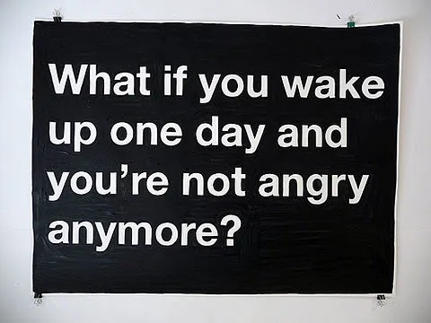
Negative thoughts are creativity killers

I stumbled on this image this morning: such a true quote. Whenever I allow myself to get upset in a Tel Aviv traffic jam, or on the phone to the useless support desk of my ISP, I simply cannot get myself to design a good presentation. The rest of the day is best spent doing the monthly accounting.

Via Diego Zambrano.

·Creativity

6 suggestions for designers to increase their Return On Time

Yesterday I came across a very insightful blog post about what is probably the main source of unneccesary time wasting in enterprises: the clash between people on a maker’s schedule versus those on a manager’s schedule. (Paul Graham is a partner in Y Combinator, a funder of very early-stage startups.)

What is the big idea? There are 2 fundamentally different time schedules that people can work on. The clash between these two causes a lot of wasted time and frustration:

  • A maker is someone that needs to produce/design an endproduct. For a maker, meetings are a disasterous disruption of creativity. They fragment the day, making him/her postpone starting a major new piece of work because “the morning’s gone anyway”.
  • A manager’s day is divided into 60 minutes slots in which meetings can be scheduled. Meetings are a great way to get updates on the progress of things (put all designers in a room and let them present), or meetings are great to expand your network (“let’s grab a coffee”).

Although people in power are usually on a manager’s schedule, it is not neccessarily so that a maker is someone in a subordinate role. Anyone doing creative or problem solving work (designers, engineers, architects, yes even management consultants) is likely to be on a maker’s schedule.

Why does it interest me? Since breaking away from big corporate environments half a decade ago I have been given a great deal of freedom to design my own work practices. To my surprise I have noticed how it is possible to improve productivity dramatically without relying on the leverage of a large number of more junior people working for you. I often get feedback from clients that they outsource presentation/strategy work to me because “you can isolate a piece of quiet time to get things done”.

Continue reading →
·Creativity

Back to basics: going analogue using the pencil (+ a bit of self-relativation)

A nice presentation by cartoonist Betsy Streeter on the front page of SlideShare today:

Ten Great Uses for a Pencil

Two “so whats” for me:

  1. Go back to the pencil when designing presentations. Sketch, erase, sketch, sketch again. A much better creative tool than opening the PowerPoint standard template. Design your slide offline, PowerPoint is a production tool to get your original idea in digital form. Nothing more.
  2. A bit of self-relativation: it is amusing to see how professional presentation designers (ME INCLUDED) increasingly resort to using “back to analogue” techqniques to make their point. We’ve come full circle when we start pasting 10MB high-res scans of a piece of paper, a sticky note, etc. into PowerPoint.  Why not bring the physical flip chart page to the presentation event and leave the laptop in the office? This reminds me a little bit of the joke of the investment banker who worked 100 hour work weeks to retire at 45 and settle in a Mediterranean village to spend the day fishing. His fellow local fisher man has been doing this since he was 15 without going through the trouble. (A better, longer version of the joke here).
·Creativity

Weekend reading: 127 RSS feeds about design

Creating PowerPoint presentations is all about design.

The COLORBURNED blog author shared the content of his RSS reader in this post with a list of 127 RSS feeds “that all designers should subscribe to” (the comments add a few more).

Not sure whether I will do that, but it does provide some good weekend reading.