SlideMagic Blog

Frequent updates about all things presentations since 2008. Subscribe to never miss a post.

RSS
all posts

Category Creativity

·Creativity

Trends in presentation and pitch design

I opened some old presentations on my hard drive and started thinking about how my work has evolved over the past years. Here are some observations:

  • Starting points of presentations (the briefing decks I see) have gotten a lot better. Garr Reynolds, Apple product launches, TED talks, etc. etc., and maybe most importantly a younger post-overhead project generation is joining the workforce, raising the bar in presentation design
  • The audience has evolved as well. People know the general drill of a startup pitch, the Internet or a smartphone is not as strange as it was in the early 2000s. People have the courage to cut a bad presentation short.
  • Back in 2003, I was probably one of the very presentation designers in the world, now there are thousands.
  • Given the above, my work is moving on a bit. While I still do the proper upgrading of the look & feel of a presentation, it is completely not the most important thing I do anymore. Actually, my graphics and visual concepts are getting simpler, and simpler, maybe even regressing to what I did a few years back.
  • Orchestrating the flow of a pitch is still important, but as pitches get shorter and shorter, and everyone has pretty much settled on a classical investment pitch are start to focus more and more and the pacing of the story. People skip over important things too quickly, while spending far too much time on the obvious, and finally sometimes they do not even touch on a very fundamental missing step in their arguments.
  • My favorite design work are the “puzzles”: diagrams that need to show very complex trade-offs, technology infrastructures, or relationships of multiple factors impacting each other. In the end, these diagrams look very simple, but they can take a relatively long time to construct, burning through endless amount of scrap paper in the process.
Continue reading →
·Creativity

Designer state of mind

Creative jobs are different from managerial jobs. I started noticing the difference when transitioning from being a management consultant to a presentation designer. It especially obvious with being sick. As a consultant, I could usually function pretty much normal with the help of some coffee until drastic body feedback such as fever or a splitting headache prevented you from going any further.

With design work it is different. You notice that something is “not right” in your head 1-2 days before the onset of other symptoms. You can’t come up with any good ideas, or you can’t focus on your creative work and decide to do the monthly accounting. So, sometimes after these 1-2 days, I do actually develop symptoms, or things disappear while others in close proximity do get sick.

Image from WikiPedia

·Creativity

Provoking input

In some projects I am literally stuck with lack of inspiration. The slides don’t look good, the concepts don’t pop out. To get going again I actually send the draft slides to the client, who inevitably will come back to me with “hey, we are not there yet”. But in addition, it is often the few other comments that she makes, that provide a way out of the impasse.

It is hard to force creativity…

·Creativity

Adobe Illustrator designers vs PowerPoint designers

Now and then I encounter a PowerPoint presentation at a client which is clearly the work of a designer who comes from the world of Adobe / brochures / infographics. Here are the differences with my style:

  • Often, an incredibly spectacular opening slides (sometimes 2-3), lots of detailed artwork, lots of time invested. Serious designers with powerful graphics design tool out-design me easily.
  • But after a few pages, the design quality drops of, and you can see that these slides are created rather last minute, in a back and forth between the executive and the designer. Maybe there is the occasional icon, but most of it is text bullet points, which are formatted by a professional.
  • Usually PowerPoint’s template functions are ignored, guides, color schemes, defaults, making it very hard for anyone but the designer to add/change slides. “Insert new slide” gets you a blank standard PowerPoint page with nested bullets
  • Heavy use of custom fonts, looking way better than the standard PowerPoint fonts, but they cause issues when displaying the file on other computers without them. Versions of old presentations usually continue to live through the organization without people even realizing that their headlines show in Arial rather than the intended font
  • Massive file sizes as the images are kept in at their highest resolution

Business presentation design is a blend of practicing good design, and making compromises to deal with the practicality of working with lots of non-designers. Being able to deal with frequent changes, keeping design standards up (also on page 5 to 20), and making sure that everyone can make decent looking edits in the presentation.

Continue reading →
·Creativity

More creativity

Some tips on creativity from a book on music production that I recently read: Music Habits, The Mental Game, by Jason Timothy. Most of them are applicable to any creative activity, and that includes presentation design. Here are some that stuck with me (in random order):

  • Have a note book / recording device at hand at any time to write down good ideas you will for sure forget 5 seconds later
  • Kill social media distractions
  • Learn what times of the day you are most creative, and don’t do your monthly accounting during that time
  • Productive and creative are not the same thing
  • When your brain wants to be distracted it could very well be that you are on to something difficult that nobody has ever done before, keep on pushing
  • The genius just tried harder and for more years than you did
  • Be yourself, find your own style, you can never catch up by imitating someone else’s
  • Don’t blatantly steal, but instead, write down what inspired you in a piece of art, put it away for 2 weeks, then look back at it again and build on the attributes of the work, rather than the exact same thing
  • Finnish your projects all the way to the end, and do lots of projects
  • Watching more tutorials, reading more books, buying more tools will not really help if you are not applying what you learned/bought instantly. Get good at using the tools you have
  • If you want to build a habit, you have to do it every day, no excuses, even if it is just 15 minutes
·Creativity

Working with background music

Sometimes it works, sometimes it doesn’t. When I have to write something (this blog post for example) or need to come up with a visualization for a tricky concept, background music disturbs me. It like the melody of the music highjacks my brain and takes things in a different direction than the storyline in front of me.

Cleaning up charts (make-over work), or building financial/economical models works great with music in the background though.

That’s maybe why many people end up writing things late at night: finally it is quiet.

Image from WikiPedia

·Creativity

Uncovering cosmic patterns

Design is all about uncovering patterns and proportions that are somehow hidden in the cosmos. Architects, music composers, graphics designers, chefs, film directors, painters, authors, each is hoping to uncover a genius composition that has been hiding in plain sight for a few billion years.

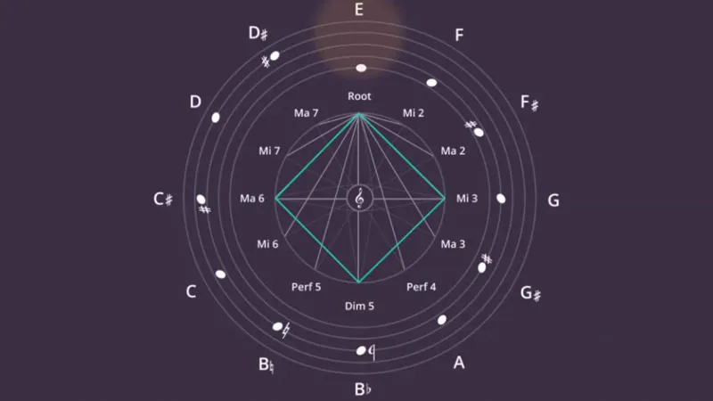
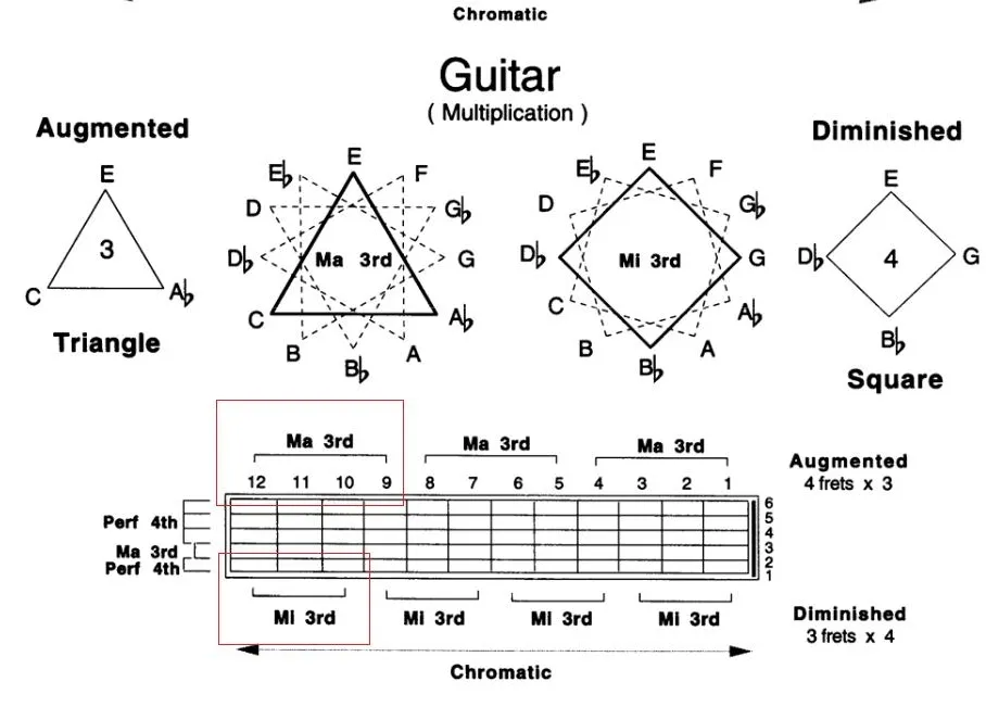
Recently, I was introduced to the patterns that jazz guitarist Pat Martino is using to teach chord shapes on the guitar. The diagram in the video (if you are interested) shows how he uses turning triangles and squares (visual objects) to construct chords (audio).

In other videos, Pat explains how he uses words as musical inspiration. For example, he assigns a note to each of the 26 letters of the alphabet, and then creates words (“beautiful” for example) to see what they sound like.

·Creativity

Presentation culture

CEOs are banning PowerPoint presentations from meetings to improve company culture:

Bad presentations are bad for company culture. And boring the audience is just one aspect of this. People forget the other ones:

  • People waste incredible amounts of time editing footnotes in slides, time that could have been spent much better
  • Presentations are used to keep subordinates busy and under pressure by requesting zillions of updates to the slide deck by 9AM
  • Company management is now mainly suggested slide edits ("cut it to 5 slides’) in emails that go up and down the corporate hierarchy

Presentation documents have become the language that corporate management uses to agree on ideas, and it is a pretty inefficient one. It is time for a change. I don’t think completely banning visuals in meetings will solve the issue. A better alternative is to ask employees to use a super simple presentation tool to back up their pitch to colleagues and I am working on that.

·Creativity

"We just need an hour together"

“I just need an hour of your time to sit together to improve my slides. I know exactly what I want to say in tomorrow’s presentation and all the slides are ready, they just need to be more visual”

I get this type of request often, and I usually turn it down. In one hour, 24 hours before the presentation, you can fix the layout of the slides a bit, but this is where it ends…

A proper presentation design process needs to go through a number of stages:

  • The first briefing, what is the idea you are actually pitching
  • Maybe in the same meeting, the more in depth questioning of the issues. The designer needs to ask the naive/ignorant questions
  • Then putting the whole thing to rest, and scribble some ideas for potential slides over the next few days to come
  • The creation of a basic graphical look and feel, usually I pick a “no brainer” slide for that, the content is crystal clear, it is just about style, fonts, colors layout.
  • Then the drafting of the full deck, going back and forth between “no brainer” slides and the tricky ones.
  • This draft gets then iterated back and forth
  • Finally: rehearsing

It takes more than 1 hour, it needs more than 24 hours, it is not a polish of the existing presentation, which will have vanished totally in the process.

Image from Wikipedia

·Creativity

It is not your fault

Back in the days as a junior analyst at McKinsey you would often see a deck or listen to a presentation that you would not understand completely. Being 23, I usually kept quiet and assumed that this was my problem, not the presenter’s.

Now at more than double that age, I still have the same issue: I often don’t get why something is so special, so unique, so difficult to do from reading a slide or listening to the presenter. My IQ has not changed much (it probably got worse), and yes I have learned things, but the biggest difference that I have gained the confidence to know that it is not my fault. It is OK to ask a question that might sound trivial.

Photo by Matthew Paul Argall