SlideMagic Blog

Frequent updates about all things presentations since 2008. Subscribe to never miss a post.

RSS
all posts

Category Creativity

·Creativity

People like to be told what is beautiful

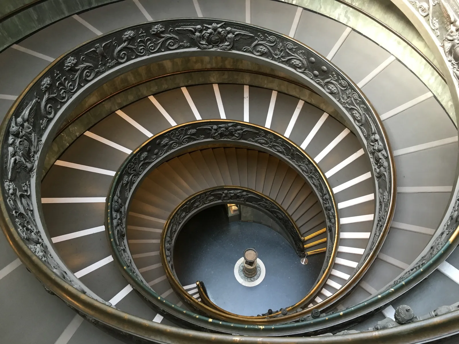
I have been touring the city of Rome for a few days with my son which was great fun. It is amazing to see how tourists gather around sights that guides and guide book say are famous or beautiful. I snapped the double helix Bramante staircase in the Vatican museum (picture below), my guide was surprised I wanted to see it and he had to look for it. You can see on the picture that not many other people were interested.

·Creativity

Great and difficult starting points

There are a number of starting points for my presentation design projects that almost always result in great presentations:

  • The enthusiastic CEO with a strong story who is all over the place with bullet point charts, skipping/jumping left, right, and centre
  • The scientist with a strong idea that is buried in dozens of unreadable data charts
  • The engineer with a great product, presented in a presentation that looks like a deck used to present the result of a school end of year craft project
  • The Fortune 500 investor relations manager with a quarterly results deck in a standard PowerPoint 2007 template that is more of a general company introduction than a razor sharp story updating investors about the key business drivers in the last quarter.

Difficult starting points:

  • A confident CEO, with a visual deck (lots of big pictures) that spends too much time on explaining a relatively obvious point, ignoring the “elephant in the room” practical questions that investors might have (yes, we get the idea, but how can you build this realistically in 3 months).
  • A scientist who is so used to her existing slides that her pitch would not change much, even when equipped with the world’s most beautiful slide deck.
  • An inventor with a great idea, but no team, no plan, no technical approach

Never a dull moment in my profession!

Image from WikiPedia

·Creativity

Designing on small screens

I have argued many times before here that design work on small screens is difficult. It is OK to fix typos in a presentation on a tablet or phone, but the small screen is not the right interface to focus your creative energy. This was the reason that my presentation design app SlideMagic launched as a web app rather than as “mobile first”.

The issue is not constrained to graphics design. Recently I started venturing in iPad apps that aim to be perfect replicas of ancient analog synthesisers. The Moog Model 15 iPad app is a technical wonder by packing so much sound in a small device, and offering a graphical user interface that enables you to connect wires everywhere.

 Keith Emerson in front of a Moog synthesizer  ( image from WikiPedia )

Keith Emerson in front of a Moog synthesizer  ( image from WikiPedia )

The problem is the lack of screen real estate. You have to scroll constantly to go from one end of a wire to another. You cannot get the full picture of what you are doing. An I think that the experience would not have been much better on a laptop either, still to small. You need a very large monitor to get the same experience as standing in front of the actual instrument.

 This goes further I think. Laptops, and before that, crappy 768 pixel, 80x25 character monitors were big contributors to the design mess in business presentations. A big empty white board works better to design charts than a small A4 piece of paper.

Continue reading →
·Hardware

Note taking on iPad in 2016 (2)

I now have spent more hours taking notes and sketching with my iPad Pro 9.7 + pencil combo (read the earlier post). Things are still not perfect.

Taking notes

The big issue is instant availability of your canvas. Keep the screen on continuously and you drain your battery in less than an hour. Do auto-power off and you find your self do this for every single scribble you want to make 1) press home button 2) touch id 3) touch canvas to activate the writing surface. The latter is probably an issue in the Evernote Penultimate app, which has 2 modes: One where you view notes, and one where you can edit them.

Sketching ideas

  • The 9.7" screen is to small for sketching big, bold concepts, I need more space. (But then I don’t want to carry an iPad Pro 12" around). You actually need 2 devices.
  • Current apps don’t support erasing very well. You have to go into a menu, change the pencil to an eraser, erase, then switch it back again. Maybe Apple can put a sensor in the back of the pencil and make it an eraser, or could enable the use of multiple pencils in the same app. My creative process is rather paper intensive. I use a huge pile of old paper: make a bold sketch, toss it away, make another one, and another one, until I iterate to a chart in 10 loops or so. Even the pretty app Paper by 53 does not accommodate this workflow.
Continue reading →
·Creativity

Uncovering secrets

I heard the same thing from 2 sources this week. When we design, we are not really creating something new, but we are uncovering a secret that was there hiding in plain sight for billions of years.

Peter Thiel, co-founder of Paypal in the context of building innovative businesses:

John Frusciante, guitarist of the Red Hot Chilli Peppers, on creating music:

Image from WikiPedia

·Investor presentation

Talking is the best briefing

A story line skeleton is hardly ever the best briefing for a presentation. It is useful for an analyst who has the fill in the missing pieces of data, not to convey a powerful sales or investor message.

The better approach is to set back and talk things over, that’s when big ideas come out.

Image from WikiPedia

·Creativity

Big meetings or email input

Usually big meetings to collect input on a presentation draft are an inefficient use of time. Conversations get side tracked, people make ambiguous comments, introverts who might have intelligent points to add do not speak up (and vice versa). For smaller comments, it is best to have them send to you by email.

There is one exception though: when the overall way to pitch the story is not clear, you have to discuss it with everybody present. Otherwise you end up going back and forth in numerous iterations with a fundamental re-write of the whole pitch. When you do run this kind of meeting, try to keep it focussed on that subject: the overall approach to the story, and not editing sentences and headlines on individual slides.

·Creativity

Freelancer at capacity

After McKinsey, I now spent almost 14 years as a freelance designer. And my work has gone through a pattern that many others are experiencing as well:

In the beginning you run after every piece of work you can get your hands on, invests tremendous amount of energy in projects to over-deliver, producing work that would not meet today’s quality standards (I sometimes cringe when I encounter my early design work). At dinner parties you have a highly elaborate pitch of what you do, and what you don’t do (that story changes monthly).

After a while your work pipeline starts building up. Reputation spreads, and happy customers come back to you for more work. You become more efficient at what you do. And at some time, that efficiency starts eating into your work. You try to please everyone and the only way to do it is to start cutting corners. The result: stress and work that is not as great as it could be. Designs still look a lot better than when you started out (you have learned a lot along the way), but the sparkle in the eye of the client is less bright than it used to be. I hit that point a couple of years ago.

I made a conscious decision to change things. Only accept projects that I knew I could add great value, and take things all the way. This means saying “no” to a lot of distractions. Creative work requires a lot of concentration and even the shortest coffee chat can render an entire morning useless. Out go:


Continue reading →
·Creativity

Full circle

Most presentation design processes go through the following circle:

  1. You scribble  a clean, crisp, story on a white board
  2. That scribble gets translated into the first series of charts/placeholders
  3. Now the dilution starts: lots of data, backgrounds, footnotes, and story line restructuring until we have a bloated, generic collection of charts

The successful presentation design project goes further: cutting things back to reach that level of freshness of stage 1. But there is a danger of cutting too much. Throughout the process, the team has gotten so familiar with the material that they have lost track of the starting point of a cold audience. Things that might seem totally obvious to them (after 2 months of work) are not that clear to a first time audience.

Was all the data digging a waste of time? No, it is good to get your facts straight, as long as you don’t lose the creativity you had in that first kick off meeting.

As a professional presentation designer, I usually come in in stage 3, lots and lots of data, and my kick interview brings back the thoughts that came up in stage 1. An unfair advantage of the outsider…

Art: Kandinsky: Circles in a circle, 1923

·Creativity

Back to pencils

I have tried many tablet note taking apps, but have gone back to the pencil. And of the many pencils I have tried, the Lamy 2000 propelling pencil is my absolute favourite. It is made out of plastic, but has a great feel to it, it has the right thickness, the right balance in the hand and looks great! The origins of the pencil go back to the mid 1960s when the Lamy pencil called in the help of a Gerd Mueller who has previously been designing for the Braun electronics company.