SlideMagic Blog

Frequent updates about all things presentations since 2008. Subscribe to never miss a post.

RSS
·Design

Do fonts display correctly?

I have changed the fonts on this blog to Helvetica Neue, they look great on every computer/browser that I have tried even if you do not have these fonts installed on your computer. Every, except for one computer/browser combination: my own Chrome browser on my own desktop (IE works fine)… Please let me know if you are experiencing garbled fonts on this site.

·Design

Graphics design overload?

I have been browsing through a number of books on contemporary graphics design recently and I must say: “more is better” seems to be the motto of many designs. Adobe Illustrator is powering complex gradients, elaborate ornaments and sophisticated hand-drawn effects. Maybe graphics design is ready for a “Zen revolution” similar to presentation design? (Or I simply have been reading the wrong books?).

stickyslides.com without the blogspot

I am embarking on a rebranding exercise of my presentation design business and in the process, I am also sorting out the various URLs of my online presence. I will continue to host Sticky Slides with Blogger/Google despite the slightly “amateurish” look and feel of the site:

  • I do not want to disrupt existing RSS subscriptions
  • There is actually something to an “amateurish” corner where we can discuss issues related to presentation design outside the context of a corporate brand

Having said that, I managed to get rid of the “blogspot” bit in the URL and the site can now be accessed both on stickyslides.blogspot.com and stickyslides.com, including links to older posts and images.

·Design

Original PPTX files from my posts

Now and people comment that they would like to receive the original PPTX files of the slides I discuss here on the blog. I am hesitant to put them up on a regular basis, but will respond to a request by email or in the comments.

·Concepts

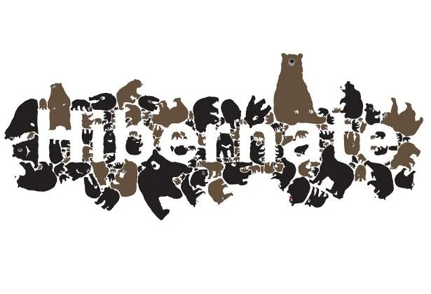
Chart concept - negative lettering space

Here is a cute idea for a slide: negative lettering space. Computerarts.co.uk has a full tutorial how to create this effect here. It is easy to copy in PowerPoint: start with a word in a huge font on a page, set the font color light grey (or another color with a light contrast to your background), fill the page with the images you want, and as a final step delete the text or color it the same as your slide background.

Here is a search for earlier posts with a “can’t see the forest through the tress” type of concept.

An emotion is worth a thousand pictures

“A picture is worth a thousand words” is a famous cliche, highlighting how inefficient reading text is as a means to transfer information.

  1. Read/recognize words
  2. Construct sentences
  3. Extract meaning
  4. Visualize image

Just looking at a picture directly would have saved a lot of time/brain power.

But this is just one level of efficiency/shortcut. Let me explain.

Locked up in your brain are millions of experiences and emotions that you have accumulated over the years. These stored experiences are of a totally different order of magnitude than a simple image. A good presentation slide manages to unlock these hidden experiences in a microsecond: a super brain short cut.

A crude comparison is to look at the basics of the transistor, an electronic component that was the basis of the rise of the portable radio and modern consumer electronics. A small current to the Basis terminal, unlocks a much larger current between the other 2 terminals (image via Wikipedia).

In his book Brain Rules, John Medina explains how smell is actually an even more powerful trigger of releasing experiences than visual stimulation. Besides the technical challenge of using smells in a presentation, it would also be impossible to use them: the smell that counts is the one you personally experienced when “recording” the emotion. They are different for every member in the audience.

I always like to contradict myself, so here we go. Hemingways’ famous 6-word story:

For sale: baby shoes, never used.

is actually an example of how a few words can actually trigger a complex chain of emotions in our brain. More 6-word stories here. But I think it is the exception to the rule.


Continue reading →
·Design

Getting the best creative commons images via Flickr

Stock images are often staged, not natural, lacking spontaneity. Images with a creative commons license on Flickr are an excellent alternative, with one drawback: it is a bit harder to find the right image.

Here is what I do. Now and then I take a Flickr “deep dive” and just randomly browse/search images not using a functional key word such as “chair”, “pilot”, or “apple”. Rather use characteristics that a photographer would use to describe an image. As an example, see what a range of beautiful images comes up when searching for “focus”.

Browse through the images and bookmark them or save them to a tool such as Evernote for later use. An example, a very detailed image of the Manhattan Bridge by See-ming Lee.

·Design

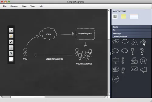
Simple diagrams creates well, simple diagrams

Simple diagrams (link) is a nice little tool to create simple sketches in the spirit of Dan Roam’s book “The back of the napkin” (review). You can either use it as a sketch tool to develop ideas, or as slides in your presentation. The extreme scenario would be to create an entire presentation out of these types of diagrams.

The program uses aggressive pop up messages to get you to use the full version. There are more subtle ways that will get to the same effect.

·Design

$10m - 3 companies - 5 slides

An interesting post on TechCrunch today: Socialcast founder Tim Young explains how he raised $10m for 3 companies using a 5-slide PowerPoint presentation. Some of the points that stood out (please read the full post for the complete picture):

  • In 1-on-1 meetings you can try to avoid the confrontational both sides of the table setting by sitting next to each other and sharing a laptop screen
  • Remember what the objective of your 1st VC meeting is: get to the 2nd one, it is - not yet - about trying to tell the potential investor everything you know about your business in the hope that he will sign the check after 30 minutes. Getting to the 2nd meeting is all about avoiding “rat holes”.
  • Focus your slides (in come the 5 slides he used), but have the 45-slide backup in your back pocket in case you need to lift out a slide.
  • Use (real) images of faces wherever you can to introduce people that are involved with the business (instead of names). When he says faces, faces, faces, he obviously is not referring to anonymous models that are too often found in stock images.

I agree with this approach, I just would like to give a word of caution/some comments. Each startup has a different set of 5 slides. Don’t just copy the ones Tim used. Rather look through the slides and see what Tim is doing.

His 5 slides have no story in themselves, they are pact with facts. Tim is telling the story himself, without slides. Only when he needs facts he reverts to slides. “Look at the credible team and investors we have” [Very dense slide packed with names, photos, and logos]. “See that there at the bottom? 75,000 i.s.o. 5,000 users per server, let me explain” “We’re on a roll” [Very dense slide with performance metrics], etc. The exception is slide 3, an abstract graphic that you can almost draw on a napkin to explain the key idea behind the business.

Continue reading →
·Concepts

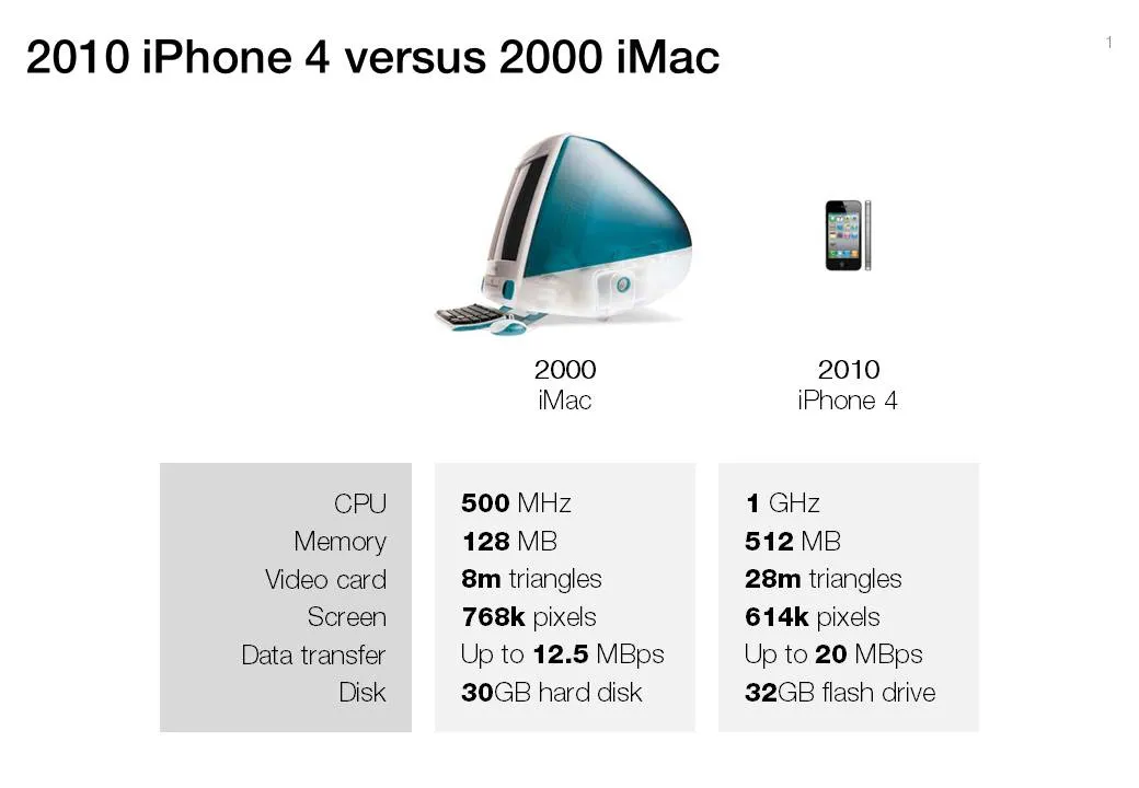
Chart concept - 2000 iMac versus 2010 iPhone 4

A chart concept I used yesterday in a client’s presentation to demonstrate the progress of personal computing technology over the past decade (technical details taken from this post by AdamH).

There is no point to construct complicated bar charts to compare the values of the technical specifications, they are similar (the point of the chart). Rather what is important, is to shrink the image of the iPhone so that it’s more or less to scale with the much bigger iMac.