SlideMagic Blog

Frequent updates about all things presentations since 2008. Subscribe to never miss a post.

RSS
all posts

Search results for “web design”

·Design

Preserving custom fonts when presenting away from your own computer

Complex, custom fonts can be beautiful. Seth Godin even recommends everyone to buy their own as one of his 9 steps to PowerPoint magic.

One problem, custom fonts are a disaster when used on a machine that is not yours. And you discover it when you click through slide 2 of your presentation in front of  a live audience…
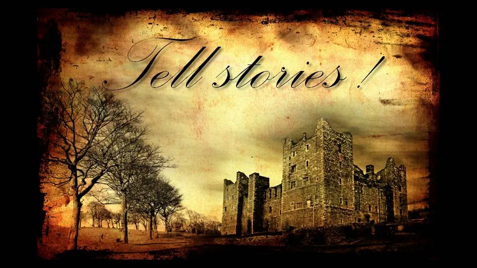
Therefore, I won’t use them as my default font in a presentation, but only in specific pages. Here is the trick:

  • Make a copy of the original (editable) slide and put it in the back of the deck, you don’t wont to lose the original
  • Group all elements of the original slide into one object
  • Cut it (CTRL-X)
  • Paste special as “PNG”

The whole slide has been transformed into an image which for sure will show up correctly on whatever computer you are using.

UPDATE: POWERPOINT NINJA SHOWS A MUCH BETTER SOLUTION. HOW TO EMBED CUSTOM FONTS IN POWERPOINT: LINK

Background image purchased on iStockPhoto. Font used is Palace Script MT, built into PowerPoint 2007.
·Advertising

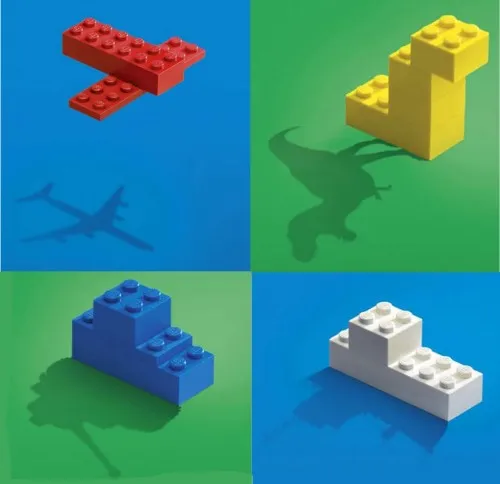
One Lego visual - 2 insights about leveraging imagination

I found this great Lego ad yesterday on SlipperyBrick:

Sometimes relying on audience imagination can work, sometimes it does not.

  1. Sometimes it can work. Although adults might lose some of their imagination capabilities over time, it is still possible to get across visual messages with very simple graphics. Simple shapes, simple cartoons, even just creative typography. The mind will fill in the missing pieces
  2. Sometimes it does not work. The book Made to Stick introduces the concept of Curse of Knowledge. The presenter “hears”/imagines a tune in his head and taps it with his fingers on the table. All is perfectly clear to the presenter. All the audience can hear is… someone tapping.
·Design

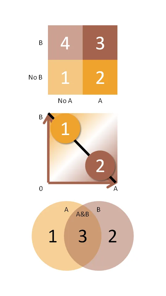
Chart concept: the 2x2 matrix and other grouping techniques

McKinsey and other management consultants love 2x2 matrices (and obviously 3x3s). Personally, I think they are often overused (framework overload).

Not every categorization can be crammed into this framework.

  • The axes need to be logical
  • The groups needs to lead to 4 categories, i.e., leaving one or two boxes as “not applicable” does not make sense
  • They work particularly well when you want to show things moving from one category to the other
  • They are good to show that something stands out (from for example the competition) by popping up in the top-right corner

Here are some other techniques to group items on a PowerPoint slide using line and venn diagrams:

  • Diagram 2 - “you cannot have it both ways”
  • Diagram 3 - “the best of both worlds”
·Design

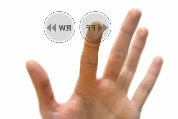
Chart concept: "fast forward" - a good summary chart is like a good headline

Putting a summary slide as page 1 in your PowerPoint presentation is tricky.

  • A diluted and boring summary might turn the audience off (“let’s check email on my phone”)
  • A summary chart might “give away the point” of your presentation too early
  • Some presenters might get stuck on page one and tell the whole story without using any other slides (sometimes this can be a good thing, a presentation with PowerPoint)

A good page one is a slide that gives the audience some clue about what’s going to happen and presents an interesting teaser about what is to come.

Now that I come to think of it - a good summary chart is like a good headline

The following image (purchased from iStockPhoto) adds another possibility to presentation opening concepts I discussed before (here, here, and here). “Let’s fast forward to the end before diving in”. Shrink the image to one side of the screen and add your teaser in big-font-text

·Design

Create a Twitter background using PowerPoint

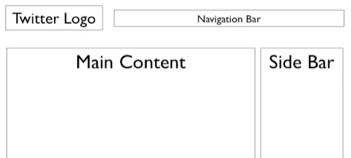
There is a lot of (white) space for self expression on Twitter in its background image. (Not implying that “cluttering it up” will make it look better though) The “The Closet Entrepreneur” posted a tutorial how to create a Twitter background in PowerPoint. It includes a template with the areas you should leave blank for Twitter’s own content.

P.S.: follow me on Twitter. Via Digital Inspiration

·Advertising

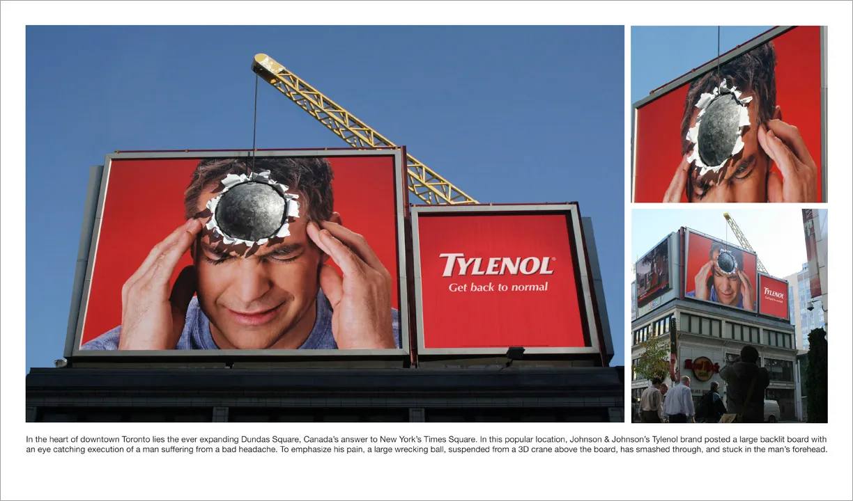
Great visual - you can almost feel the headache

I am adding adgoodness to my blog roll. This is another great find.

·Design

Nokia E71 - great phone, screen graphics could be more "Zen"

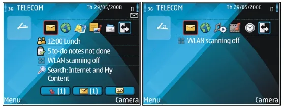
My wife had to swap her mobile phone because my 2 year old son decided to empty a bottle of water on her previous one. These things happen. The new phone is a Nokia E71. Phone reviews are a bit out of the scope of this site (it is a great phone by the way), but I can comment on the graphics of the user interface.

Nokia could have done so much better:

  • Like almost all mobiles, there is a busy wall paper crowding the display
  • Overly sophisticated icons with random colors
  • Different font (sizes), poorly aligned.

Mobile phone screens can also benefit from a “Zen” make-over to transform them into calmer and more minimalist user interfaces

PowerPoint and mobile phone interfaces are the same: the fact that you can make that sophisticated watermark background does not mean you have to use it!

·Design

Not all presentations are "Zen" - different formats for different settings

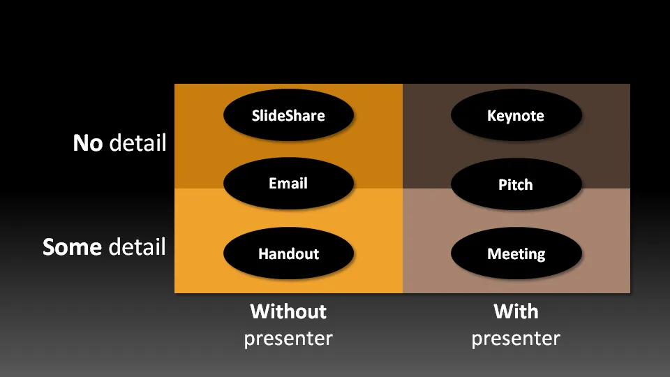
Not all presentation settings are the same. A “Presentation Zen” slide show with stunning images and the incidental word on a slide is great for a keynote, but might be a bit too much to discuss last quarter’s financial results. The 50 page deck with bullet point slides might be serve better as a printed business plan than the key communication tool for a 20 minute VC funding pitch. I have tried to describe 6 presentation scenarios and categorized them according to:

  • Whether the  presenter is present or not
  • The amount of detail/data inside the document

Here we go (click image for bigger picture):

  1. The key note is the classical “Zen” presentation. Huge fonts, dark background, few words, large images.
  2. The pitch is similar to the key note, with the difference that it might be shorter, and does contain some more data to answer questions from the much smaller audience.
  3. The meeting presentation is probably done on a light background, and contains much more facts and details. Over-simplified slides with beautiful pictures do not work in the small conference room with people ready to go through raw material. McKinsey and other consulting firm’s presentation often fit in this box.
  4. The slideshare (or online) presentation is something relatively new. People see it typically in small windows, i.e., fonts should be big, pictures should be nice. The audience of this presentation is highly impatient, clicking rapidly to reach the end, and aboning your presentation if it is not interesting enough. No animations here.
  5. The email attachment is similar to the key note presentatation with an important difference that it needs to stand on its own, titles need to explain the messages in the charts. Some animation could be used here (sparingly though). Detail is less than the handout.
  6. The handout contains the full detail, the full text. It should be prepared on a white background (people will often print it) and use no animation (again, does not come out in print). For VC pitch situations, the good handout makes the business plan “brick” obsolete (hardly anyone reads these anyway).
Continue reading →
·AI

ChatGPT Images 2 beats Nano Banana

Another day, another model improvement. The latest visual model by OpenAI is now the gold standard for creating realistic image, beating Google’s Nano Banana (August 2025).

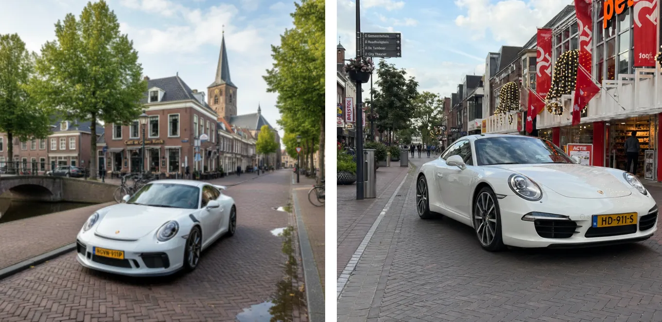
I prompted a “911 in Hoogeveen” back in an earlier post to Nano Banana (left), and the ChatGPT result today to the right. Nano Banana figured out Hoogeveen was a town in the Netherlands, and created a historical Dutch town as the backdrop, ChatGPT got the actual details of the town (which I recognize very well), but created its own mashup version of the city.

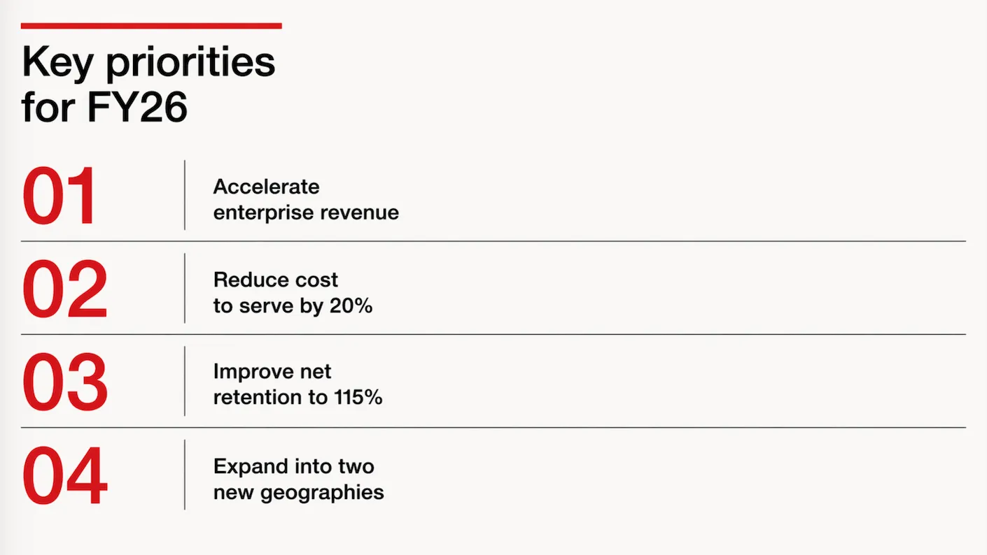
Text rendering is now great. Look at the traffic sign: correct spelling and places relevant to the town. The model is actually incredibly good at making slide in consistent on-brand format. Below the result of a request to transform a slide in a 1960s Swiss graphic design style. The catch: you get pixels not a file you can edit…

It achieves these results not by just being a better pixel generation model. The response to a prompt now involves reasoning about it, sketching a few raw options, ‘seeing’ (an LLM cannot see) the intermediary results, picking the best one, then producing the final result in pixels.

ChatGPT Images 2 is now the default model in ChatGPT, it will be used when you ask it to create an image. Set the model effort to ‘thinking’ to add more reasoning effort in the processing.

To be continued.

·Software

None of the tools were right, so I quickly wrote one...

This is 2026… I needed a super basic text editor for Google Drive. If you double click a text file in Google Drive, it will convert it to a bloated Google Doc for you. You can install text editor apps, but they all come with a catch: too many features, 1990s UI design, ads, paid plans. So i used Codex to write me one… Writing the app took 10 minutes, configuring the Google Cloud Console a few hours (but now I know the drill).

I have requested Google to approve it to get rid of warnings when you install it. The primary user is me anyway, so I won’t put it out in the add-on market place.

You can try it: drivedraft.slidemagic.com. Sign in with your Google Account. Now go to Google Drive and right-click a .txt or .md file and choose ‘Open With’ DriveDraft.