SlideMagic Blog

Frequent updates about all things presentations since 2008. Subscribe to never miss a post.

RSS
all posts

Search results for “web design”

·Design

You don't have to be dyslexic to benefit from these presentation design guidelines

Reading through a web site with guidelines for designing web pages for dyslexic users, I realized how valuable these recommendations can be for any audience, not just people with this condition.

This is a PowerPoint presentation design guide 101:

  • Choose a big, san-serif font
  • Avoid capitalization
  • Apply a calm background, no watermarks
  • Don’t righ-justify text
  • Minimize use of italics
  • Keep things short, write in a simple style
  • Use bullets (if you have to), don’t write proze
  • Refer to the reader as “you”
  • Stick to narrow columns, text lines
  • Use pictures
·Design

Injecting a designer's personal touch into a presentation

All presentations I design are used by others - not me

All presentations I design have a serious, professional subject

Still, I like to add a personal signature to my work. How can you do that within the constraints of the presentation other than the little reference in 8pt font on the last page?

As a designer you can steer the choice of visuals you use with things you are passionate about:

  • When you need an urban street image: take one from Paris, even better Boulevard St. Germain, even better people sitting outside Cafe de Flore…
  • When you need to express harmony use a black and white image of Miles Davis playing a away…
  • When you need to visualize something agile and fast, take a bright yellow Mini car…
  • When you need a newspaper cover, take one from a memorable date…
  • The list can go on and on…
·PowerPoint

Video in a webinar?

The big problem in webinars and web meetings is the upload bandwidth. If you are running the presentation live from your computer, then the speed at which attendees can download your high-res images, video, or animations is the speed of your upload connection which in most cases will not be much more than 1Mbps. Download speeds are much higher (I have gone up to 50Mbps recently).

 The solution for this would be to upload the bandwidth-heavy content beforehand to a server, and only use your live upload connection for the audiotrack. Some web meeting solutions such as SalesCrunch (disclosure, a client) allow you to upload presentations beforehand. But video does not work (yet). Do any of you know a solution or a workaround that allows me to use video in a live webinar?

P.S. An earlier post about how I use an iPad to log in as a participant to monitor what my audience is seeing during a webinar.

·PowerPoint

In Paris early December (LeWeb'11)

I will be in Paris around the LeWeb’11 conference early December. Feel free to contact me if you would like to hook up in person.

·Delivery

Better webinar software?

I now did a few online webinars and I found it a great way to connect live with an audience without the need to travel, and without the requirement to get a large group of people together in one physical location.

Having said that, the experience from the presenter point of view is far from optimal. You are talking into a microphone, staring at your screen without any feedback. Here are some suggestions to make better webinar software and make the webinar experience a bit closer to that of a live presentation.

  1. Avatars. Encourage people to upload avatars when joining a webinar as an audience member, and more importantly, have these avatars show up on the presenter’s computer. In that way you get a sense of a real audience in front of you. I am sure as technology progresses it would be possible to create a virtual audience shot of live video avatars
  2. Kill presenter distractions. Applications that I use show statistics of people online, people leaving, people joining, people that are active, versus people that are checking their email in another browser window. Some applications require the presenter to let people into the session during the presentation. This information is useful, but there should be a way to switch it off, enabling the presenter to focus on her story. In real life, the presenter on stage does not need to open the back door to let someone back in to the room.
  3. Find a better way to moderate questions. At the moment, questions get punched into a small chart window. There is a constant flow of information, and chart windows are too small to be able to read the text. In a real live presentation setting, people do not shout their questions at the presenter all at the same time. There should be a 2-stage process: 1 audience members need to indicate that they want to ask a question, then the presenter need to give them the floor, and only then can the question be asked. Either through a live voice, or through a text box that has big fonts and can easily be read by everyone.
Continue reading →
·PowerPoint

Reminder: my webinar tomorrow

Just a reminder that I will be hosting a webinar as part of Ellen Finkelstein’s Outstanding Presentation Workshop tomorrow. Details of the event are here.

·PowerPoint

Speaking at one of the Outstanding Presentations webinars

For the second year in a row, Ellen Finkelstein is organizing her Outstanding Presentations workshop, a series of 7 weekly webinars by guest speakers. I will be one of them. Here is the line up of presenters:

  • September 7: Carmen Taran, co-founder of Rexi Media and author of Better Beginnings
  • September 14: Cliff Atkinson: author of the Beyond Bullet Points
  • September 28: Bruce Gabrielle: Author of Speaking PowerPoint: The New Language of Business
  • October 5: Me
  • October 12: Simon Morton: Founder of Eyeful Presentations
  • October 19: Andrew Dlugan: blogger at the Six Minutes blog
  • October 23: Ellen Finkelstein will be wrapping up

For your calendars: October 5, 14:00 EST

The sessions are free and will be recorded for later viewing. More information about the Outstanding Presentations webinars here. Please note that you still need to register if you want to view the recorded sessions.

·Delivery

Sync narrative and visuals in web presentations

Online presentation sharing services such as SlideShare allow you to upload an audio track alongside your slides. You need to make sure that the narrative is exactly in sync with the visuals.

I have seen (heard) examples where the audio presenter starts talking about data or concepts that are not present on the visual in front of you. As a result, the brain starts to wander off, looking for missing pieces of information on the slide.

When talking to a live audience in person, you can draw the attention from the visual back to you. An exact sync is less important, and it is easy to fit in a slide story. During a short web presentation with audio, your audience is using the narrative as an explanation of the slides. Make sure they are lined up.

Sometimes, when you are short in time, that might actually mean inserting a slide with some quick (very short) bullets (did I just write that?) or a short sentence to support your side story. Something like: “Case example: 22% cost savings”

·Design

Clutter-free web site screen dumps

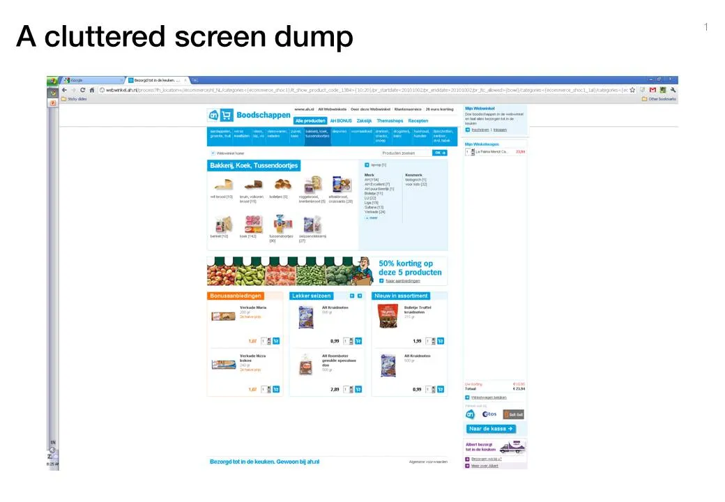
Screen dumps are often used in VC pitch presentations; either to showcase the company itself, or to give examples of competitors in the market. These screen shots are often filled with excess visual details:

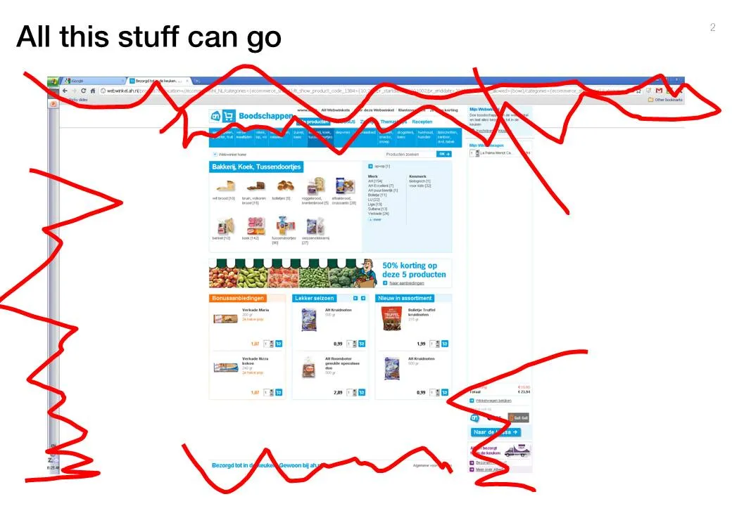
  • The Windows title and scroll bars (sometimes with personal information such as instant messaging windows or the names of other web sites that are open on the screen)
  • The menu navigation structure, login windows, banner ads that surround the core web site.

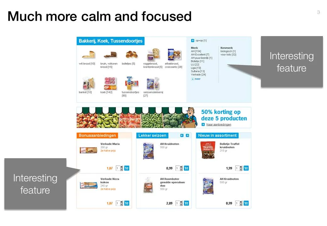
Cut this clutter to create a much calmer slide that allows you to focus on what feature/aspect you would like to highlight.

·Design

Microsoft Office web apps are going live

Microsoft is quietly rolling out its office applications in the cloud. They announced that the web-version of major Office applications are live, at least in a number of countries/languages. In Israel I could get it to work. Try for yourself here.

I have been following these in-the-cloud initiatives closely, and must conclude that Microsoft stands a good chance to be the winner. I chose Microsoft over Google docs for a recent project that involved collaboration in multiple countries.

It looks like the world is dividing into 2:

  1. Consumers and freelancers using Google Docs, iPhones, prezi, SlideShare, Windows 7 or Apple OS, gmail, freely sharing stuff over social networks and insecure internet connections
  2. Corporate workers using Blackberry, Microsoft Office 2003, Windows XP as a result of strict security guidelines and cost cutting in IT budgets (i.e., delaying upgrades of software). These people are struggling to find stuff in their bulging Outlook 2003 inbox.

The learning curve of switching user interfaces of Office applications is huge (read: costing a lot of money in downtime and helpdesk support), and for a big corporate to switch means that everyone is required to change habits: the 25-year old tech savvy analyst, the 60 year old secretary of the CEO, the CEO herself, to name a few. It’s just hard to move them out of the Microsoft world.

Ultimately, the big corporates will move Office applications/data into the cloud, there are significant benefits to collaboration and simply finding stuff. They will go with Office Live though, and not with Google Docs…


Continue reading →