

Book review - "Brain Rules" for presenters
I finally got around reading Brain Rules by John Medina and can confirm that it is indeed essential reading. Not only for people interested in visual communication (the likely reader of this blog). But it is also likely to change some of your fundamental perspectives on life if you are a knowledge worker, a manager, a student, a teacher, a parent, or any combination of these.
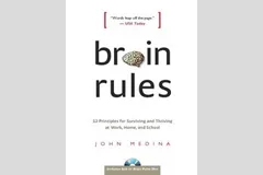
The book has been reviewed extensively elsewhere, and a good web site covers its basic ideas centered around 12 rules. I will not repeat this, but rather dive in to some of the details that I marked on the pages because I found them interesting. Most of them (but not all) are related to visual communication. Here we go.
- Contrary to popular belief that (brain-related) things only go down after the age of 28 (millions of brain cells dying each day), the brain can renew. Just exercise and stay curious.
- Everyone’s brain is wired differently, wiring gets decided early on in a person’s life. Surgeons about to operate on a patient need to keep the subject conscious with exposed brains, while touching part of it to figure out what’s inside. “Someone just touched my hand”. This allocation might impact performance. “Don’t let the superior temporal gyrus host your critical language area. Your verbal performance will statistically be quite poor”.
- We don’t register boring things, after 10 minutes of a continuous flow of densely packed information, our attention is close to zero. A presentation should have a break, or something to wake us up every 10 minutes (or better still, presentations should last 10 minutes).
- The first few moments of exposure to new information are the most important. Presenters should not waste it on boring generic overviews of their presentation, long-winded introductions of themselves. Leverage the fact that all brains in the audience are still switched on.
- Recalling an emotion at the moment we are fed information the first time greatly improves our ability to remember it. Dare to use creative tools. “Apologies for the ugly drawing of this huge orange turtle, but it walks about as fast as the typical decision making processes in our company”. People will be talking orange turtles for the rest of the day.
- Vision trumps all other senses is almost a cliche (the 1000 words etc.). We know that images in presentations are important. But here is interesting bit: reading text is difficult. Decode the funny shapes, construct the sentence, understand its meaning… Bullet points and text books create too many processing layers between information and memory. But this gives also food for thought to reconsider some of the “big font/powerful quote” slides. “20% of kids are obese” combined with a huge picture of a fat kid walking out of a fast food outlet. Sounds powerful, but I think visualizing the 20% will do an even better job of getting message across.
- Vision is more than just registering an image. There are different parts of the brain that deal with color, motion, patterns. The brain is especially good at the latter. Use patterns, repetitions, in charts. Especially to visualize data.
- The brain fills in missing gaps in a visual picture. When you imagine something should be there, you see it. Drawings don’t need to be perfect. Rely a bit on the audience’s imagination.
- Meaning before details. We need to internalize what things mean before we can remember them. Out with the buzz words, out with the cliches. “Our new holistic security concept delivers scalable ROI that helps you stay competitive in an ever changing world”.
- People need to sleep to function well. Poor sleep kills 20% of your brain power, that’s about 2 hours worth of work for an average working day. Brains are build to deal with short-term stress (“help a tiger!”) but cannot handle prolonged pressure. Manage your deadlines. A last minute, late night presentation iterations will for sure not deliver a brilliant end product. Our brain continues to chew on an idea in our sleep, give it time. These findings put into question the whole system on which corporate work environments are managed.