SlideMagic Blog

Frequent updates about all things presentations since 2008. Subscribe to never miss a post.

RSS
all posts

Category Story

·PowerPoint

The counter top presentation

I am currently designing a presentation that is supposed to run on an iPad that sales people take into busy, noisy small businesses to sell something to an owner who does not have time to listen to us.

Of course it has to be short. But we are pondering whether to go with lots-of-big-pictures-slides in 4 minutes, or a few condensed slides in 4 minutes. Big images are better to catch the attention of the owner, but constantly swiping through slides on an iPad might be awkward, and standing in the way of creating a human one-on-one interaction.

On balance, I think to go with the first, what do you think? Have you had experience with this?

·PowerPoint

Writing it on every page

Sometimes a senior executive comes in at the end of a presentation design process and starts making some “edits for clarity”. She probably does not have a lot of time to go through the deck in detail, but wants to make sure the key points are said. No better way to do this than adding the words “flexible solutions ” on as many pages as possible. Now the deck says at least what it is supposed to say.

When this happens, it is time to stand up for yourself.

·Advertising

Presentation first

Presentation design often comes at the back of other marketing communication (advertising, scripts for brochures, white papers, and web sites). In many cases, marketing can benefit from the opposite approach. Visuals are much better to lay the foundation of a marketing story than text. And it is far easier to involve a CEO or other senior executive in a visual presentation design process, then force her to go through revisions of text. So a good presentation design project does not only give you a nice slide deck, it might well provide the inspiration for an entire marketing campaign.

·PowerPoint

Non-wordy-self-explanatory slides

Everyone has bought into the idea that presentation slides full of text are poor communicators of ideas. The result is that many presentations are now so minimalist, that hardly anyone can understand them without verbal explanation. This creates a problem, as more and more, slides are used as commercials of ideas that are shared without the presenter being present (yesterday’s post).

One solutions is to add an audio stream to your slides, or going a step further, turning your slide deck in a small video. This requires some technical skills though. Also, busy important people often prefer to sticking to the communication medium that they have grown up with: slides. But, they like to do so at their own pace (meaning fast), impatiently looking for a visual that catches their attention. Boring blah blah blah gets skipped.

So what to do in situations where you do not have time / resources / patience to separate slide decks for a live presentation and a cold email attachment? Some ideas.

A very clear headline. Write your message out in a human sentence, you can even change your presentation template to allow 2 lines of text at the top of your page.

Pick useful images. A big squished orange to support that your are crushing the competition does not add much. A photograph of bored people waiting and lining up to buy paper lottery tickets to argue that there is a market for mobile lottery makes the point perfectly.

Swap verbs for visual concepts. A tension can be 2 boxes of text with a rope in the middle that is about to snap. An implication can be arrows with 2 words in each pointing to another box with 2 words. Best of both worlds can be a Venn diagram. Contrasts can be 2 boxes with opposing colors.

Continue reading →
·PowerPoint

Making a fool of yourself

Reading through the book The a-z of visual ideas, I came across this tip: do not hesitate to make a fool of yourself in a creative briefing. So true. I think the largest part of my contribution as a presentation designer is asking the stupid questions, and having the courage to take a fresh perspective on things.

If you design your own presentation, ask a friend or colleague to take the role of asking the stupid questions. If you are working in a big corporation and need to design a presentation for a senior executive,  maybe try to get a few minutes of 1-on-1 time to ask the stupid questions, it easier to make a fool of yourself there then in a huge meeting.

·Delivery

Timing your elevator pitch

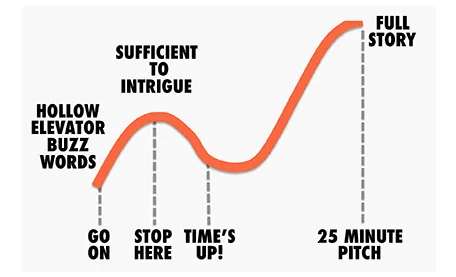
Sometimes there is little time to do your pitch. You meet an investor in the corridor, you got a slot at a pitch competition. Seth Godin said the other day that no one has ever bought anything in an elevator: in other words a very short elevator pitch consisting of 2 sentences with hollow buzz words is not going to excite an investor.

Instead, you need to add more specifics to intrigue the investor to invite you to another occasion where there is more time to discuss your idea.

But sometimes, elevator pitches become less effective when you take too much time. You start adding details, provide facts, that take the energy out of your presentation, that require time to close all all the plot lines. There is a dip between the perfect short pitch, and the full-length 25 minute story. Do not get stopped in the middle, it is better to keep it short.

·PowerPoint

Little (cultural) differences

More and more people understand the power of personal stories in presentation design. One of the easiest sources of stories are things you are passionate about. Many people are passionate about sports, and as a result, sport analogies often are used to give a more personal flavor to a presentation.

That is great, but only for a national audience. There are little cultural differences.

People in Europe have never seen the 2006 Super Bowl finale, and do not know who the coach of the New York Yankees is. And vice-versa, very few people in the U.S. will remember European sports stars.

If your presentation travels across borders, think of other ways to connect to your audience.

·Delivery

Avoiding the answer is not an answer

A politician in a television interview can sometimes get away with giving an answer to a different question than the one that was asked her. Or filling time with some meaningless generic statements, after which a smile indicates that she is ready for the next question.

In a VC fundraising pitch (or an interview for a position) this does not work. If you think you need more time to get to an answer, think before speaking. You cannot parallel process coming up with an answer and speak coherently (both will be bad). If you hope that by repeating something what you said before you might manage to skip the difficult question, it will just bore the VC and make her impatient.

Sometimes it might be best to admit that you do not know or do not want to disclose it.

·PowerPoint

Think of yourself as an interviewer

Back in the old days at McKinsey, your interviewing skills as a consultant on a team would be evaluated roughly on 3 levels: 1) you got the piece of information you needed (the market for [x] is $1bn, 2) you managed to get an insight that was completely new to the team, and 3) you actually made the interviewee realize something she did not know before.

Great journalists know exactly what questions to ask at what time in the interview. The interviewer draws out the story of the interviewee.

When designing a presentation think of your self as the interviewer. If you design something for someone else, then you can take it literally. If you design something for yourself, imagine interviewing yourself in front of a big audience.

Poor interview question: what five pieces of research support the assumption about the target market size? Good interview question: what, I thought only 5 people need this product, give me a feel for why this thing is huge? Poor interview question: “Now that we have spent the past 30 minutes analyzing the market, let me ask you: what do you actually want to achieve?” Good interview question: “before we dive in, tell us quickly what your ambition is”. Poor interview question: “So let me re-phrase what I think your story is”. Great interview question: “But is your story not a bigger one if we draw the parallel with this?”

Then you will have hit level 3, the interviewee walks out of the chair with a different perspective, and the re-designed presentation will be more than a beautification of existing slides. Which interview do you want to follow to the end, and which one will you skip with the mouse or remote control?

Continue reading →
·Delivery

Preaching to the converted

A story from the early 90s. Back then I had recently joined McKinsey as a Business Analyst and got involved in recruiting presentations at Dutch universities to try to convince more engineers to apply for a  position. The slide deck covered it all: our offices, our expertise, our clients, our selection process.

Until one day we did a survey asking the audience to rank how useful this presentation was. The outcome: people already knew that we were probably very smart, worked with prestigious clients, were unlikely to starve because of lack of financial resources, and were very professional.

The questions the students had were: are you guys human or nerds, do you really have to work 80 hours a week, how on earth can a physics engineer be useful there? These questions you cannot really address on a slide, so we cut the introduction presentation to the minimum (to re-confirm what people already knew), and then switched off the projector and started talking about us as a person, and opening up the discussion for questions.

Preaching to the converted is a waste of time. Instead, use your presentation to address the issues the audience has.