

SlideMagic Blog

Frequent updates about all things presentations since 2008. Subscribe to never miss a post.

RSS
all posts

Category Investor presentation

·Investor presentation

We are big

What you measure is what you get is a common management saying. Most line managers in large corporations are focussed on market share rankings and top line sales figures. Chart after chart of many investor presentations often repeat that same message, look how big we are. But a simple “We want to bet the biggest” is unlikely to be a compelling strategy to investors. How are you going to turn that size into shareholder return?
·Investor presentation

Twitter IPO presentation review

The Twitter IPO presentation is posted online. Overall it looks good and very professional, here are my thoughts on how it could have been even better (comments in random order):

UPDATE: The official presentation has been taken down, it is still out there on YouTube:

  • The whole story is structured around a description of Twitter, what do we do, how do we make money, how are we going to grow. It could have been pitched more to the point: why is Twitter such a great company to invest in. This would have changed the flow of the story significantly
  • For knowledgeable investors, there are a number of huge elephant-in-the-room questions about Twitter: the biggest one being, how are you going to make money? The presentation should have included hints to the answer to that question upfront in the presentation, and elaborate on it more during the presentation (the CFO only gets to the meat around 27 minutes into the talk, many potential investors might have tuned out by then).
  • The presentation is full of social media speak: engagement, driving conversation, rich media experiences, content, etc. To an industry insider, the sentences make the exact point, but to an audience who might be tuning in and out (watching the presentation online, while now and then checking the email inbox in another tab), this creates too much white noise to which the brain pays limited attention.
  • The look and feel. Twitter has an incredibly powerful branding (colour blue and the bird). It could have been used more prominently in the slides. Not by increasing the side of the logo, but by using the graphical language in the actual content of the presentation.
  • Using the actual embedded Tweets in the presentation is good, but the small print makes them hard to read for the audience. Also complicated conversations (a celebrity chefs replying to a person preparing for a dinner party for example) do not really come across, or worse, the audience is trying to read all the stuff that is going on on the screen (windows, tweets, hashtags) and loses the audio narrative that drivers the big point home. A better solution would have been a tiny representation of the actual Tweet with an extreme close up of the content that actually matters.
  • The 16:9 aspect ratio leaves some canvas blank on the tiny 4:3 screen of this 1990s video delivery platform of the Retail Roadshow service. For an IPO this size, they should have resized the slides.
  • The energy of the presenters (CEO, CFO) is held back a bit sometimes. In some sections, it flares up. For example: the interesting statistics about Tweets during TV shows, or the CEO closing remarks about the importance of the platform that can give everyone a voice.
  • Some very interesting messages are not reinforced by explicit slides. I found interesting for example that on Twitter, advertisers can target people by their actual interests in life, while traditional advertisers have to derive/guess these interests from demographics information. A big point, it deserves a slide. Another example: the majority of Twitter users are outside the US, while international ad revenue is a fraction of the US one, again a point that can be made in a slide, ideally with some growth curve that shows that it is not unreasonable to assume that international ad revenue is catching up to US levels fast.
  • Video is used only in the beginning of the presentation (mainly portraying the founders), it could have been used throughout the presentation.  Interviews with people, or snap shots of important live events that were broken on Twitter. The video animation of the spread of the Obama-4-more-years Tweet was amazing to watch, and only popped up in a small window.
Continue reading →
·Investor presentation

"Do something like this"

I get this request sometimes, with an attached presentation of another company. Most of the time, the example presentation is actually not that good.

My theory of why it still appeals to a client? It is written in the same corporate language that she uses. As a company insider in a similar industry, she can instantly decode the language and it all makes perfect sense. Two CEOs communicate to each other in highly efficient compressed CEO speak.

The problem is a competitor CEO is unlikely to be the audience of your presentation…

·Investor presentation

So, in short?

This is a great question to ask yourself after you finished designing the presentation.

“Well, what I really want is raising a bit of extra equity to de-leverage the company (slide 12, yellow bars). I think it is a really good deal for investors, since it looks like the stock is undervalued (slide 24, bottom right). Management has delivered on all its promises over the past 5 years (slide 15) and no one in the industry has a scale that is even closely to ours (slide 37 on the left), so it looks like our advantage will hold out for the foreseeable future.”

 Your presentation can be shorter: focussed slides upfront, with extra info in the appendix.

·Investor presentation

Amateurish format or no format?

It requires some skill to get a presentation to look professional. And when you are a boot strapping startup, I think most investors will forgive you if you did not have time or money to get your investor slides look completely perfect. You decided to put your effort elsewhere, rather than spending it on PowerPoint looks.

So, the bare PowerPoint template with a tiny logo on the bottom right looks, well, bare, but you could still say it is professional, sort of. Worse is when you put in a lot of effort and the results do not look good:

  1. Clashing colours
  2. Too childish, or too cute for predominantly machine/male investors
  3. Tacky, cheesy stock images
  4. Super complex gradients and other template graphics that take over 50% of the slide surface

No format works for an early stage startup investor pitch with a good idea, it will not work in a sales presentation though.

·Investor presentation

Investor pitches evolve

As your company evolves, so will your investor pitch. At the idea stage, you are mainly concerned with explaining your idea and establishing you as a credible entrepreneur.

But with a product up and running, a few customers, and some revenues, investors will turn to other things like customer acquisition cost, churn, customer close rates, whatever is relevant for your industry. Inevitably, your deck will become less creative and resemble more a standard business presentation full of numbers and data.

Do not use the pitch deck from last year for your next investor meeting.

·Investor presentation

Big co versus small co

I have seen big improvements in the presentation design of my startup clients over the past year. In some cases when the design is adequate, I have to admit that my involvement might not be the best return on investment for a start up on a tight budget.

Whereas startups are adopting new design and story telling ideas rapidly, the opposite is true in big corporates. Corporate culture (“This is how we do things here”) is reflected in PowerPoint decks that look pretty much the same as they did 5 years ago. Managers go through the ranks by continuing to use PowerPoint like they used to do, and new recruits get told to stick to the format.

When designing for a startup, we can dive straight into the content of the presentation, when designing for a big corporate we first go through a process to convince them that a visual presentation can still be serious.

·Investor presentation

Fitting the trend

The world of Internet startups is filled with buzzwords: SoLoMo (social, local, mobile), freemium, wearable computing, big data, social sharing, sticky eyeballs (2000), monetization, consumerization to name just a few.

I see many startups trying to force-fit themselves into one of these trend boxes. You start with the buzzwords, then steal charts about the buzzwords from analyst reports (“online video will be huge in 2017”), and then present a diluted story about your company, showing how it fits in.

A better alternative is to explain how your company solves a big problem in a unique way and worry about the buzzwords later.

·Investor presentation

Investor infographic

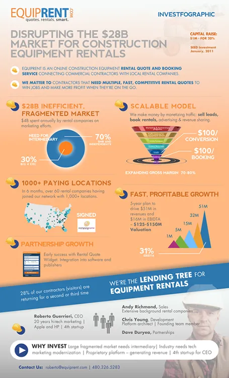
Equiprent is raising money, and put together an infographic to attract the attention of investors (found it on the Cool Infographics blog).

What I like about it:

  • One page Executive Summaries are boring and yes, this is a much better way to grab attention. Equiprent is realistic and does not think that this graphic is landing them the investment. Its sole purpose is to get a 5 minute phone call to discuss the next steps in the fund raising process
  • The company is not afraid to get the fact that they are fund raising out in the open: it says so, it shares their suggested valuation, and it states how much they are raising in return for what % of the company. I feel that the benefits of publicity and reaching more investors outweigh the drawbacks (putting some of your company secrets out in the open). The fund raising process can be much more open than hush hush discussions in small venture capital meeting rooms.
  • The infographic itself catches the basic points of an investment pitch, if an investor is convinced that all the claims are true, she will for sure invest in the venture.

Some feedback on where it can be improved:

  • From a design perspective: some objectives on the page can be aligned better
  • Content-wise: maybe the fragmentation point can be beefed up more. It is the core argument of the pitch. I have no immediate suggestion how to do it better though
  • Financial projects look impressive, but have little credibility without the accompanying assumptions
Continue reading →
·Investor presentation

"I get it"

Yesterday, Seth Godin posted about us thinking that we can absorb anything in 140 characters. Part of it is true, but part of it is that we fail to fully immerse into something.

Busy venture capitalists often show this behaviour. In the first few seconds they try to put your idea inside the framework of other similar ideas in your field of business and they get it, they think.

Think about this when you prepare your investor presentation and put emphasis on those aspects that are different, not that obvious. Even to the point where you make it extremely explicit: “I see what you are thinking, but no, this is not the [FILL BLANK] for [FILL BLANK]. Let me explain why.”