SlideMagic Blog

Frequent updates about all things presentations since 2008. Subscribe to never miss a post.

RSS
all posts

Category Investor presentation

·Investor presentation

Finding the bottleneck

If you are struggling to get traction with your investor presentation, it is worthwhile to try to find out where the bottleneck is:

  • Do investors understand what I am trying to do?
  • Do investors understand that this is a big problem/opportunity?
  • Do investors understand that someone can make a big business out of this?
  • Do investors understand that I am the person who can make a big business out of this?

These are slightly different questions than the ideas entrepreneurs often have:

  • My slides do not look “slick” or professional enough, let’s add some colour
  • The story flow is not completely right, let’s talk about the market earlier
  • We have not put in aggressive enough financial forecasts, let’s bump it up to $100m
  • We did not put in that Gartner total market number for 2016
  • We are not mentioning the right buzzwords, let’s add a few
  • The deck is too long, let’s cut it down to 5 slides by combining pages
  • We should use Keynote or Prezi, PowerPoint is stale
  • We should invest in a video clip
  • The deck needs more animated slides
  • AirBNB raised a lot of money, let’s copy their pitch deck

Art: Edvard Munch, Self Portrait with a Bottle of Wine

·Investor presentation

Filter your VCs

Fred Wilson discusses a blog post by the CEO of eShares about his fund raising experience. Let’s throw in my experience as an investor presentation designer (both for startups and VC/PE funds themselves).

  • A decision in 5 minutes. Yes, most VCs will make a decision whether an investment merits deeper due diligence in 5 minutes.
    • This might actually be good news for startups. If you have a good deck, you can get to a decision without travel-meeting-travel.
    • It proves again that a 5 minute pitch is not 5 minute filled with fluffy buzzwords.
    • If the feedback from a phone call is “no”, it is probably highly unlikely that banging the VC on the head for 60 minutes in a meeting or coffee chat is going to change her mind. Better spend that energy on another investor. If you ask why, and she says “the market size” politely, coming back with 50 slides about the market size is not going to change her mind. Market size is probably not the real reason
    • That coffee chat, is actually a meeting that is further in the due diligence process: you passed the first stage (you seem to have an investable idea), now things have moved on to checking you out as a person/CEO. There is no better way to do that then a brief meeting. Even if you just talked about the weather, the investor will make up her mind about you.
  • Risk-related questions are a sign that you are moving in the right direction. An interested investor is trying to figure why she should not invest in you, much better than a bored investor trying to fill the 30 minutes with asking questions why she should invest.
  • Combine the above points and you can see the implication for your pitch deck: very focused, highly emotional, visual, charts to get the big idea across in a few minutes, and actually more charts for those risk-related questions, to take the obvious questions out of the investor who has bought into the basic idea.
  • Investors are increasingly specialised and have a specific mental model against which they evaluate opportunities. If your business does not fit a specific model/investor profile, find a different one rather than forcing let’s say a semiconductor business into a CAC/LTV/churn SAAS spreadsheet
  • One more point about the 5 minute pitch. I had client briefing meetings where I only go the point of the pitch after 45 minutes of discussion. I tried from the left, from the right, tried again, thought it was just me who was to ignorant not to see something, until finally the coin drops. Be very perceptive when someone in front of you who is willing to grant you the 45 minutes, this might just save your 5 minute pitch.
Continue reading →
·Investor presentation

The press release is dead

TechCrunch blogger Mike Butcher wrote an interesting blog post about how to pitch to tech journalists/bloggers. It is well worth a read (below are his slides that convey a similar message from 2012).

Like VCs/investors, tech journalists are overloaded with inbound pitches. There are similarities in the way you should pitch them:

  • Get straight to the point, cut the fluff/small talk
  • Give more or less the full info the 1st time around, no “can I send you some more information”
  • Be concise and clear what your project does and why it is great

There are differences though with investors:

  • Exclusivity (breaking a story first) is really important to journalists, so blasting your news out to 100 people is not going to make it more attractive
  • Journalists really want something to be news (dah), something that the world has never seen/heard before, investors are looking for the big returns, even if it is an old idea that is recycled
  • Big $ fundraising is seen as validation by journalists, investors probably care less (at least the good ones who can spot a rough diamond before everyone else)
  • Journalists might not have the in-depth technical knowledge as a highly specialised VC (an early stage medical device investor), and like to compare/contrast companies and technologies to the ones they know (competitors).
  • He loves plain text and hates PDFs/attachments. This partial because of practical reasons (mobile devices, copying quotes), but also - I suspect - the journalists are actually used to digesting written/verbal communication and less used to digesting visual slides (hypothesis).
  • The world of tech journalism is changing. In the early days TechCrunch used to be all about startup discovery, now there are increasingly other news sources that plays this role (Product Hunt for example). Mike says he is increasingly interested in deeper, background stories. So putting your pitch into the context of an overall trend that is happening might make it more interesting to publish.
Continue reading →
·Investor presentation

I am going to force feed my Executive Summary on you

People often ask me what an appropriate summary presentation is to send a head of the actual presentation, the dreaded “Executive Summary”.

Executive summaries and web landing pages have similar objectives. Keep the user hooked long enough to transfer the idea/messages and get her to do something at the end (click “BUY”, or reply to the email and set up a meeting).

In web design, people have learned a lot. Use lots of white space, attractive images, links with inviting text that scream “click me”, cut out boring non-essential information and put that on pages for people who want to look for it.

The Executive Summary though is still in the 1990s:

  • We expect tat our story is so boring that we need to drag the reader through it as long as we can
  • The solution: cut the amount of pages (maximum 2), anyone can read just 2 pages right?
  • Whoa, how do fit all this information on there: reduce font size
  • We need a big bold vision statement upfront (1 paragraph at least), a big bold vision statement really encourages the reader to keep on reading. Maybe there will be more big bold statements on page 2? Good stuff!
  • The it is important to link our idea to all the latest buzzwords, readers love to hear more of the things they read on the latest tech blogs. Even if it is vaguely related to your idea, put them all in there. Wow, this Executive Summary is all about these great trends? I have to read on!
  • After rereading the Executive Summary, we find that it sort falls out of the blue. We need to tie it into the big things that are happening in society. Mobile phone penetration is huge right now. Social media is changing the way we consume content. (This is especially true for younger people). Gartner and IDC have some good stats and quotes on this, let’s add them. The reader must think: I want to read more about this!
  • The broader market (TAM) is just absolutely big. We are the only company in this space but the market will grow from $15b (2011 data) to $32.67b in 2014. This size market? These guys have discovered something that I completely missed, must read on.
  • Our technology is absolutely amazing. Let’s start with the bottom architecture layer, and build it right up step by step. The “secret sauce” that makes us so scalable and flexible
  • We are 1.5 pages in, time to introduce the idea.
  • Oops, what about the team? Five bullets with CV summaries (don’t forget the undergraduate degrees, and our hobbies).
  • Squeeze the margins a bit, it just fits.
  • Now copy paste selective paragraphs to put in the cover letter of the email.

Continue reading →
·Investor presentation

Team slide, in the front or in the back?

Where to put the slide with the team? Early in the presentation, or towards the end? It depends.

  • If your team is one of the main assets of your startup, well, put it up front.
  • If the majority of your team is sitting physically in the presentation room, well, you might as well use the team slide upfront to introduce them
  • In other cases, I gravitate towards putting the team slide in the back, after your pitch of the big idea of your venture.

The team slide in a live presentation is different from a detailed bio

  • The presentation slide should emphasise what is remarkable about your team, and omit other details:
    • If your team worked at a lot of big, blue chip companies, splatter the slides with recognisable logos
    • If your team has a history of working together, show a time line with overlaps
    • If your team consists of brilliant scientists, show the awards they got
    • If your team has complementary skills, show the puzzle with all the pieces
  • The detailed bio is important as well, for people to read/study after the meeting. This can be a dense font 10 page that goes in the appendix of your presentation. You can include links to LinkedIn profiles as well on this page.

Art: Jacob Jordaens (1593–1678), The King Drinks

·Investor presentation

Salami slicing valuations

Negotiating company valuations is part art and science. Science (Excel sheets) can be helpful, but also dangerous in investor presentations. One risk is “salami slicing”. I explain what this is in 2 examples

  • You email the full valuation Excel model that backs up your $95m valuation (cell D34 of the DCF worksheet) to the other side. Obviously this model is full of assumptions, and these assumptions are set with a seller’s bias. The buyer can now take each of these assumptions one by one, nock them down a bit, and get an instant reduction visible in cell D34. Your own logic is being used against you. In M&A situations it is better to just exchange assumptions and let the other party stitch them together to a point estimate in their own model.
  • You are an extremely early startup and benchmark your valuation against an Internet giant on let’s say a sales multiple. The salami slicing can now happen in multiple ways. You should correct the multiple downwards to compensate for some assets that facebook has, and you obviously do not have, or people can go back in time and see what facebook’s valuation was when Mark just started out in his garage.

Watch out for the salami slicer.

Art:  Albert AnkerStill life Excess (1896)

·Investor presentation

Investors spend <4min on your pitch deck

Here is an interesting analysis of VC pitch decks that were hosted on the DocSend slide hosting/viewing platform. They aggregated data (anonymously) about what slides were included, how long the slides were viewed, how many meetings it takes to close the round etc.

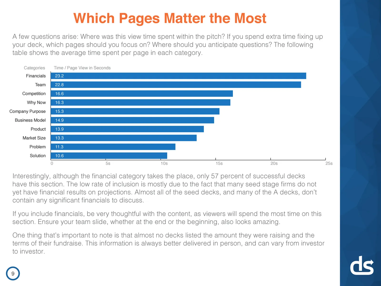
Investors spend on average 03:44 minutes on a pitch deck, and 12% of them does so on mobile devices. In the second screen shot you see what this means per slide: 10 to 25 seconds. That is all you have to get your message across.

I do not completely agree that the ranking shown here implies how important slides are. Slides with financials, competitors, and team bios on them take more time to digest.

You can see the full results of the survey here.

Art: The dance to the music of time c. 1640, a painting by Nicolas Poussin

·Investor presentation

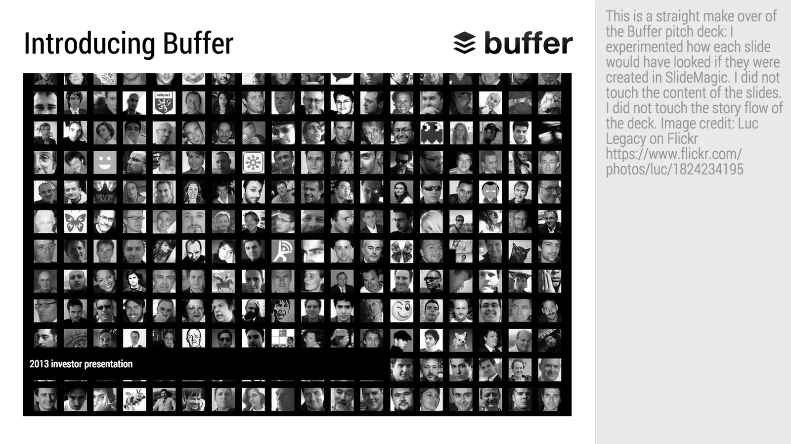
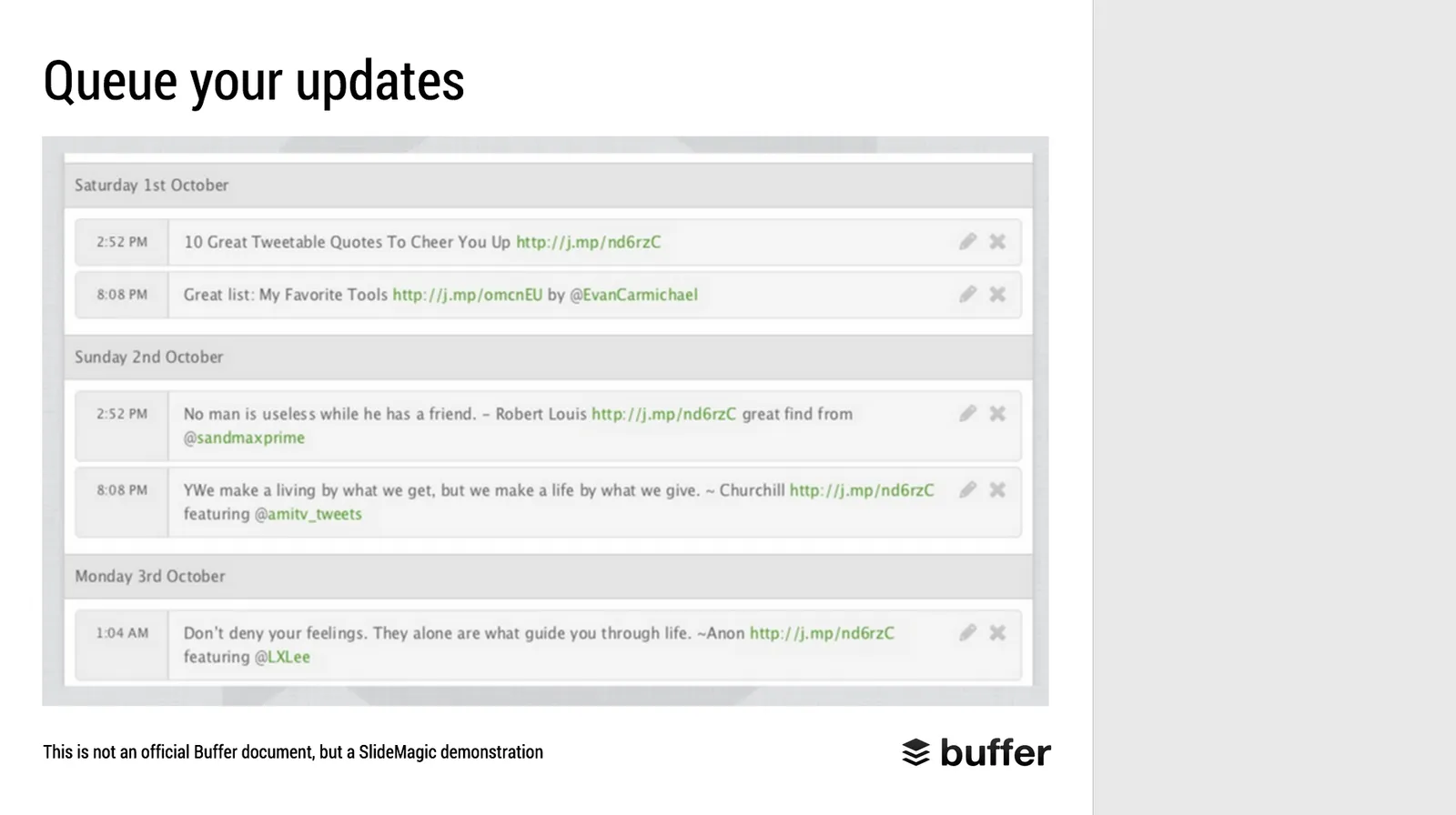
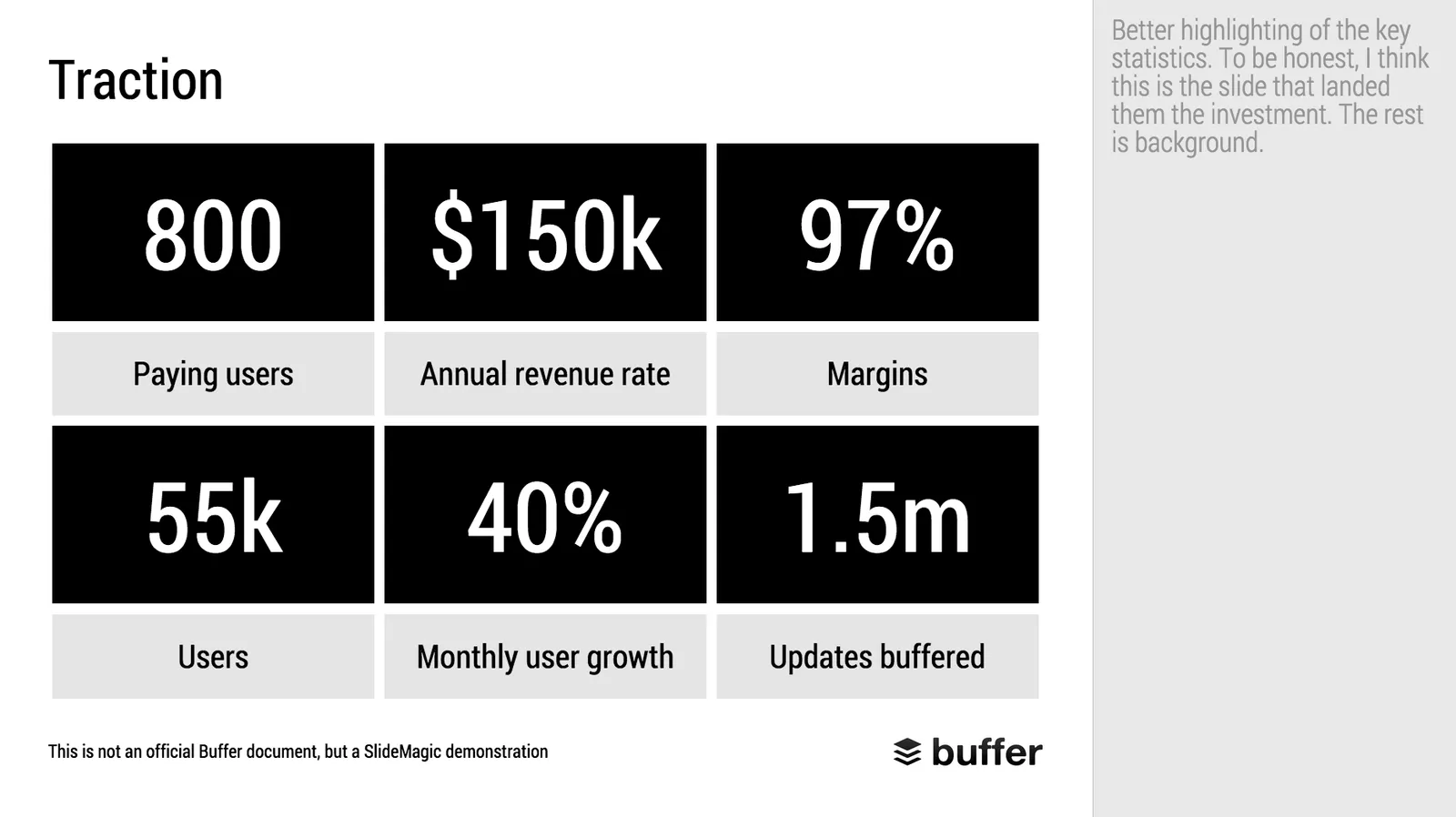
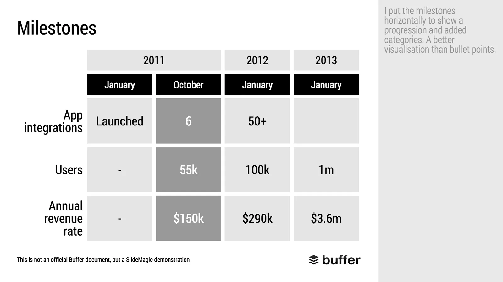
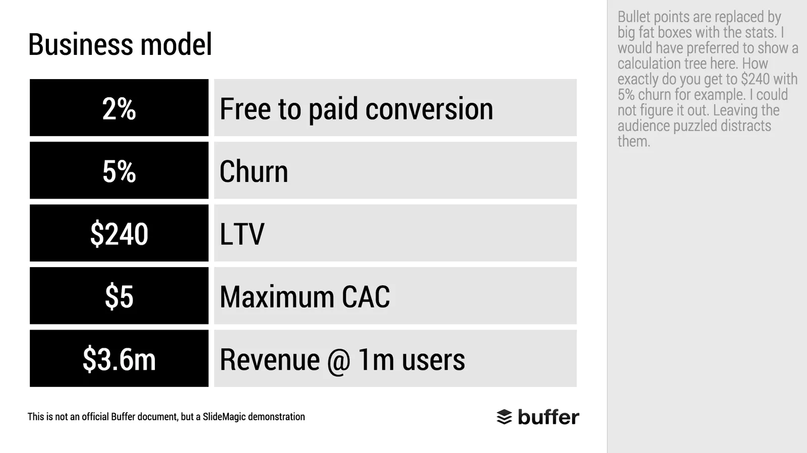
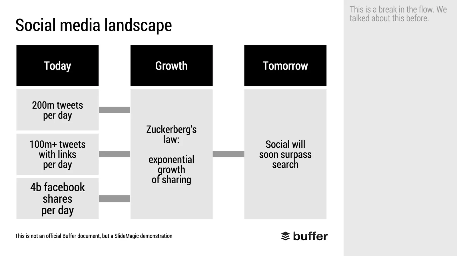
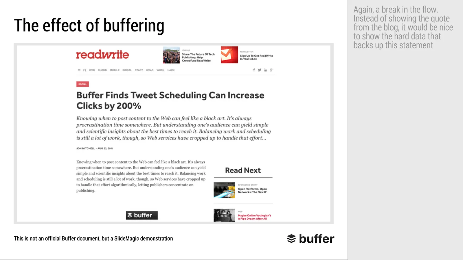
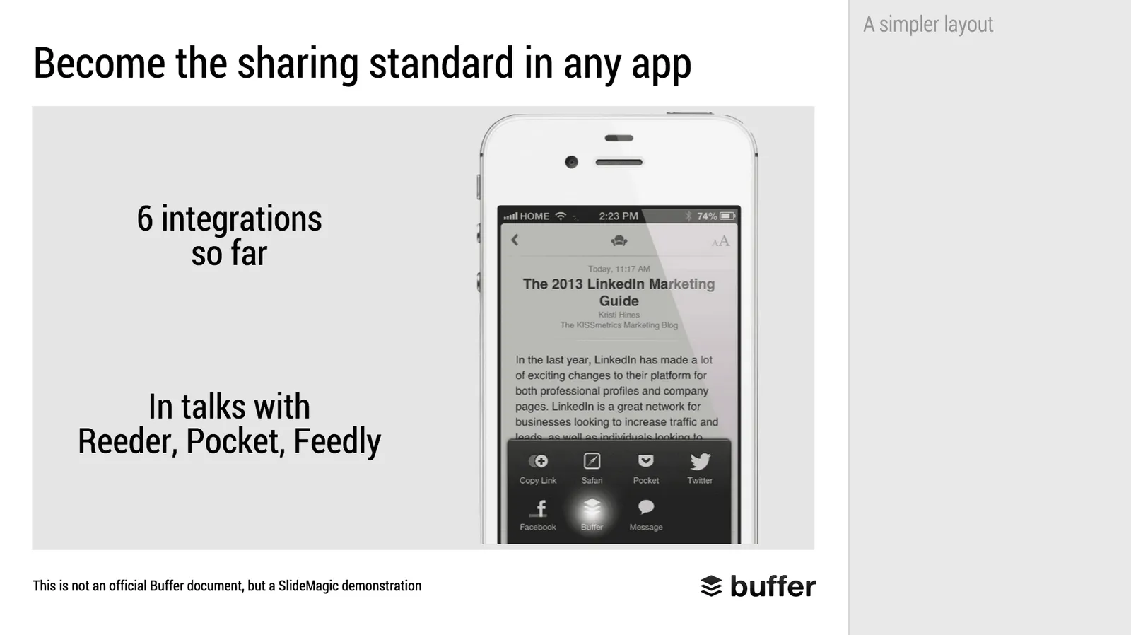
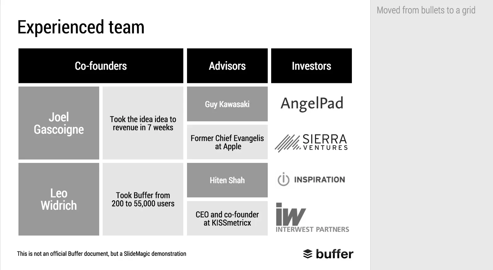
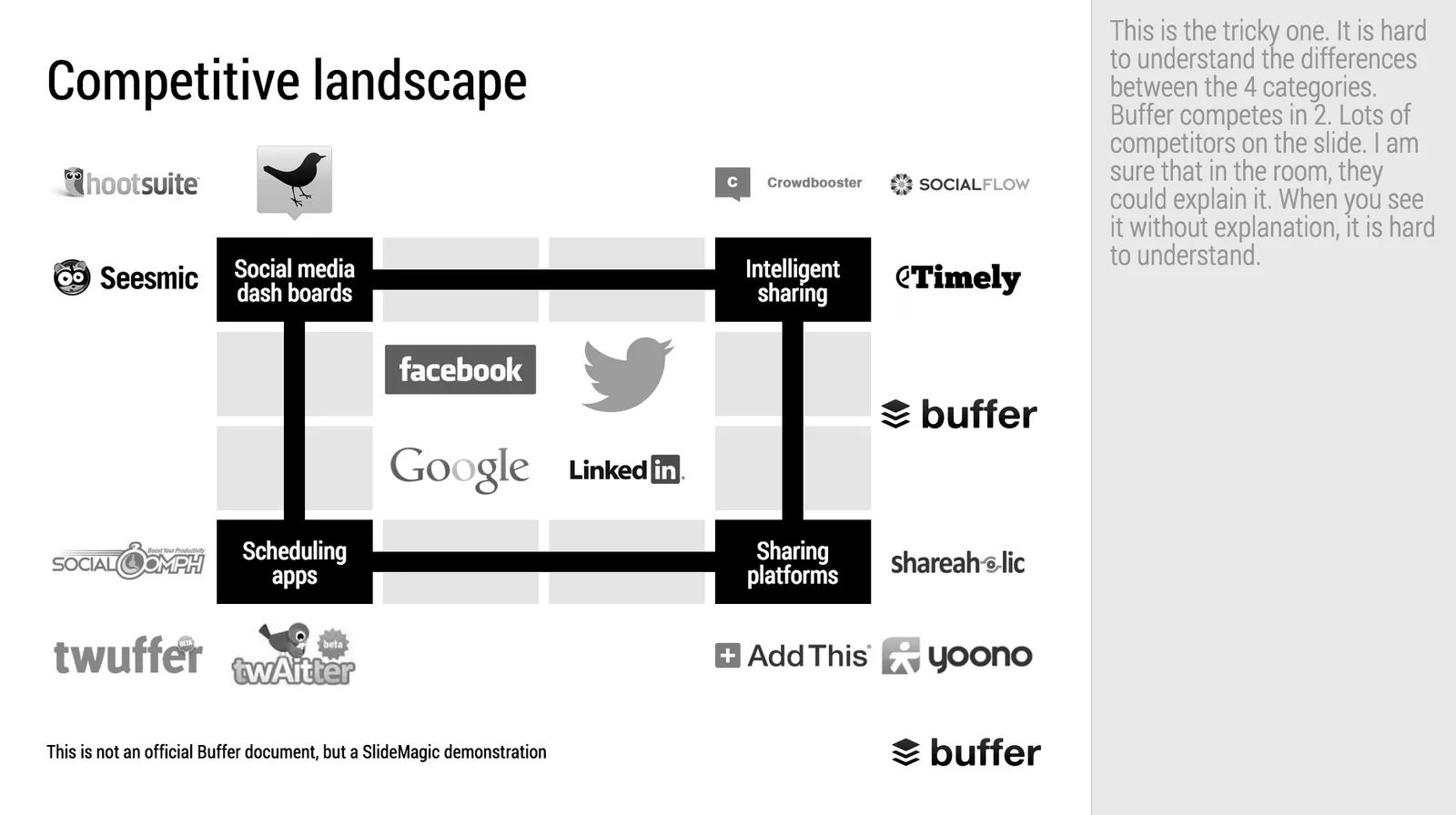
Makeover of the Buffer pitch deck that landed them $500k

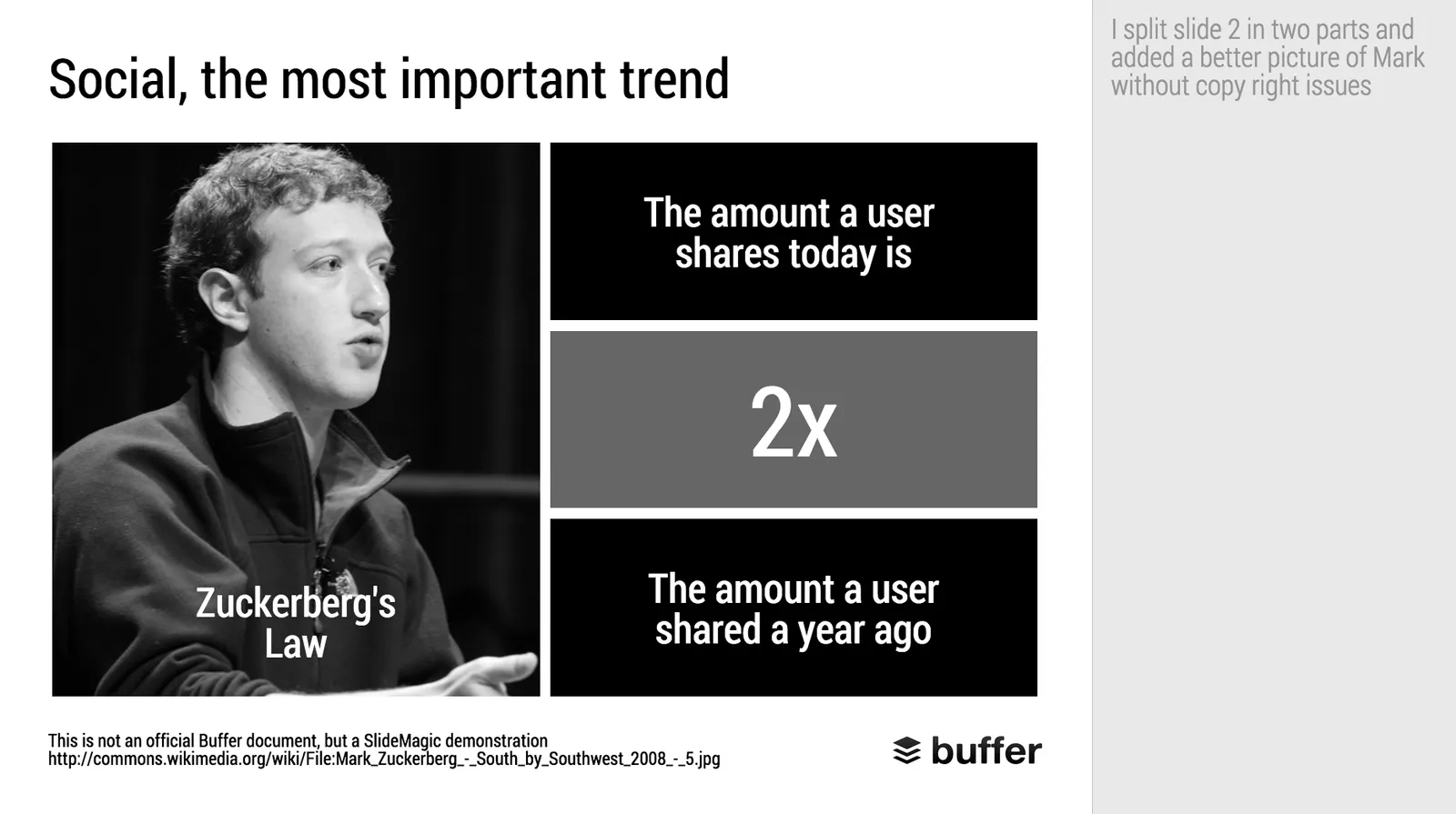
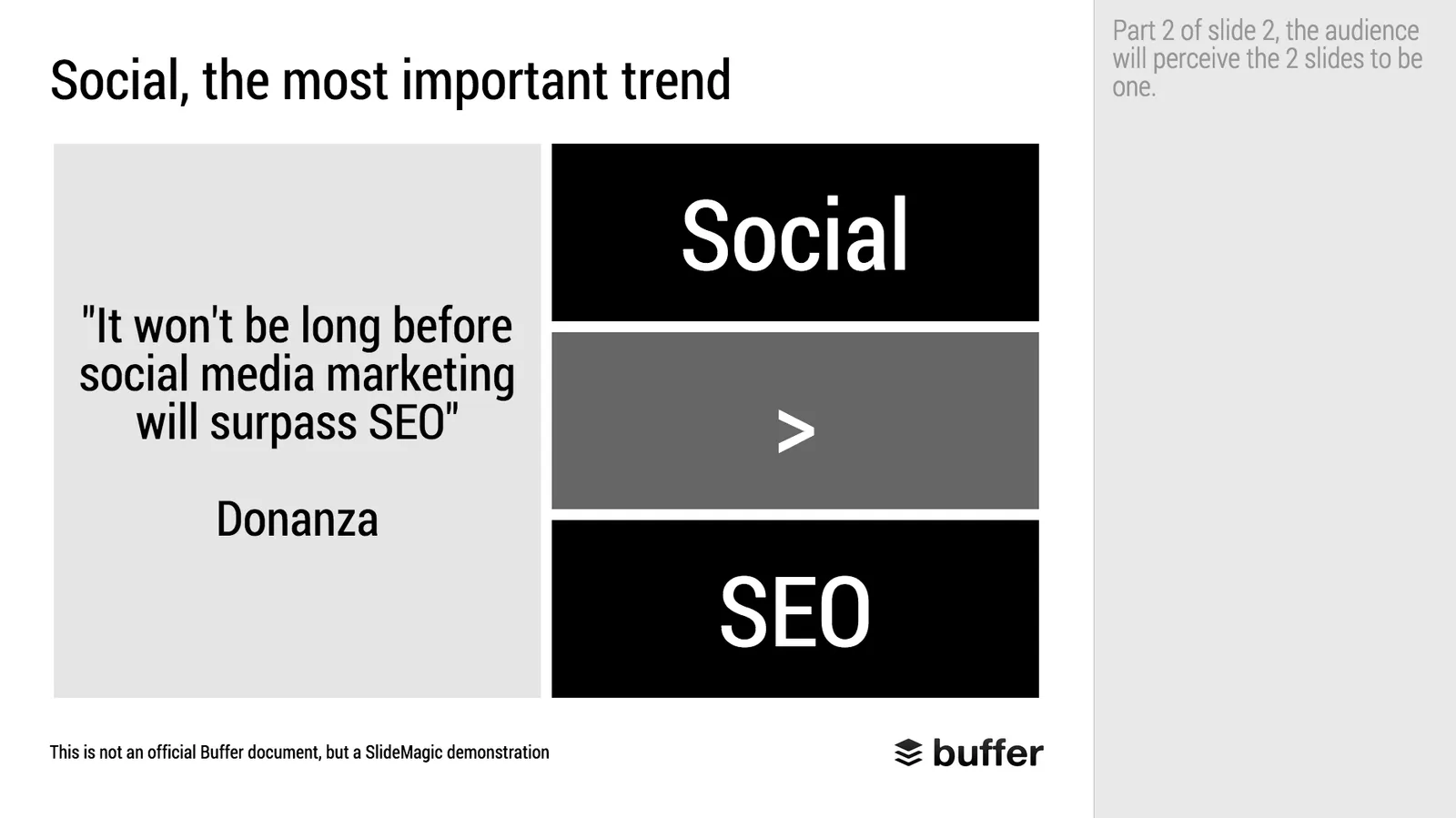
When Googling for examples of VC pitch decks, the on that Buffer used to raise $500k in 2013 ranks high. I decided to give it the SlideMagic treatment: how would the deck have looked when the slides would have been created in SlideMagic.

  • I changed the slide design to fit SlideMagic
  • I did not change the slide content
  • I did not change the story flow

I have a few comments on the slides that I have put in the SlideMagic explanation boxes.

Here is the original:

Here is the same deck in SlideMagic. You can clone this presentation to your own SlideMagic account by **clicking this link**and use some of the slide concepts in your own presentations. I have also added this presentation as a template in SlideMagic’s template library.

Art: Johann Zoffany paints a group of Englishmen in Rome for the Grand Tour, united only by their wealth and love of art; unlike most conversation pieces, this was not a commissioned work

·Investor presentation

Design DNA

Design DNA is engrained in a company. It shows in presentations, in the web site, in the way the office is laid out. When a visitor/user/viewer gets in touch with a company, she makes up her mind in the first millisecond about the design DNA of the company, by comparing it to all other presentations, web sites, and offices she has seen. We have all seen these stereotypes:

  • The bare bullet point presentation in the standard Microsoft Office 2007 format
  • The over-designed PowerPoint template with gradients, images with faded edges and huge logos at the top of the page
  • The social media expert website full of call to actions to buy her $5 ebook on being a social media expert
  • The traditional, hierarchal office with too many big leather board seats crammed around a too small board table in a board room that doubles as a storage room for exhibition displays
  • The hipster I-don’t-really-say-anything web site
  • The girly office full of plants and cute natural-material furniture
  • The macho office with an impressive collection of booz in the lunch room
  • The 1990s tech company web site: takes 40% of your screen and has detailed product hierarchies that get to pages that don’t really say much about that specific product
  • The startup web site where “tour”, “about us”, “benefits”, and “product” tabs pretty much say the same thing

At every point you come in contact with a client, user, investor, make sure you look the way you want to look. Even if your investor presentation looks right, that impression can be undone in one second when someone opens your web site.

Continue reading →

Startup pitches are changing

A few things are going on in startup land, especially for consumer facing apps:

  • It takes less and less money to launch a product (who could have thought 10 years ago that 1 person could self-finance and launch a PowerPoint alternative)
  • Startup ideas and pitches are fragmenting and are everywhere around us. Most ideas are variations on existing concepts that everyone is using. “Uber for gardeners”, got it.
  • Business communication gets more efficient. Phone calls, coffee chats, Hangouts: the big, formal standup presentation where everyone patiently and politely let’s you finish your bullet points is on its way out.

What does all this mean for investor pitches?

  • Do not feel worried if you can explain what your idea is in just 2 slides. If you are done, there is no need to add padding.
  • Since it is so easy to get an app up and running, the actual beta/prototype web site/app is a large part of the product pitch. Does it look polished? Does it work? Do you feel like signing up?
  • Related: market size analysis is increasingly replaced with “what % of your user base are willing to pay the $10 per month for this, and how fast you growing?”
  • The big, big, big, question is: do users like it. User growth, traction, user behaviour analytics. Numbers, data. All this matters a lot. The qualitative upfront part of the presentation (emotional pictures that show the problem) gets smaller, and the quantitative what is your LTV, CAC, churn, etc. gets bigger. Pitches start to look like consulting decks again.
  • Success/failure will be evident in a shorter period of time, so you need to be sure what you are doing with the money you are raising. (You are no biotech startup that raises a lot of money to “continue doing clever R&D”). Know where you spend things on shows that you are mature to investors, but is also protecting you. If you do not have good customer conversion rates, it is a waste of money to raise capital to spend on marketing and attract lots of people at the beginning of the funnel, who will then leave.
Continue reading →