

SlideMagic Blog

Frequent updates about all things presentations since 2008. Subscribe to never miss a post.

RSS
all posts

Category Delivery

·Delivery

"What is different about an American audience?"

I get this question a lot from (potential) clients in Europe and here in Israel. Ten years ago, I would have answered the question with a usual rundown of presentation design basics: not too many bullet points, visual slides, etc. etc.

But in 2016, I think the playing field has levelled. Audiences in any country now recognise a good or a bad presentation.

There are still differences between audiences though, but they do not differ across geographical boundaries. Here are some contrasts that I often come across. It is especially in these situations that an outside presentation designer can help to bridge the cultural gap.

  • Engineers that need to present to more sales & marketing oriented people
  • Engineers that need to present to potential customers
  • Founder/inventors that need to present to potential investors
  • Small company that needs to present to a big trade show and/or large Fortune500 company
  • Internally focused managers (production, logistics, finance) that need to present to an outside audience (M&A due diligence for example)
  • Local subsidiary that needs to present to corporate headquarters
  • CEO that needs to present to Wall Street analysts
  • Sales Director who needs to present to distribution partners

When presenting to someone outside your typical circle of “audiences” it is important to put yourself in their shoes. Simply recycling your usual presentation is unlikely to work.

Art: Jasper Johns, Flag, 1954
·Delivery

The old tricks won't work anymore

Because they have been used so many times, or maybe better, disappointed so many times, some of the old (and often expensive) tricks of presentation design are not at all that effective anymore.

  • Complicated language. Buzzwords, complicated sentences, clarifying footnotes. This person must know what she is talking about, better believe her.
  • Scientific frameworks. Management consultants loved these. It looked complicated, scientific, they were delivered by smart people. Even if you don’t understand the framework, the message must be true.
  • Excel-generated hockey sticks. The highly complicated spreadsheet produces the $500m revenue in year 5 number, all assumptions seem sound, it must be true
  • Noisy/flashy/spectacular videos. Stuff is flying in, drum rolls, this looks professional, these people probably tell the truth.
  • Stunning images. “Yes! We should follow the guy who jumps of a a building with a parachute!” That sun set looks amazing.

I am afraid we are back to humble, human communication again.

And here is the pitch for my presentation design app SlideMagic: make it easy to create slides that look pretty decent/professional, and let you spend the majority of your time creating your story.

Image: fake cathedral ceiling in Rome’s Sant Ignazio Church

·Delivery

Learning from Seinfeld

Saturday, I visited one of 4 sold out performances of the stand up comedian Jerry Seinfeld here in Tel Aviv. The setting: 10,000 people in a covered basketball stadium with poor acoustics. Here are some of the things that Jerry did to get through to the crowd. And was interesting to see how effective he was in comparison to the warm up act who had less experience.

  • Timing of punch lines. Know when to keep the flow of words going, know when to pause, and when you pause, pause for a really long time to let a point sink in with the audience.
  • Immediately build a connection with the audience. This is more than speaking 1 word of Hebrew, and more than showing how you appreciate the country. Seinfeld build an entire series of jokes about the experience of fighting traffic and crowds to go to a major event (and leaving it). It created an instant bond with the speaker, but also a shared experience between the members of the audience. This was a good set up for the later sections in his show that often were derived from material targeted at a US audience. Started to throw these types of jokes into the crowd right at the beginning would not have gone down well.
  • Fake eye contact, there was now way that Jerry could see anyone in the audience because of the lights, still he was moving his eyes around and holding them left, right, front, and back as if he was connecting with a member of the audience.
  • It was interesting to see how Jerry ended the show with a punch line, and then boom, said goodbye and thank you, walking of the stage immediately after. There was no time for the “well, this was it…”
Continue reading →
·Story

"This is my usual introduction"

“When I put up the first [incredibly busy bullet point] I start of with this introduction before I take people through the slide”

Usually, these introductions are great. They come out naturally, in a conversational style. Next time:

  1. Use that introduction as the opening of your presentation, add a visual slide here and there to support the story. And don’t stop there, finish the entire presentation in that style
  2. Second best option. Put in a black slide before your busy opening slide and tell that introduction without encouraging people to start reading your bullet points.

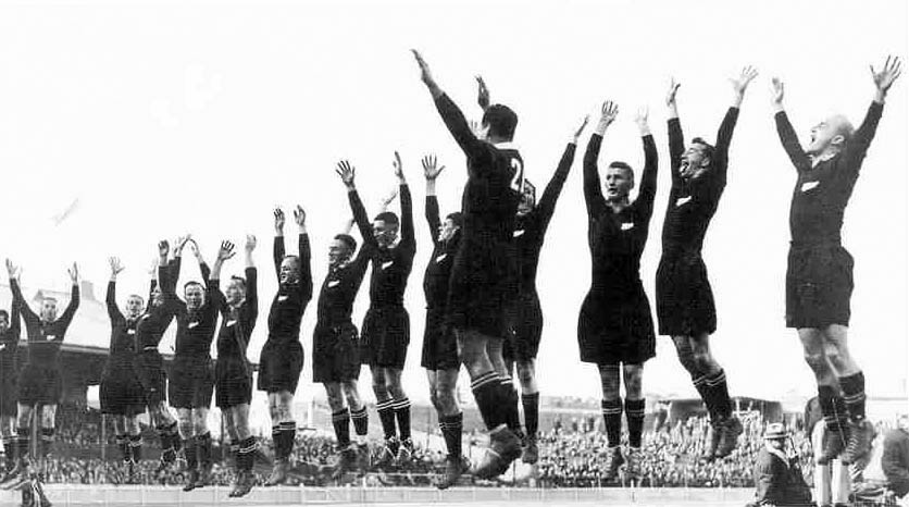
Image: New Zealand rugby team performing the “haka” in 1932

·Delivery

Designing presentations for print

In some industry sectors, especially financial services, people still insist on printing the presentation slides and handing out booklets at the start of the meeting. You can have groups of 10-20 people sitting around a conference table flicking through pages.

It is great for taking notes, analysing detailed financials, but it is not that great for a close connection between speaker and audience, and that last minute typo in the name of the CEO cannot be corrected once on paper.

Sometimes you have to pick your battles and if print is the way to go, think about these issues when starting the design of your slides. The bottom line, get a slide to look good on paper on day 1 of the design project, not at 3AM the night before the meeting.

  • Colours appear different on screen than on paper, especially on cheaper, older, or almost-out-of-toner printers. Bright blue can turn into faded grey, lively orange can become girly pink, subtle grey shadings turn into bright white, just to name a few potential problems.
  • Hole punchers for binding machines require extra space at the top of your page, test it.
  • Dark back grounds empty toner cartridges and make make the fingers of your audience black.
  • You can get away with low res images on a 15 year old VGA overhead projector, on paper though, you will get caught. Use high resolution images.
  • A monitor frame, or the light rectangle on a projection screen provide an implicit frame for your slide. Paper should do the same in theory, but A4/letter/4:3 and other issues makes it highly unpredictable how your slides are scaled on paper. In the worst case you might have draw a tiny grey line around your slides to anchor things (yes really).
Continue reading →
·Delivery

Take that conference tag of

Name tags are a necessary evil when visiting a conference. The security guard can see you paid, and people can read your name, company, and role casually. It is also a great way to store the day program and your lunch coupons.

But when on stage, it looks a bit weird. When presenting right that moment, when someone watches the online video of the talk 6 months later, when the entire panel consists of 12 people with the 12 white dots on their shirts.

Oh, and also ask people to take of their tags when posing for a group photo.

Art: Albrecht Drurer, Portrait of a young Venetian woman, 1505

·Delivery

Comcast pitching lessons

The Comcast-Time Warner Cable merger fell through. Fred Wilson makes the case that this is probably a good thing, not so much because of consumer choice, but on the other side of the business: content providers trying to get through to consumers with their offering (Netflix, etc.).

This article in the NYT provides some interesting background on the failed $25m lobbying and pitching effort. Some quotes:

“He was smothering us with attention but he was not answering our questions”

“And I could not help but think that this is a $140 billion company with 130 lobbyists — and they are using all of that to the best of their ability to get us to go along”

  1. If there are elephants in the room, huge obvious issues that need to be addressed, you have to deal with them, somehow. Avoiding the issue will not make the issue go away.

  2. Beyond a certain point, “slick” is actually working against you, when you try to convince a human. (The same point I made with respect to highly sophisticated videos).

Art: The colossus, Francisco de Goya, 1808–1812

·Delivery

What did you remember?

It is a good exercise to go back in your memory and try to recollect presentations you saw, and what you still remember of them.

Chances are that you forgot:

  • The names of the 7 forces affecting that guy’s industry
  • That complex logical argument structure
  • The mission statement
  • That inspirational quote
  • The benefits: flexible, scalable, cost efficient, and customisable
  • Etc.

There is a good chance that you still remember:

  • That personal story
  • That detailed but unexpected fact
  • That French accent
  • The Skype message notification icon
  • That image of a container ship that summarised the big idea
  • The button that was missing on the shirt
  • That clever analogy that ran through the entire presentation
  • That unexpected turning/break point in the story
  • The benefit that you get that whole thing up and running 7 minutes 30 seconds
  • Etc.

Now look back at the presentation you are working on.

Art: Gilbert Stuart’s unfinished 1796 painting of George Washington, also known as The Athenaeum. Sign up for SlideMagic, subscribe to this blog, follow on Twitter.

·Delivery

Smaller screen, better presentations

There is a nice side effect of people ditching their laptop and carrying a small tablet device instead: presentations get better. But it has nothing to do with technology, it is the setting of the presentation that has changed.

In the absence of a big projector screen or LCD monitor, that small conference room just changed from a mini cinema theater to a discussion table. The attentions is shifting back from the screen to the presenter. The presenter vaguely points at the device and continues “what this chart wants to say is [and out comes the story]”. Only when you have to, the iPad gets passed around the table to show that important piece of data on page 37.

Good stuff until Airplay-enabled projects are hooking up our mobile devices to projectors again.

Art: Roy Lichtenstein, The whole room, 1961 Subscribe to this blog, follow me on Twitter

·Delivery

Alcohol against stage fright?

The supply of liquor in this tweet below probably was more symbolic than functional, but I have heard other stories about people getting offered a drink back stage before appearing in a major TV broadcast.

A bit of alcohol relaxes nervousness, but it is actually not the sort of relaxing you want on stage. You need to be sharp and switched on to remember your story and react to audience feedback. Some other things you can do to deal with nervousness:

  • Know your story inside out, rehearse, rehearse, rehearse. Seth Godin suggests that you can even start with dogs as your risk free audience. Work especially hard on the opening of your presentation, since these are the most difficult moments. Once you are on a roll, the rest will follow much easier.
  • Remember that everyone (including the pros) is a little nervous before going on stage, remember that a bit of nervousness gives you the right alertness to deliver a good performance (alcohol does the opposite), remember that the audience wants you to succeed there, remember that for most people stage fright is like that first chill when jumping into a pool, it is over in 2 seconds once you get going.

Art: Edgar Degas, L’Absynthe, 1876 Subscribe to this blog, follow me on Twitter