SlideMagic Blog

Frequent updates about all things presentations since 2008. Subscribe to never miss a post.

RSS
all posts

Category Books

·Books

Book review - The Power Presenter

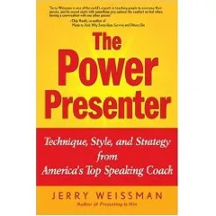
I just finished reading the book “The Power Presenter” by Jerry Weissman, a public speaking coach.

My main interest is in graphical slide design, so it is a bit unusual for me to be reviewing a book that is solely about delivery of speeches and presentations. Initially I found it a bit hard to get into the story of the book, but as I finished more and more chapters the entire plot of the book became clearer and by the time I read the last page I found that I learnt some real valuable lessons that will affect every presentation I will give in the future. The central objective of the book is to get rid of a presenter’s adrenaline rush when presenting: the instinctive debate of the body whether to fight or flight a stressful situation. Rather than prescribing a number of dogmatic “presentation rules”, Jerry suggests way to create a natural way to becoming a more confident speaker.

Central in his book is a concept called “ERA”:

  • Eye connect: “only speak to eyes”. Much more powerful than “don’t turn your back to the audience”, or “don’t muffle your voice”. It is a simple rule that everything you say, everything, should be said by looking a member of the audience straight in the eyes, waiting for eye contact, delivering the sentence, and then move on. No exception. Quite a challenge for a presenter, but it makes sense
  • Reach out with your hands and your body language to simulate the appearance of a hand shake
  • Animate, adding more drama and passion in the way you deliver your message
Continue reading →
·Books

Great book "Tasteful Color Combinations" - not even available on Amazon

Found hidden away on a shelf in the book shop of the Tel Aviv Museum: “Tasteful Color Combinations” by Naomi Kuno. It is not even available on Amazon, that’s why I have trouble finding a good web link to it.

The book contains 455 color schemes (with detailed RGB  and CMYK codes), organized in 14 chapters each with a different mood. (“Nostalgic and melanchology”, “humanistic and natural” to name two). The first edition was published in Japan in 2004, and the English translation is not always perfect, adding to the charm of the book.

Some examples of colors schemes available (exact quotations from the book):

  • 241, Formal Kimono: the color of a patterned formal kimono for a married woman
  • 255, Homely: the cozy warm color of home where a cheerful laugh is always heard
  • 359, Glory and fame: glory and fame never fades away when quality is accompanied. The blue is for glory and the red and gold are for fame.
  • 370, Rococo -1: the elegant rococo period colors of Fragonard’s paintings and dresses
  • 111, Ryugu castle: the color of a town of Ryugu castle in a deep sea, where princess Otohime and beautiful fish are said to inhabit, in a legend story of Japanese fantasy.

The colors of 111 below as an example:

I have used this book a number of times as a source of inspiration for finding color schemes for seed-level technology startups that need help developing their very first fund raising presentation. (Other techinques to find a good color scheme can be found here).

Continue reading →
·Books

Book review - Made to Stick by Dan/Chip Heath

Made to stick by Chip Heath and Dan Heath (find it here, affiliate link) is recommended reading for everyone who delivers presentations: it analyzes why certain stories “stick” in people’s mind, and why others disappear, almost independent of the content: it’s they way that they are told that matters.

  • Keep them simple without creating silly sound bites
  • Add unexpected twists to keep people interested
  • Be specific and avoid fluffy hollow statements (Dilbert mission generator style)
  • Be credible to get people to believe your idea
  • Add emotion to make people care
  • Tell stories

The book is written as a set of stories that are analyzed following the above framework. Sometimes this categorization can feel a bit forced (since most stories combine multiple elements), but generally it works well. Framework or not, the stories inside the book are the real treasure. They are interesting and fun to read (many of them still stick in my head). Besides the big idea of the book there are countless interesting bits of knowledge hidden in the stories. Some examples:

  • The brain stores stories in a “virtual 3D” space. Slightly absurd experiment: people read a sentence about a guy and a shirt slower when the shirt has just been taken off a few seconds ago. Your presentation structure and the structure used to absorb information is not the same
  • Being analytical, logical, thinking of numbers switches off your emotional mood: the mood in which you are most receptive to store information. Think about that when ordering slides
  • The curse of knowledge (actually this is a big idea in the book) prevents people from putting themselves in the shoes of an audience for which a concept that took you 3 years to understand might not sound as obvious as it seems to you
  • Another example of the curse of knowledge: when someone taps a song with his fingers on a table, he/she hears the entire performance including vocals, instruments, etc. A bystander just hears an irregular beat of taps…
  • 70% of learning can happen by just imagining, anticipating, thinking about the task ahead of you (scientifically proven): rehearse, rehearse, rehearse your presentation.
  • Negative “don’t”, “avoid this”, “don’t fall in this trap”-type recommendations stick better than positive ones: people learn from mistakes. This goes a bit against my marketing theory in business school though.
Continue reading →
·Books

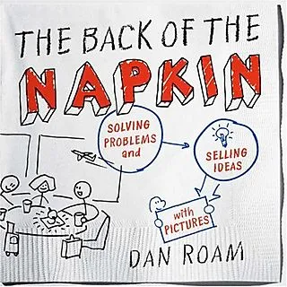
The strategy consultant's review of The back of the Napkin by Dan Roam

We talked about sketching chart ideas on paper before, but Dan Roam takes visual problem solving to the next level in his book The back of the Napkin. This book was an interesting read for me not only because of the presentation concepts discussed, but also because The back of the napkin aims to provide a complete framework to solve business problems. (The key frameworks can be downloaded here for free). I think the book did really well on the presentation front, the goal of a generic strategic problem solving kit is not really reached. Dan does a great job convincing us that we should use our drawing/visual thinking skills that most of us have been neglecting since we started formal education. On top of that he provides practical guidelines to get going

  • Have the courage to use a more informal drawing style (away from the computer) to get to the essence of problems, focus not on form but on content
  • Help us think about what type of drawings are best to be used in which situations (who, what, when, why, etc.) and to what audiences (the visionary CEO, the detailed operations manager)

As a problem solving tool kit, he provides useful tools but falls short of providing a generic solution framework for all business problems (which impossible anyway I think).

  • Dan takes the “S-type”/“sensing” approach to problem solving, spread out all data, put in on the walls, digest it all to see the bigger picture. A way of data processing very similar to the human brain sizing up a new environment. This is actually a useful and fresh approach compared to for example strategy firms such as McKinsey, that apply a very targeted data gathering approach focussed on key questions/issues that have been identified earlier.
  • Another take away for me were diagrams that try to summarize all relationships in a problem. Plot a variable on the x axis, one on the y axis, start adding bubbles in different sizes and different colors to analyze 5-6 dimensions in one diagram. Useful for solving problems, less for communicating results to a “cold” audience that is confronted with the material for the first time.
  • I do think however that the book does not provide a simple step-by-step guide to solve problems, you need guidance for this. Running problem solving brainstormings around a white board requires a strong moderator, and picking the right diagrams requires experience. Hiring Dan’s firm would probably do the trick, but the novice will find it difficult to apply the techniques after having read the just the book.
Continue reading →
·Books

Book review - Presentation Zen by Garr Reynolds

I had a big shipment of books coming in recently, hence the stream in book reviews.

I finally had a chance to read Presentation Zenby Garr Reynolds. Garr is a leading authority on presentation design and delivery, advocating his minimalist (or “Zen”) approach to presentations. His blog is one of the most visited web sites on the subject.

That’s what 50% of this book is about, convincing the army of business managers writing thousands of PowerPoint presentations every day to drop their bullet point slides, take off big corporate logos from their slides and use more images supported by minimal text. It is an important message and I forgive Garr for repeating it many, amny times throughout his book.

The other 50% is focussed around taking the designer approach to presentations. I enjoyed reading backgrounds on Japanese and Zen culture and how they can be applied to good design. I did learn a few things about photo composition.

The book is nicely illustrated with example presentations, and many “before and after” slide transformations. There are a lot of references to iStockPhoto in the book. A great site (I use it a lot), but the suggestions could have been put in slightly more subtle

Having read slide:ology by Nancy Duarte just a few days a go, it is interesting to draw a parallel. Slide:ology contains more practical presentation advice: how to define color schemes, specific examples about slide build up. Presentation Zen adds more on the create design process, esthetics, and photo composition.

Continue reading →
·Books

Book review - slide:ology by Nancy Duarte

A copy of slide:ology: The Art and Science of Creating Great Presentationsfinally made its way across the Atlantic. (Disclosure link via Amazon Associates program) Nancy Duarte is managing Duarte Design, a company that has created some high-profile presentations (Al Gore is one of the clients). They (her husband is the company’s CFO) started out in the 80s when the Apple Macintosh brought desk top publishing and graphics design to the masses, and have now become one of the big brands in professional presentation design. This is the perfect book for those who have mastered the PowerPoint (or Apple Keynote) technical skills and need to make the final jump to master concepts usually taught in art schools (rather than software manuals):

  • Picking pleasing color schemes
  • Slide composition
  • Typography
  • Etc.

The trained eye can extract almost everything there is to know about presentation design. However, this is not the book that will teach you magic that will turn your beginner-level PowerPoint edits into a professional presentation. Many subjects discussed in this books are covered in other material as well (minimal bullet points, cut words, use professional images, etc. etc.) However, there are some very specific things that I picked up in this book that were new to me:

  • Thinking about cinematic movement for animations or slide composition
  • Creating one big map and using the PowerPoint push transition to navigate it: one presentation - one big slide
  • A large library of chart concept sketches, there were many new ones I did not use before
  • Stressing to adopt a “designer” mentality to presentations
Continue reading →