

SlideMagic Blog

Frequent updates about all things presentations since 2008. Subscribe to never miss a post.

RSS
all posts

Search results for “mckinsey”

The quick fix boomerang

As a kid (I must have been 13-14 years old), I actually saw one of my friends getting hit by his own boomerang from behind while he was searching the sky (ahead of him, ignoring 180 degrees of his surroundings) where it had gone. In addition, he ignored our warnings…

Almost all the time delays in coding are the result of some short cut that I took before and did not bother to fix.

I learned the same the hard way in my early days at McKinsey as an analyst, when I was building spreadsheet models. Just before the presentation, your manager would come and require a quick change in the numbers to reflect a new insight (or complication). In the end, the numbers that count are the ones on the PowerPoint slide, not in your model, so the changes were easily made.

But after the presentation, the adrenaline levels dropped and there was no immediate need to mop up that spreadsheet. Mistake, because by the time the next presentation came along you had no way to get everything consistent again.

So, quick fixes are fine, just clean things up quickly afterwards to be ready for future changes. As an analyst, you control the numbers with your model. If people don’t agree with the outcome, and/or feel it does not makes sense (unfortunately senior people have a good nose for this), something inside the model has to change, to reflect that insight. Simply overriding the output cells will work for one presentation only.
"You are coding at this stage in your life?"

Over the past 30 years, I did an INSEAD MBA, worked for a decade at McKinsey, and built a global micro brand in presentation design. Why coding, when this is something that 20 year olds do in far away places like Ukraine?

Yes, it is a bit crazy, but I would call it “calculated craziness”:

  • The world has changed a lot. It is now possible to build a software product with the only investment involved is the missed income of other things you could have done with your time. Try doing the same thing 20 years ago and think of the investment and effort you need
  • My previous business model exploited the fact that usually people who understand business are clueless about design, while I was lucky to combine both in my head. What I am doing now is exploiting the fact that people who can code (backend), usually do not understand design (frontend) either, and both of these usually do not understand user needs very well. When it comes to the niche of business presentation design, I found a way to master all three (still learning the coding part).
  • There is a big difference in between being a developer in a huge organisation with 1,000s of colleagues, working on a specific feature, and coming up with an idea, designing and implementing it in a full product.
  • I think it is very hard to design a completely new product by committee. Something needs to stick their neck out and do something bold, try it, change it, try it again, change it again, without the delays of too much debate about ideas and ho unfair it is that you ask people to turn around and undo/redo their work completely after 48 hours. For me on my own, there is no such thing as wasted time.
Continue reading →

One directory workflow

File organisation on a computer is a pain. Going up and down directory hierarchies to find the right folder, then going backwards again if your machine prompts you to load a file from the location you last saved something in.

Back at McKinsey, one senior partner had a different paper filing system from everyone else: simply plop everything in chronologically: mixing up different projects, personal and work, etc. The arguments: it saves a lot of time to put things away, and a calendar timeline is actually a pretty good access mechanism for your stuff. (‘Where is that presentation I made 3 weeks ago?”) .

More and more, I go to a one directory workflow. The one directory usually ends up being the default downloads folder:

  • Save and load everything in one folder

  • Don’t bother naming images, look them up by thumbnails, if you can’t find them, search for a similar one online

  • Once in a while, go through the folder and put the most important things away properly:

    • Most work files expire: that version 29 you were so keen on saving in order to roll back to it, is no longer relevant by version 37. After returning from holiday, the hotel and car reservations are not needed anymore. All can be deleted safely. (That is the reason that the few bits of paper that are still floating around in my office first go in the “buffer box” before filing, usually the archive problem solves itself after 2 months)
    • There are exceptions: for my app source code: I need to be careful not to cause a massive corruption. Family photos, medical files, contracts, they go somewhere properly.
  • Use gmail search as your archiving index:

Continue reading →

Pens!

I love investing in good writing instruments. Here is the current line up (with a new addition):

  • Apple pencil for notes I need to keep (meeting notes, important concepts for my app development, ideas for new blog posts)
  • Mechanical pencil for sketching disposable charts, diagrams, concepts that either need partial creative erasing and/or a ruler (read the review of my trusted Lamy 2000 mechanical pencil here)
  • And now: a nice roller pen for other “disposable” notes.

Since I started my career at McKinsey back in the 1990s I have been using pencils for everything. Back in the day, all charts and slides were sketched by hand before being produced by a graphics designer who understands PowerPoint (or Solo before that). But, pencils leads break easily when writing enthusiastically and have low contrast, hence the addition of the pen.

The Lamy 2000 roller pairs nicely with my pencil. The design is almost identical to the classic fountain pain, but with less staining (I am left handed), and the need to get that writing angle perfectly right. I think a roller is better for short notes than a proper fountain pen. The Lamy has a perfect balance (wit the cap placed on the back), and somehow the plastic that is used in the pen gives it a really nice brushed feel, and a perfect weight. Only drawback, those two tiny grips that were part of the original design and produce that satisfying click when the cap is closed.

Document editing 1990s vs now

This post by Seth Godin about “STET” reminded me of my time at McKinsey, where in the early 1990s presentation design was pretty much a manual activity. You would draw all your charts by hand, then give them to the graphics department who would produce them for you.

Graphics designers make typos: suggested valuations of take over targets could be cut in half, or worse changed by +/- 10% which makes the error much harder to spot. Graphics designers had mostly no understanding of the context of the document, which could lead to pretty funny interpretations of hand writing.

As a junior analyst, you found yourself in a sandwich: every sentence and number had to be checked for typos, graphics designers tend to push back on poor chart design (please ask the senior partner to stop writing these dense bullet points will you), and the senior consultants would use the opportunity of this “slow” production process to try out endless variations of headlines and chart orders. Most instructions were scribbles on faxes and/or instructions in lengthy voice mails. All of this usually at hours where the rest of the world was no longer in the office.

Looking back at those days, I estimate that roughly 25-50% of the time (=fees) of these management consulting projects would go into document production. The solution was there, now we just need to put it on paper convincingly (and for the analyst: with the correct numbers).

Today, everyone probably has an understanding of PowerPoint that is good enough to produce most of these documents. This is a huge efficiency gain. But we also have lost something I think. That process where everyone is painstakingly focused on those 25 pages with a red pen really made sure people put their thoughts in slides, with everyone more or less in agreement. A more careful approach than quickly slapping/Frankensteining charts together.

Continue reading →

Number (in)consistencies

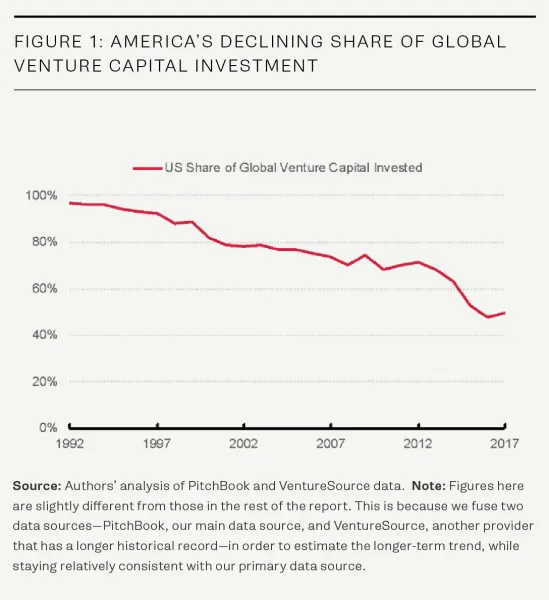
Have a look at the elaborate footnote at the bottom of this graph in a recent Venture Beat post:

A big apology for using multiple data sources, and as a result, producing 2 sets of slightly inconsistent numbers in the same report.

Data sources are almost always confusing and inconsistent. But that is the problem of the analyst, not the audience of a presentation. Using inconsistent in a presentation makes it harder for the audience to understand your story, but more importantly it also undermines your credibility.

If you have a good reason to adjust publicly available figures (and the VB team seems to have), why not create your own new data set? This is what we did at McKinsey all the time, adding the famous “McKinsey analysis” as a source of the figures at the bottom.

So, when having to present an analysis:

  1. Analyse all the inconsistent and confusing data around there
  2. Decide if you are confident enough to make adjustments: decide whether you are going to go with the raw data, or your own data. Stick to this throughout your presentation
  3. If you decided to use your own, you can throw in a backup chart at the end that shows how/where your adjustments impacted the data that people are used to seeing.

Cover image by rawpixel on Unsplash

Management gets more efficient

We are constantly on a path to make company operations more efficient. First we tackled factories, assembly lines, supply chains, leaving us with that ballooning layer of middle management that spends time on meetings, memos, analysis, more meetings, doing the annual accounts.

But slowly things are changing. It is striking to see how state of the art analysis I was doing pretty much by hand at McKinsey in the 1990s (as in allocating cost to a product) is now automated and computerised. Projects that would require 3 months of management consultants can now be done with the press of a button.

One reasons for this is technology, but an equally important driver is the basic idea behind the original analysis. How to think about product costing, what you would have to measure, how to allocate it etc etc. Over the past 20 years, people have learned how to approach this problem, and mastered the skill of actually interpreting the data quickly.

Something similar is happening in the world of presentations. Long-winded memos are out, people now have the courage to say that a presentation meeting is useless, people have read thousands and thousands of business presentations that pretty much follow the same structure.

What does it mean for your presentation? (I am thinking of an “everyday” deck in a company, not a major TED Talk)

  • Stick to the format/story line that people have gotten used to
  • Cut all excess padding: things people already know are convinced of, buzzwords, background info
  • Focus and spend time on what matters, what is unusual, unexpected, not obvious
Continue reading →

Maybe you don't know your story well enough

Some poor, rambling presentations might be the result of the speaker actually not understanding the story well enough. A good presenter understands the story one level of detail deeper than what is contained on the slides. If you don’t actually know that much about the subject you tend to hold on to the bullets on the slides, start repeating things, go in circles.

Some case examples:

  • (Me as a junior analyst in my early days at McKinsey). You just did a big interview survey at the beginning of the project and had to present the current status of the organisation to a room full of executives of the client who obviously knew that picture better than you. Every opportunity was taken to to erode your self confidence. A few weeks and a lot of analysis later, I was full of confidence and could answer every question.
  • (Me as a slightly more senior, but still junior, consultant at McKinsey). You were asked to present a piece of research/knowledge that was prepared by someone else in the Firm, you can obviously present the slides, but things get trickier when confronted with questions. Once you had complete a full project in this particular field, you could ace that same presentation, and add your own content for others to present.
  • Some start up founders get themselves into trouble when it is time for financial forecasts, go-to-market strategy, product pipelines, etc. If you actually do not master these completely, it will show.
Continue reading →

Writing macros in PowerPoint

The last time I used macros in PowerPoint was probably back in the 1990s during my time as an analyst at McKinsey. Yesterday, I picked things up again where I left them of.

To my surprise, the record function is no longer available (at least on a Mac). This used to be my secret weapon: record something very roughly, analyse the automatically generated code, and re-write that in a better way. The fastest way to learn the macro language.

Now you have to go through the process of learning VBA via the MSDN website. For someone with a Computer Science degree (i.e., me), this is doable, but I am afraid, anyone else will get lost.

Macros are still very hard to make idiot proof. Giving non-technical users access to a neat button in their ribbon that does magic probably works 70%, but in 30% of the cases, it will either not work, or worse: do damage to their work.

I need macros to speed up my production time of slides for the template store. Highly repetitive work is the bottleneck: creating thumbnail images, creating the individual PowerPoint and Keynote slides, in different aspect ratios, and creating the product pages on the store.

I toyed briefly with the idea of outsourcing this to other designers, but after a few days of study, I might have found a way to automate the bulk of the work, which will save me a tremendous amount of time and reduce errors, and free up my hands to increase the speed at which I can add slides to the store dramatically.

Continue reading →
·Delivery

Take the junior analyst to the CEO meeting?

Yesterday’s meeting blog post made me think of an other topic: junior analysts (lots of them among my readers) and whether they should go to the meeting with the CEO or not.

During the early years of my McKinsey career, there were many, many occasions, where I did not get to go to meetings where my work would be presented, and it was explained to me that too many people in the room would harm the meeting dynamics. A valid point: sitting in a huge conference room full of consultants does not create the atmosphere for a candid discussion about strategy.

But there were other concerns my seniors might have had:

  • The junior analyst might not be able to present the slides, not having the right “CEO language”, going of on a tangent, explaining how he did the analysis, without the so what
  • And even if we did not let the junior analyst present, he might come in with odd remarks that throws the discussion in the wrong direction, vent his uncomfortable feeling with the broad assumptions that were made in the analysis (that were actually justified), thereby undermining the credibility of the whole deck.

If you are just starting out as a consultant, it is worth your while thinking about the above.

But there are advantages of taking a junior member to these meetings now and then (feel free to use the following with your seniors):

  • Taking turns makes sure that the entire 15 people team does not sit in the room at once
  • Analysts can actually learn a ton from these meetings that will make the whole team perform better:
    • You see how these analyses are actually used
    • You get to learn that CEO presentation skill that you can put to work even when presenting to more junior clients
    • You might come in handy when a very detailed question about the data comes up
    • You get credibility with your client team members
    • You will get a motivation boost
    • You will need less time briefing to follow up on next steps
    • (Junior analysts are always good at serving coffee, making copies when needed)
Continue reading →