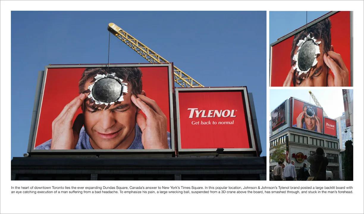
Great visual - you can almost feel the headache
I am adding adgoodness to my blog roll. This is another great find.


Frequent updates about all things presentations since 2008. Subscribe to never miss a post.
I am adding adgoodness to my blog roll. This is another great find.
My wife had to swap her mobile phone because my 2 year old son decided to empty a bottle of water on her previous one. These things happen. The new phone is a Nokia E71. Phone reviews are a bit out of the scope of this site (it is a great phone by the way), but I can comment on the graphics of the user interface.

Nokia could have done so much better:
Mobile phone screens can also benefit from a “Zen” make-over to transform them into calmer and more minimalist user interfaces
PowerPoint and mobile phone interfaces are the same: the fact that you can make that sophisticated watermark background does not mean you have to use it!

All presentations I design are used by others - not me
All presentations I design have a serious, professional subject
Still, I like to add a personal signature to my work. How can you do that within the constraints of the presentation other than the little reference in 8pt font on the last page?
As a designer you can steer the choice of visuals you use with things you are passionate about:
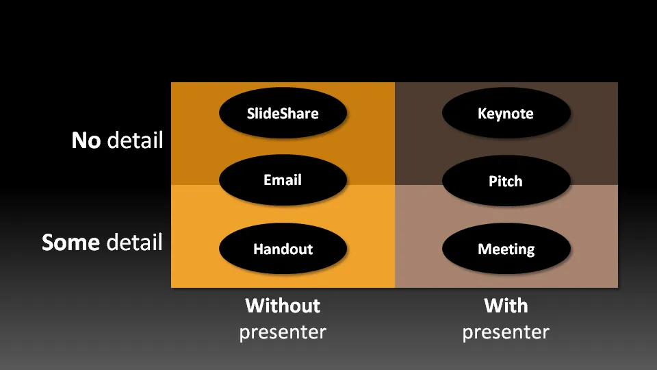
Not all presentation settings are the same. A “Presentation Zen” slide show with stunning images and the incidental word on a slide is great for a keynote, but might be a bit too much to discuss last quarter’s financial results. The 50 page deck with bullet point slides might be serve better as a printed business plan than the key communication tool for a 20 minute VC funding pitch. I have tried to describe 6 presentation scenarios and categorized them according to:
Here we go (click image for bigger picture):
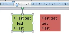
One of the PowerPoint annoyances is that bullet point paragraphs are not aligned properly when overflowing to the next line. It’s easy to fix.
Display the ruler (view menu), select the text, and move the little markers, leaving the top one to the left, and the bottom one at the desired indent. (See the image to the right).
That bullet points are NOT the main design concept to make PowerPoint presentations is clear, but a completely separate subject.
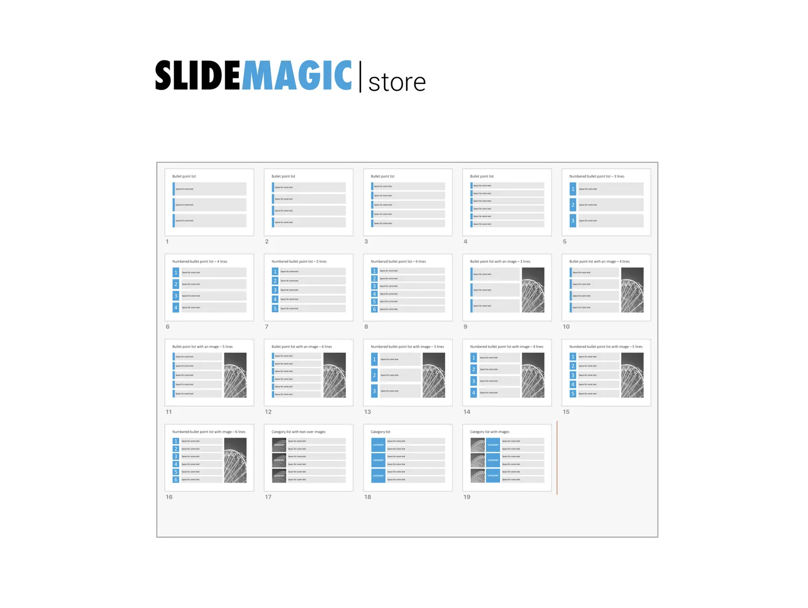
UPDATE February 2018. Another way to align bullet points in PowerPoint, is to use boxes with a very light background. This background shape gives the page a grid-like structure, compensating for differences in the length of text in a bullet point. Even if some bullet points stretch over 2 lines, and others consist of a few words, the page still looks evenly distributed.
I have added some examples of this layout style to the SlideMagic template store.