

SlideMagic Blog

Frequent updates about all things presentations since 2008. Subscribe to never miss a post.

RSS
all posts

Category McKinsey

·McKinsey

How to create a McKinsey-style waterfall chart
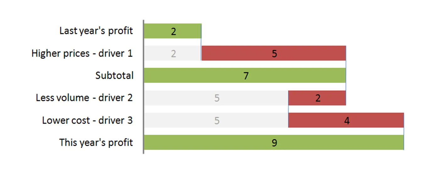
The “water fall” chart is an effective way to summarize the quantitative impact of a number of drivers. For example, you need to put the following story in a chart: “Our profits went up by 7, the positive effect of higher prices and lower cost was offset by a lower sales volume.” A waterfall chart would look something like this:
For illustration purposes I left the light grey color and data labels of the supporting series in so you can see how to make the chart: it is basically a stacked bar chart with 3 series:

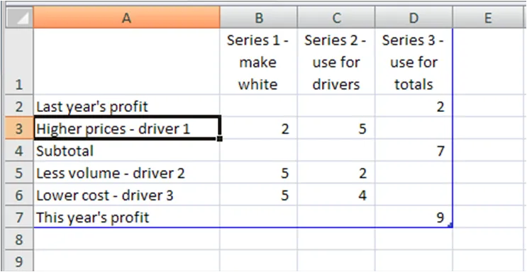
  • A “white” series to support the drivers
  • One series for the drivers
  • One series for the (sub)totals

The data table for this chart (Powerpoint 2007):

For a final touch, make the color of the light grey series white, take out the data tables and that’s it. There is the temptation to make automated tools (in Excel) that do the work for you. Like almost all my charts, I start with a piece of paper and make my waterfalls manually, to make sure that they

  • Are correct (negative numbers can make these charts a bit tricky to get right sometimes)
  • The chart tells the story I want it to tell (what subtotals to use, in what order to list factors, etc.).

UPDATE 1: here are two other posts related to McKinsey waterfall charts:

Continue reading →
·McKinsey

Googling for free McKinsey PowerPoint templates

Doing a Google search for “McKinsey PowerPoint templates” highlights many entries that are almost all a violation of copy right. Moreoever, the templates are of little use to someone who is not working at McKinsey team on a client engagement. First of all: presentation starts with substance, then follow the frameworks (if any) A bit of historical context. I recognize the frameworks from my time at McKinsey, almost all of them are from the early 90s, when McKinsey was still working with an early pre-PowerPoint presentation tool called “Solo”. Solo was developed specifically for McKinsey, later marketed as an independent application. It vanished when PowerPoint emerged, not because PowerPoint at that time was neccesarily better, but all of McKinsey’s clients were running it and using it to edit presentations. (A slightly outdated looking site is still offering it for sale?). Your graphics assistant (nobody knew how to make charts themselves then), would dive into the template database to find “something that uses 4 arrows”. All these frameworks were meant to be used in densely written strategy/micro-economics documents, not in convincing on-screen presentations. If you would like to learn about McKinsey’s approach to graphics and presentations, try this:

  • The content available on the McKinsey Quarterly site (most of which look actually better than “day-to-day” work)
  • For the chart “Bible” that was used in the early 90s, flick through a copy of the book “Say it with charts” by Gene Zelazny. (I see he’s updated it since I last saw it).
  • The foundation of McKinsey’s approach to writing logical story lines (but not always the most compelling stories that are important in presentations) can be found in Barbera Minto’s book “The Pyramid Principle
  • UPDATE: I posted about a question I get often: how to make a McKinsey waterfall chart here.
Continue reading →