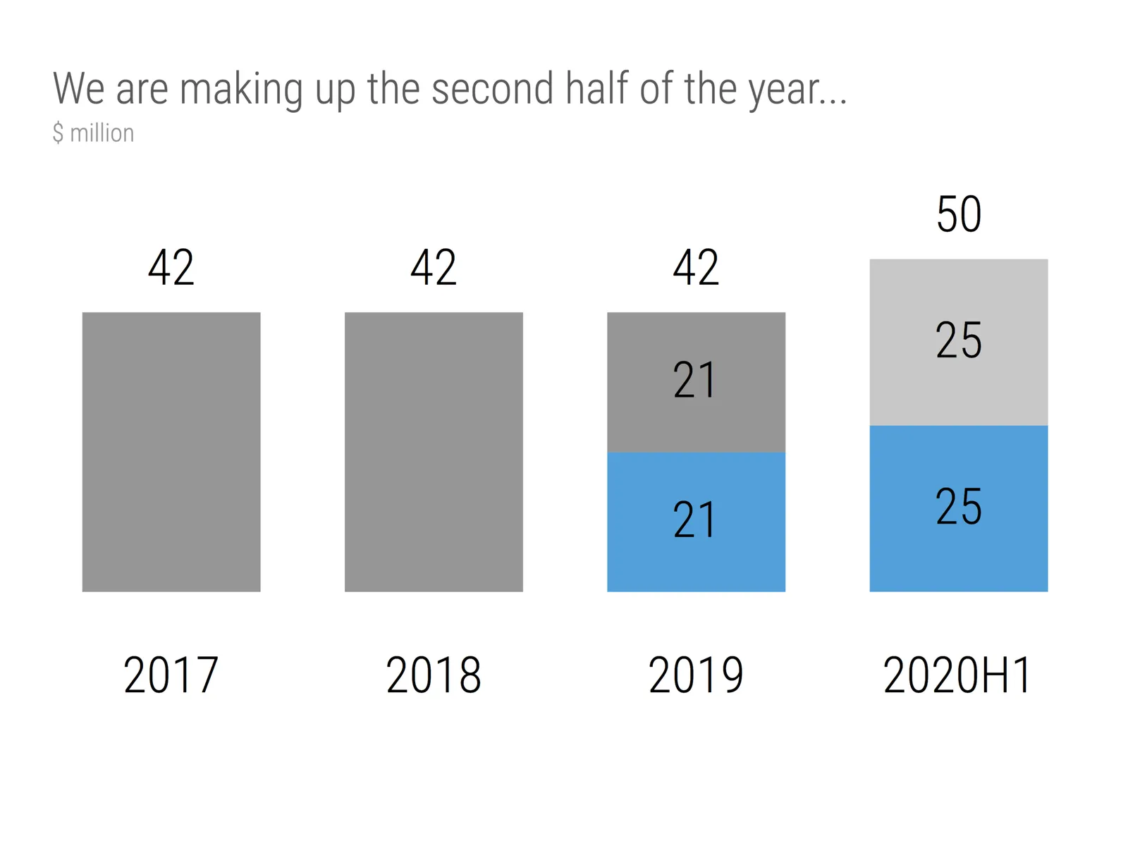
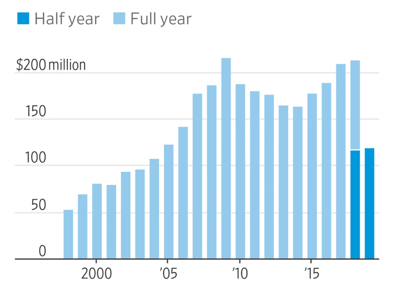
This chart that was published in the WSJ shows a good way to highlight financial data when you only have the first half of the current year available. You create a stack chart that only appears for this, and last year. For this year, you only show H1 data in the matching color.
I have add a template to the SlideMagic 2.0 database with a setup for this type of chart. It is extremely easy to add more years to the data history.
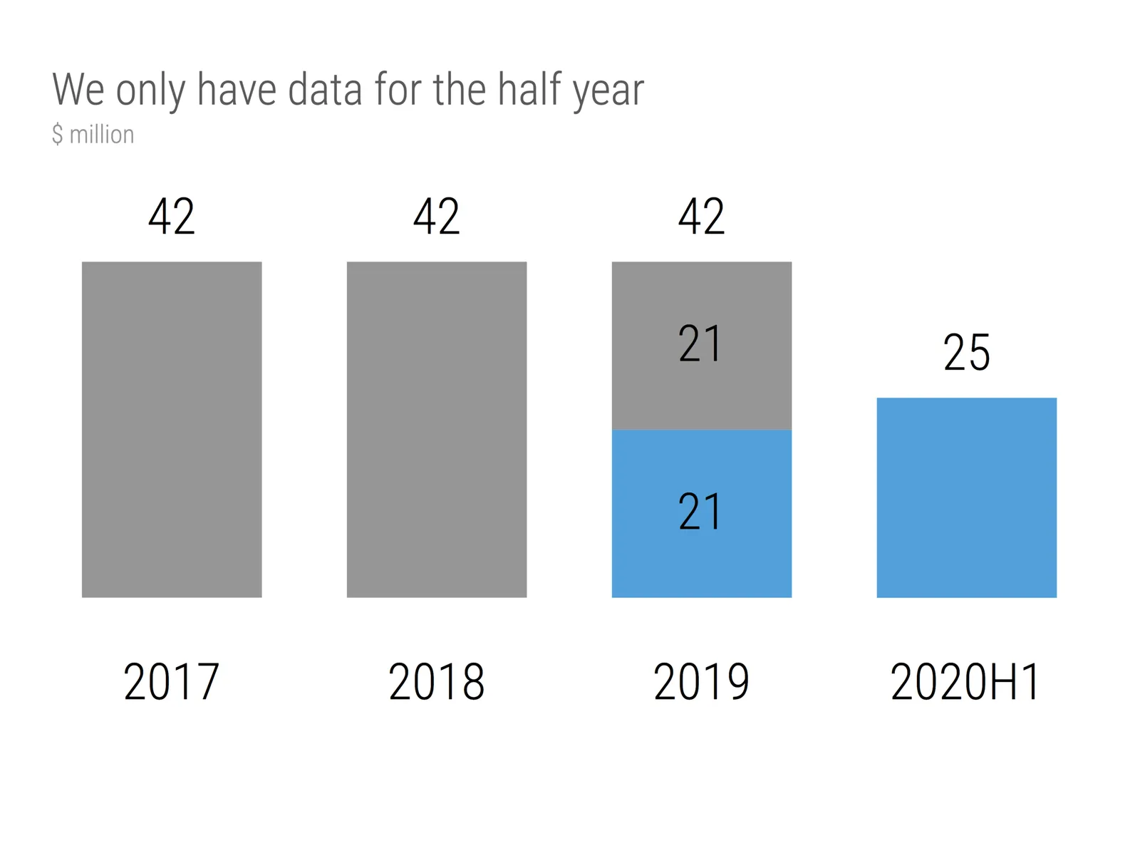
Some of my bespoke design clients were very eager to push things further, why not add an extrapolation for the H2 data, assuming similar growth? Well you can, but you should realize that your chart just became a totally different one: it no longer reports what happened, instead you are putting your name on the line for delivering the H2 numbers.