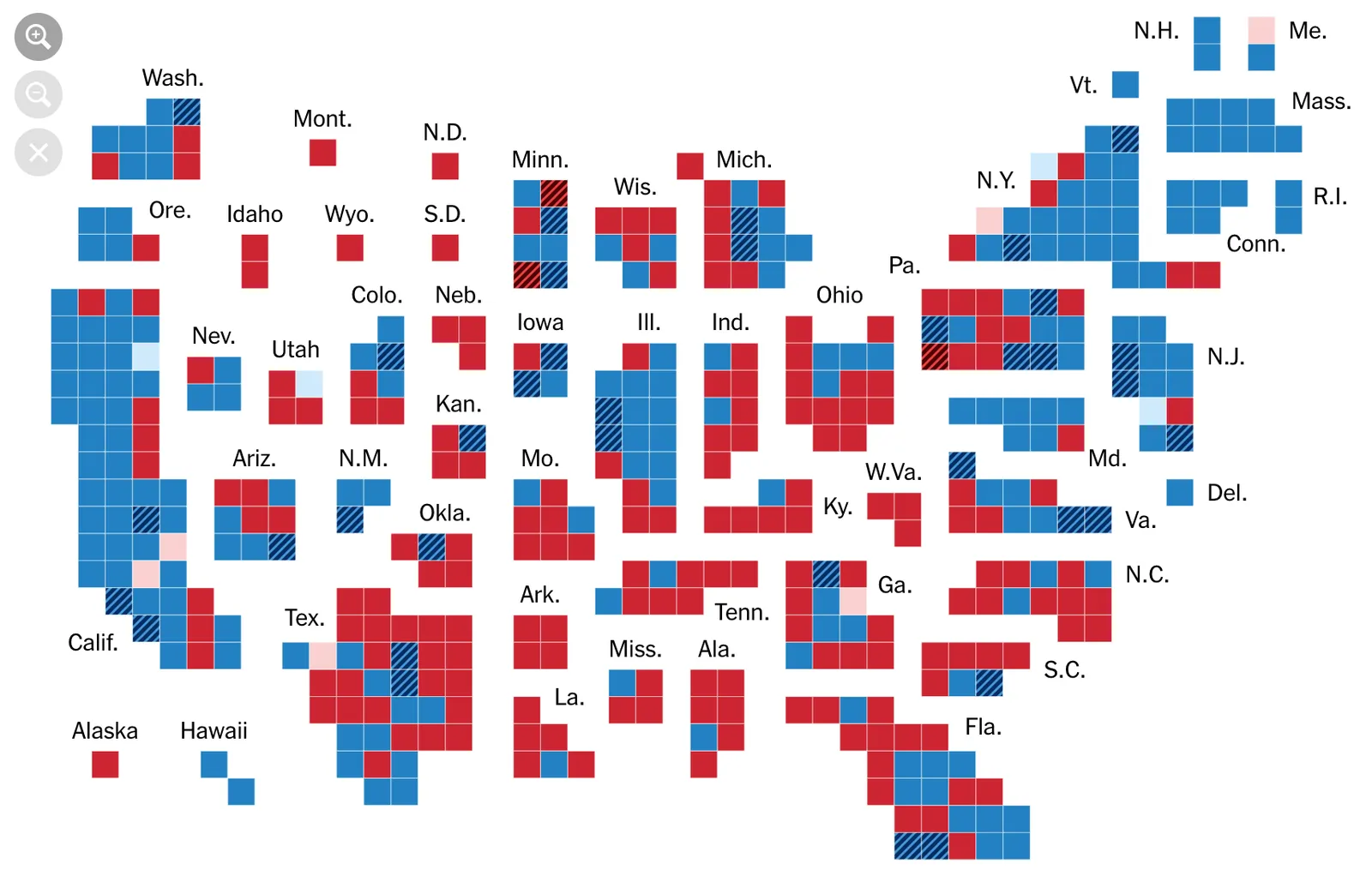
These 2 maps by the NYT times are another great example of the use of waffle charts. Both of them are unfortunately very hard to replicate in PowerPoint.

Cover image by Lindsay Moe on Unsplash


Blog post
These 2 maps by the NYT times are another great example of the use of waffle charts. Both of them are unfortunately very hard to replicate in PowerPoint.
Cover image by Lindsay Moe on Unsplash
About this blog
Notes on all things presentations — design, storytelling, and AI workflows.
Subscribe now to never miss a post.
About SlideMagic
A platform for business presentations.
A free student plan is available.